a r t w o r k : s a n c t u m d e c o r - u m

|
Title: All My Dreams
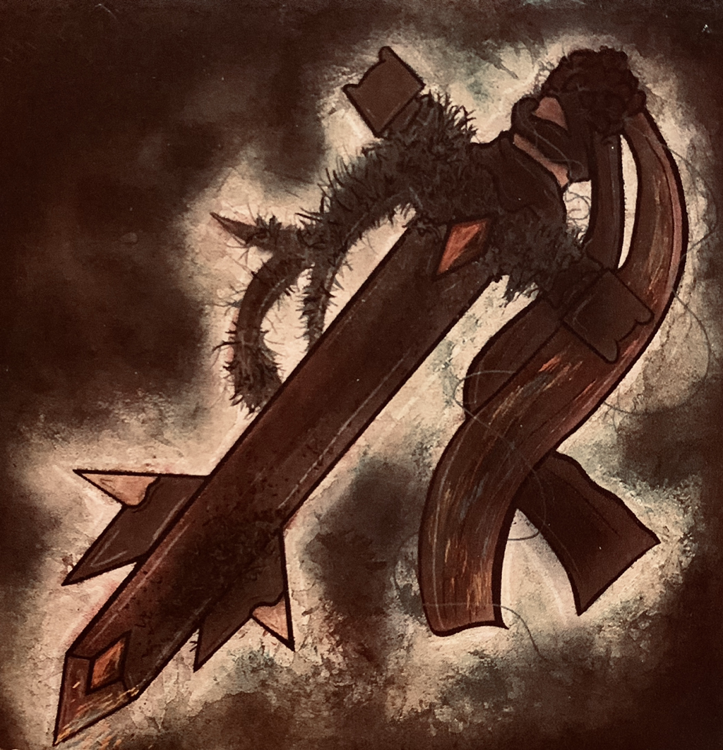
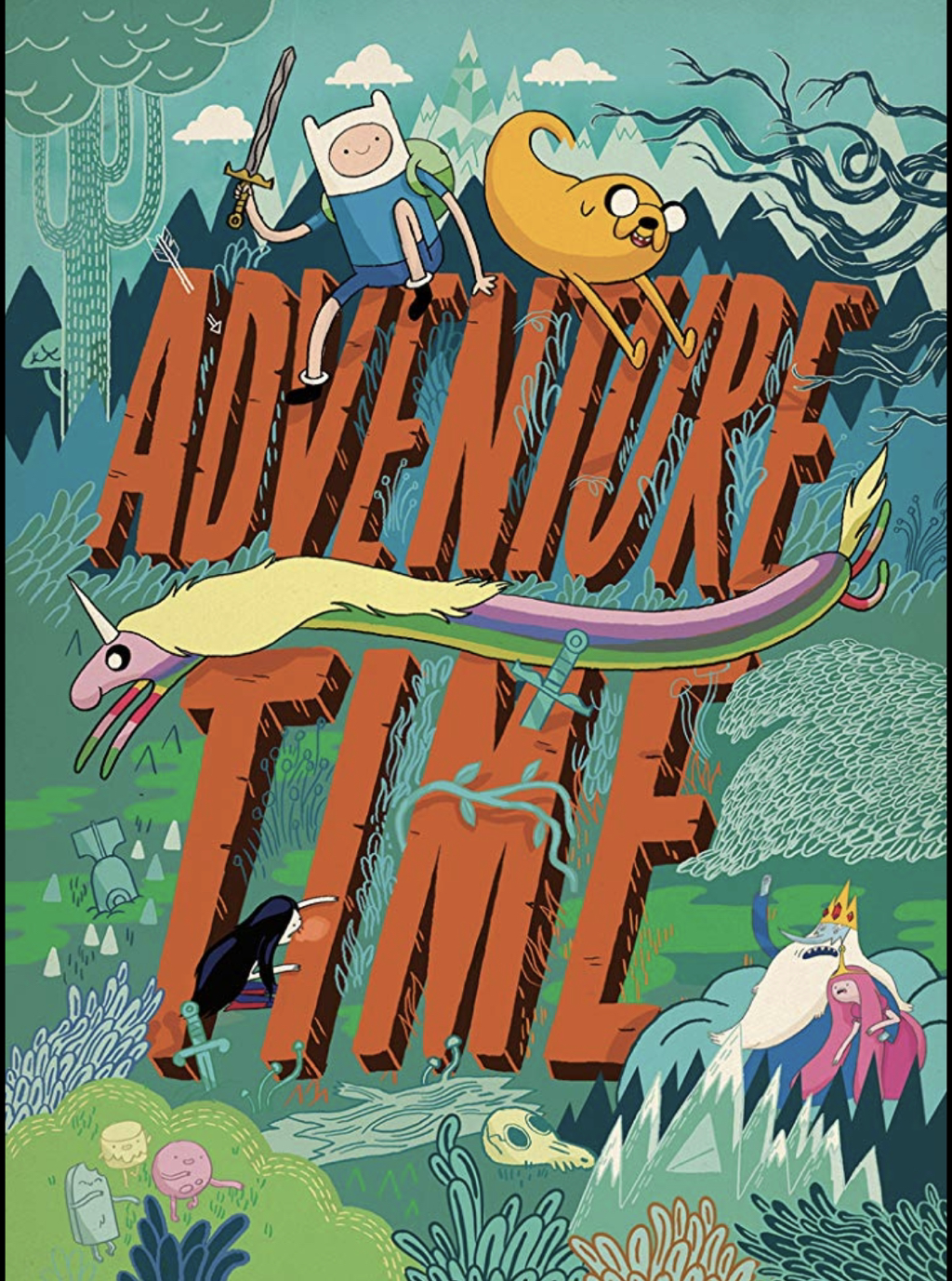
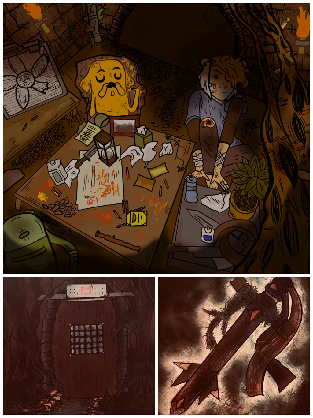
Size(s): Room: 25.4 x 38.1cm Door to Room: 15.24 x 22.86cm Key to Room: 10.16 x 10.16cm Medium(s): Room: Digital Photoshop Illustration Door to Room: Digital Photoshop Illustration Key to Room: Watercolor paint & Digital Photoshop Illustration Completion: July 2019 Exhibition Text:"All My Dreams" is a three piece digital and watercolor illustration that shows the secret room, door, and key for popular fictional character Finn Mertens from Adventure Time, a Cartoon Network show that aired from 2010 to 2018. Inspired both by animated and real life dungeon/forest scenery, and of course Adventure Time, I created a Sanctum Decor-um for Finn with my own twists. I make Finn my own by giving him a fresher look in my art style, and a showing of his more secretive side.
|

Introducing: Sanctum Decor-um - a project by Miad
|
The Sanctum Decor-um was a 2 week long project that gave us the job to create a secret room that a certain fictional/nonfictional being could only get into. You would provide the entrance for this room and a small spot illustration of the key/type tool that'd be used by your character to get in. We would have to redraw the character in our own art style, and would also have to include our own self concepted secret about the character that isn't canon to their realistic being.
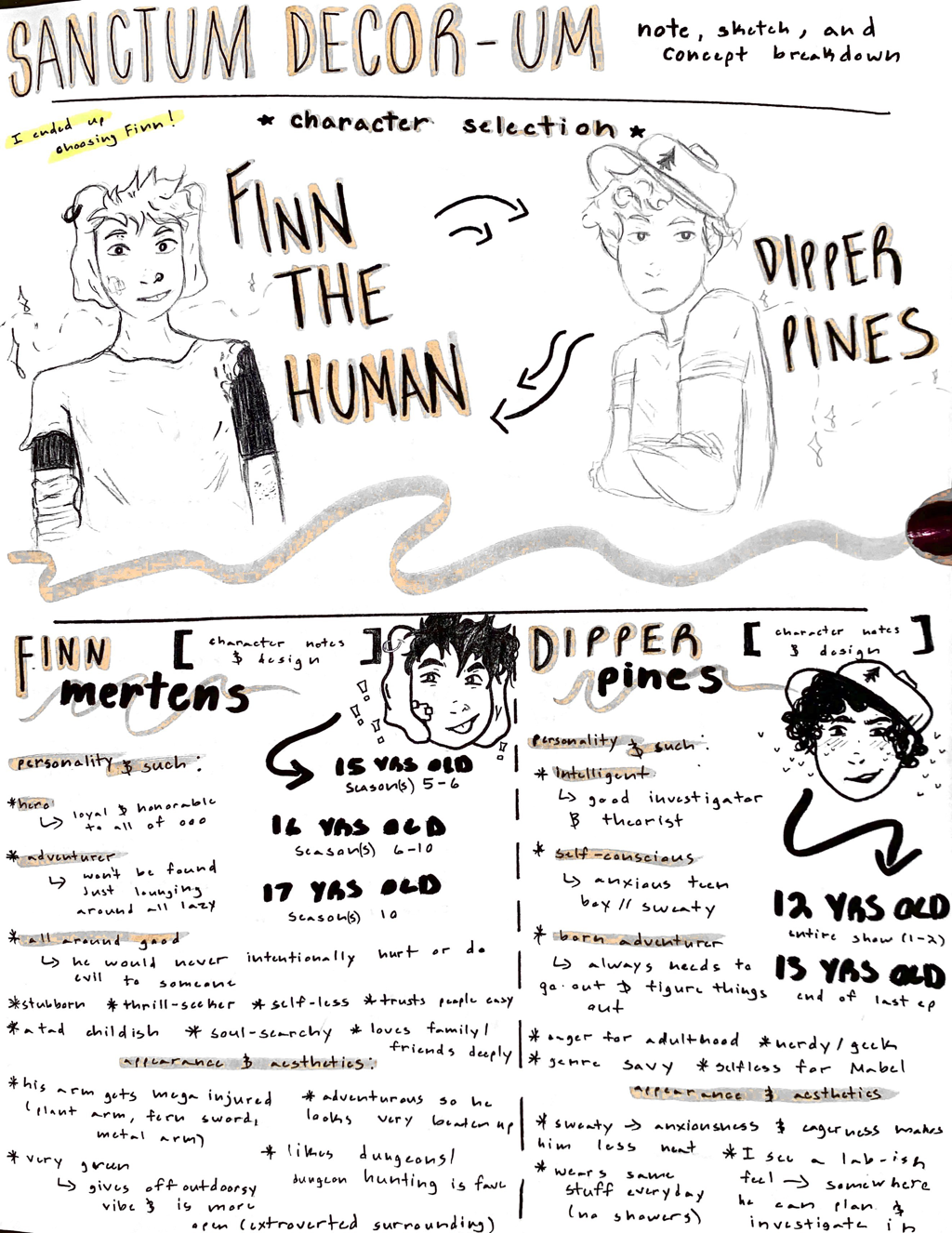
My class and I would also be responsible for 10 sketch book pages, at least, of conceptual ideas, notes, and thumbnail sketches that went along to our final three pieces. We also considered the ideas of our peers and instructors; for example, everyone had to get their character choice "okay-ed" to move on and critiques were only really done to expand on good ideas. The sheet to the left is the basis/basic info of the entire project produced by my Miad professors themselves. I decided to summarize above. |
Inspiration:
|
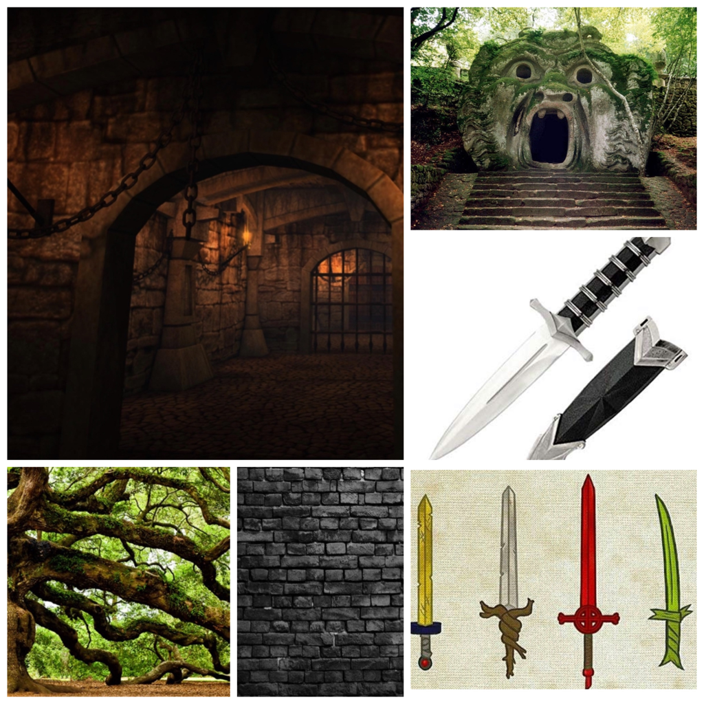
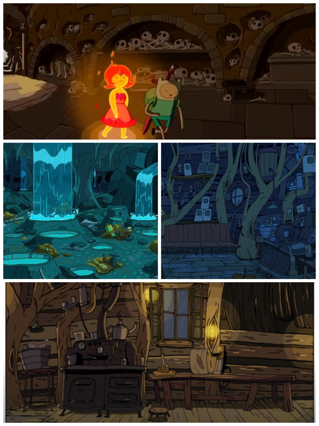
Inspirations: Adventure Time & Dungeon Scenery
Artist In Focus: Pendleton Ward, creator of AT Inspiration from clear, direct artists is difficult to reach with a project like this. It makes you personally concept ideas from what you know about the original subject material, your character, and in that only comes references and such as "inspirations". In general, Adventure Time is what gave me Finn, and I chose Finn because the show already inspires me so much to construct this for his character. Finn's design is already so fun to play with in my own hands, and the cross between serious and silly in the series is something I've always loved about this show growing up. |
|

|
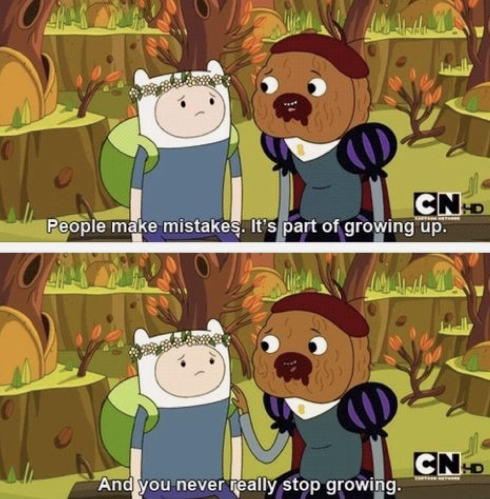
Adventure Time was a 2010-2018 Cartoon Network show created by American animator Pendleton Ward. It tells the adventures of Finn, the supposed last human on Earth, and, his dog/brother, Jake, as they perform everyday heroism, beside the perculiar and quirky antics of secondary characters, of course. My Finn is the one from Season 3, I'd say between episode 9 and 10, as this was both after Finn had quite the personal conflict confusion with a character he's had an unrequited crush on for most of the series and also being the episode before "What Was Missing", an episode where telling everyone your secrets and learning to stay true to your friends was a major theme. I between this, metaphorically, would be a great placer for the events that happen in my piece's story.
|
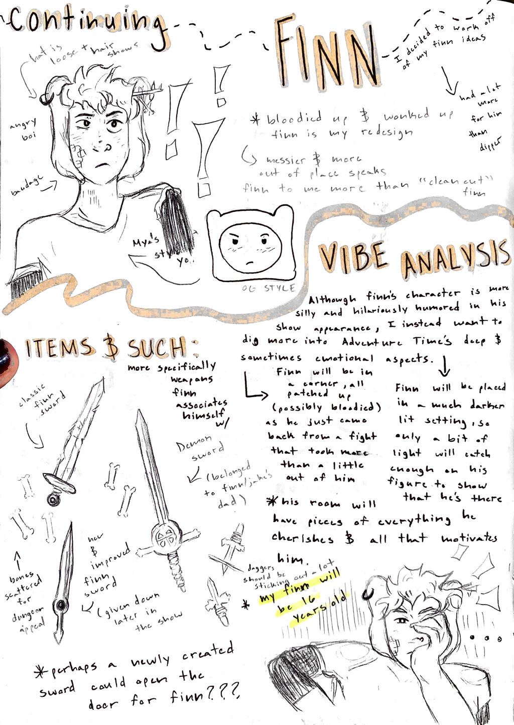
Finn's character is a very dungeon-type boy; he likes to get lost in these when he's stressed to unwind, so I looked a lot to real life dungeons and temples to figure out how I'd set up Finn's room.
Swords and daggers also yell to his character enormously, so I knew weaponry would be a needed factor for this adventurer, alongside his teenager needs in the room. |
|
|
|
For any further explanation to my piece's full and true story, it will be told a lot more in depth in both my sketch book pages below, and even in my reflection below. I had so much idea in this piece. Also, "All My Dreams" by FUR was actually the song that ushered me to take the pathway I did for the secret Finn would have and what his room overall represented. It felt like a fitting title.
Planning:
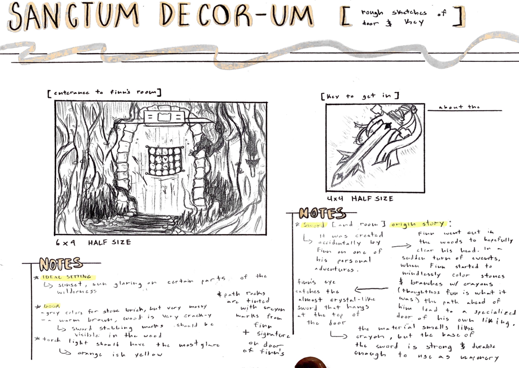
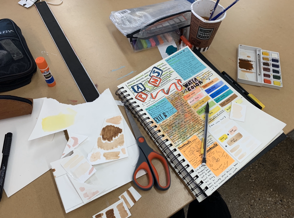
As clarified earlier above in the project introduction, we were given the task of putting together 10 pages of conceptual planning. This meant that, in at least 10 pages, we'd come up with an expanded exploration of our character, the needs for their room, and notes/sketches related to what each of the three pieces would come to look like. I've written and drawn... a lot... so most of my planning is done in the 10 pages below. You can click on them to get a better look, but they really say it all.
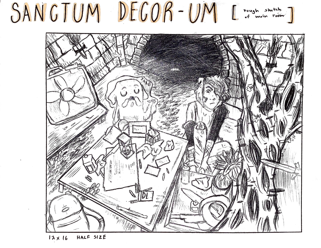
Below are the last two pages of my sketch book planning, and these were basically the outline towards what my final product would look like as a whole. To the left is the room design, of which had it's own dungeon/forest vibe to it as I wanted, and to the right is my key and door idea. I also included the origin story and basis of my entire piece on that piece, so do go take a look!
|

Experimentation:
To the left below this are some of the many planning photos I took to get the original thumbnail sketch of my main room idea down. By laying out objects and other things, such as tables and plants, I am able to look on easily for perspective examples, so my final product will be stronger in things making sense. Reference can do so much more from an artist, so I benefitted a lot from this.
Even though Finn's rebooted character design wouldn't be the main focus for my room piece, I did want to practice with posing to expand what I could do with my personal art style. Plus, the area I would sit Finn in would not only shape out the piece, but increase unity in every single bit of my piece with his presence. You can see me studying some of the poses by sketching them quickly out onto paper to the right. Finn would end up sitting a bit back with his knee all blooded. It built his character for me a lot more by doing this.
Finn's room was supposed to show how much of a personal mess he was, while also capturing the small secret objects he collected on personal adventures. He uses the room to keep them hidden, perhaps like his own pirate treasure, but the thought of having a room only to Finn is... comforting, in a way. That's why the room makes him more vulnerable; it's a space where only he is able to visit, and, in that, he doesn't have to hide his secrets and objects-they can just stay out in the open as is. Adventure Time is a show that likes to add clutter as well, so I wanted to use that in this piece to give a better feel to what Finn's secret room would actually be like.
|
Experimentation with Medium: Wacom Tablet w/ Photoshop & Watercolor Paints
My reaction to being given a Wacom Tablet was anything but subtle; using a tablet like this has always been a dream with mine. My instructor, Andy, let me play around with it for a bit on my own before starting on line work, but everything seemed so... easy. It's odd to explain it that way, but the tablet makes it easier to undo and erase things, and the endless tool accessability lets you really do anything you wish. Shading, changing shapes of lines to create a certain amount of detail, and even coloring in was simplized, and I loved having that at the reach of my fingertips. I also experimented with Watercolor Paints because having medium balance felt important to at least try in this three part project. It was a little hard getting the colors I wanted, it's very transparent, but my sword colors were unique in texture. |
|
Process:

|
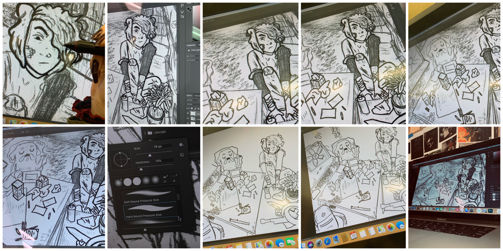
Lots of sketching and initial thumbnail sketching happened in this first part of the process. As what happened with our last project, planning sketches and the process of laying out everything before it’s done is still seen as something to not take lightly. This project, however, at least for me, really started to move forward after our first critique. I was told to redraw my design of Jake to make him more of a my style type of guy, which was an easy fix, and small tweaks were also made to get my final sketch down. We called this a “tight sketch” in the process. |
|
Our first goal in this assignment was to do a few color tests for how we'd build the atmosphere for our final product. My instructor Andy wanted us to really know how everything would look before pulling it off officially. This also ran in testing out what colors and shading we’d pull off in our final product. I first went in with seafoam color schemes. The show has a lot of these, and I wanted to test it I liked green and bluer hues and saturation in this piece, but decided against it. I wanted Finn’s room is feel very home-like; this meant making the colors warmer and more orange related. I played with putting transparency in colors such as orange over the piece to see how it’d look. The same was done with my sword and door pieces. |
|
|
To the right are three different color tests I ended up liking the most for my final product. I decided to show these three because they ended up being the colors and type of aesthetic that I wanted his room to have. Hues such as orange, yellow, brown, red, and black liter this piece to make it feel warm. Warm tones just felt like a better choice. |
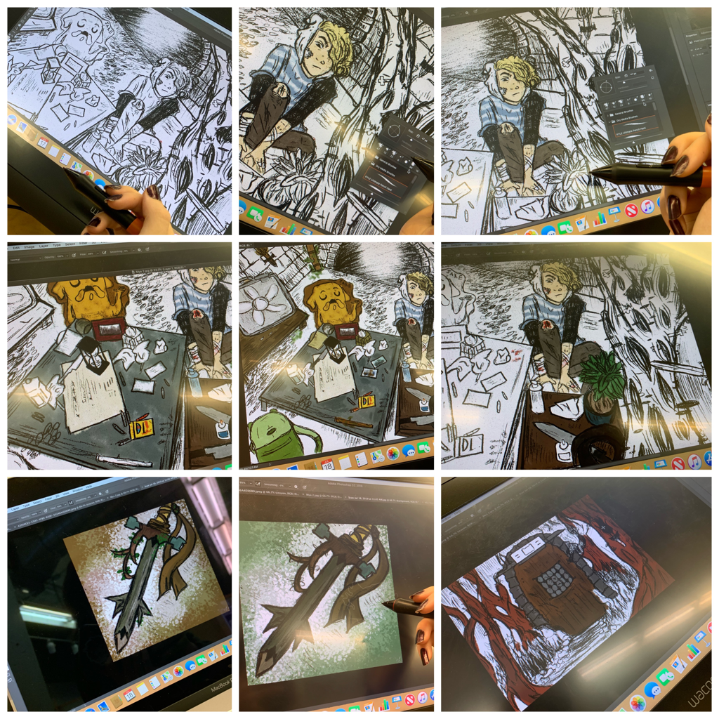
Using the different liner brush settings on Photoshop, I began the overall lineart for all three of my pieces. Lineart had me experimenting a lot with how hard I pressed down, and with the tools I was given. I used the hard round pressure Photoshop brush.
|
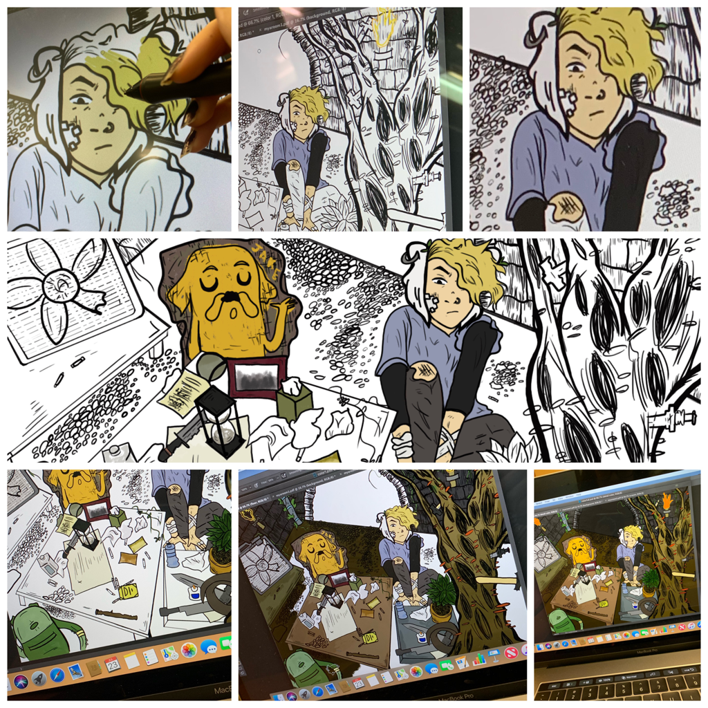
As I let up on the pen, it’d create these thinner, lighter lines, and the look made the piece have a better unity as a whole. I began with Finn’s figure, which I blame on my love for drawing and lining characters, but afterwards I moved to the table and the contents that lay on it. The line art took an entire class day and a bit of the next, but I think the look of it was already a lot smoother and nicer looking than my rough and tight sketches. |
|
|
To the right and left of this text you can see all three fully lined pieces. I wanted to include this just to show how my lined piece looked as a whole before any coloring was done.
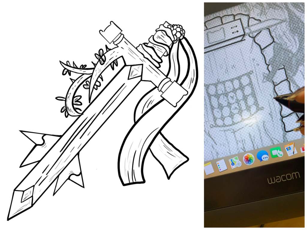
Honestly, this is a piece of its own. I had also included the full lining of Finn’s sword too, and some bits of the door. I did this after finishing the lineart for my main room, and these didn’t seem to take as long for me to do. |
|
The next step was to actual get color in my piece in every single bit of each of the thre illustrations. Coloring my piece was where most of my time went. Everything has its own color and look to it, so I made sure to zoom in and out a lot so everything looked right. I used a soft round pressure brush and this other messier graphite like brush to color things in. With my colors at least in the areas I wanted them to be in, I could start playing around with shading and hue/saturation settings. |
|
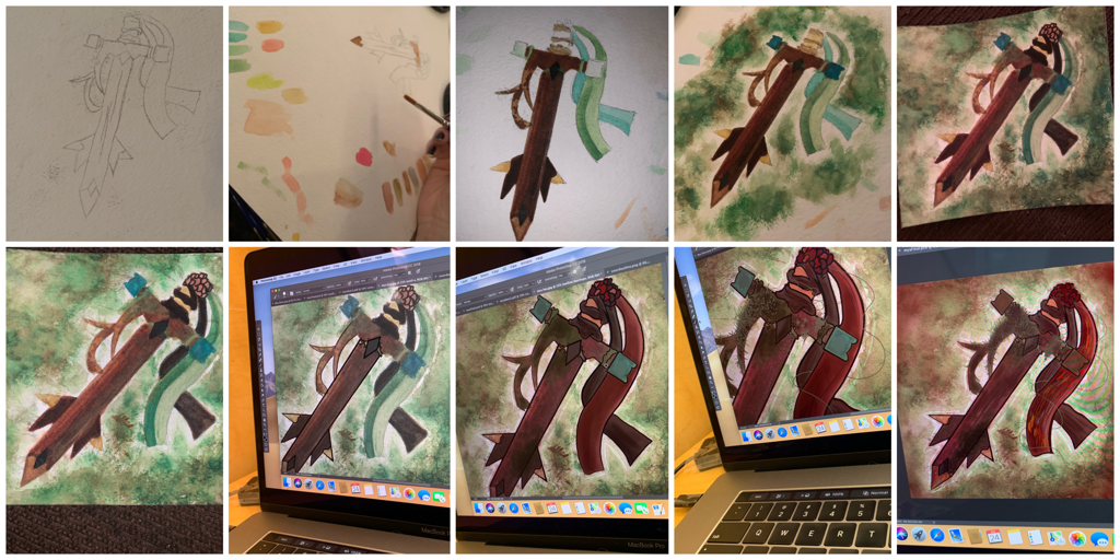
|
I decided to balance artistic mediums, so I used Watercolor paints to give a whole new texture towards how to final product sword would look. These paints are a little difficult to control, especially when filling in the outline of a small space like this sword. I reflected back to the greens and browns or my color test from earlier, and tried to replicate the hues on watercolor paper, but things didn’t go exactly how I wanted. This was fine though. Later on I’d make a copy of it into photoshop and tweak it as much as I pleased. The process for working through this lies out to the left of this text.
|
|
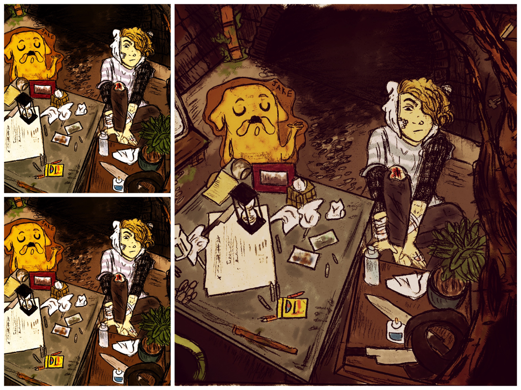
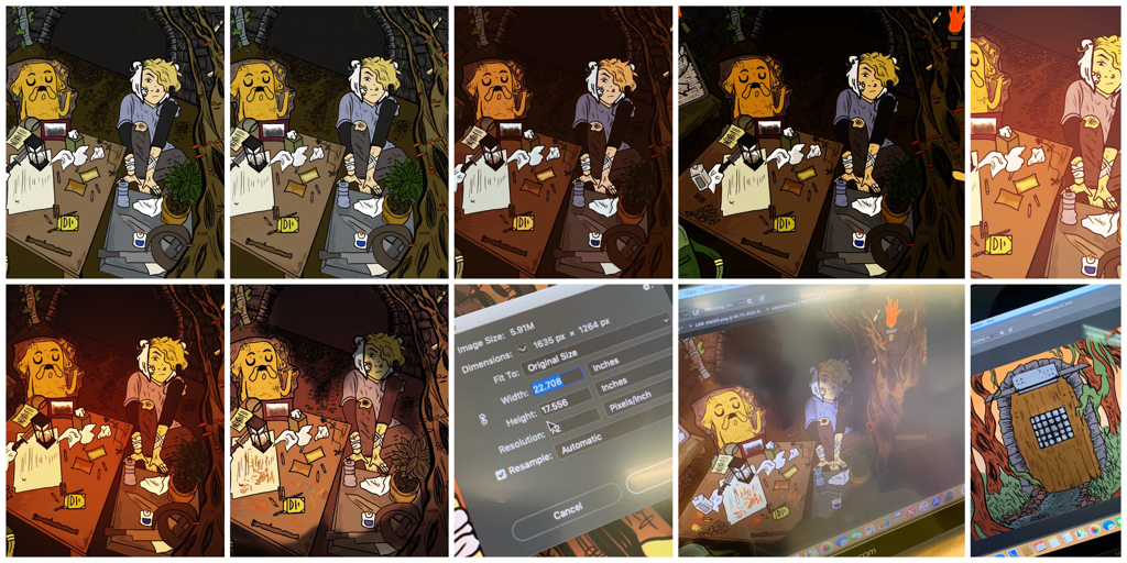
I finished up small color tweaks to all three of my pieces, meaning that I'd be bringing in shadows and value to really shape the atmosphere. This is where I specifically went in with detail and shaders to make the piece look how I wanted it to be. I ended up doing a few more other tests (this meaning I made copies and lots of layers to test certain things out), and these images show that experimentation. |
|
|
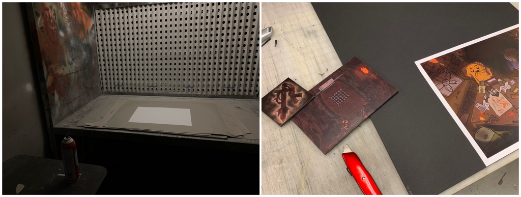
Next was the mounting process for all three of my illustrations. The mounting process went a lot like it did at Reagan, so I felt a sense of familiarity when given a cutting tool and foam mat board. |
|
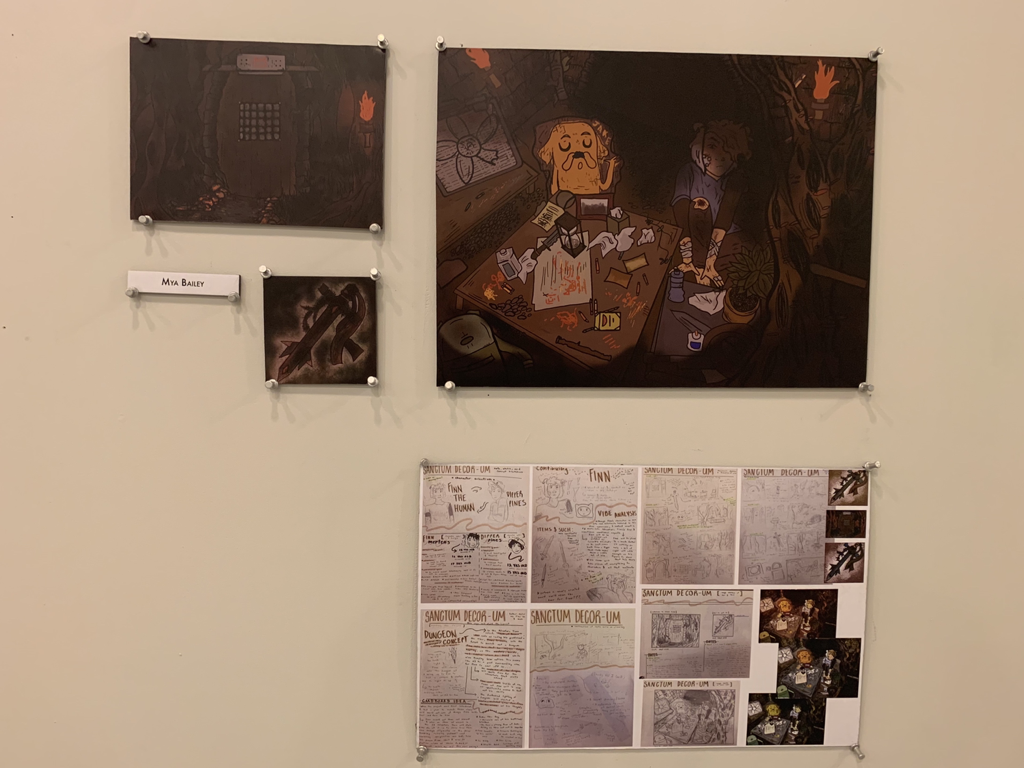
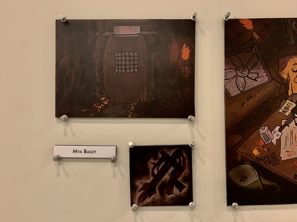
To the left and right of this text, you are able to see my pieces up in the gallery at Miad for the Advanced Program's gallery night. We had to show off all of our three pieces in the Miad gallery, of course, but there will also set up with our planning/sketch book pages beneath it to really show people what all went into this process. |
|
My experience in Miad’s Pre-college program closed up here, and I felt very proud of myself for all I did.
Critique:
This next area will be comparing my three pieces, "All My Dreams" to it's original inspirations: Pendleton Ward's "Adventure Time" series with his character Finn Mertons & actual scenery from real life dungeons and temples.
|
Similarities May Include:
- There's a homelike feeling to the atmosphere. I tried to replicate the color schemes and calmness of both Finn's treehouse and dungeon scenery in my final product through shading and variations of brown/yellowish hues.
- Our pieces use shading and lights to really capture the moment. Again, using different types of colors to create a harmony in emotion for both our works made things feel very alike. - They stayed true to the cartoon look. My personal art style shines more in cartoon characters, so this was perfect for creating my own adaptation of a character like Finn. |
|
Differences May Include:
- My piece alone has a lot more character in it than the screenshots I was inspired by from Adveture Time. This is mainly because they're only screencaps from different episodes of the show (so of course they aren't going to tell a lot), but the difference still sounds pretty prominent when comparing my work to my specific inspirations. All of my item choices tell more about Finn's characteer and the kind of stuff he'd keep in such a private place for himself.
- My Finn redesign and the show's true Finn design are pretty different. Incoporating my own view of Finn, I wanted to make him look more teen-like. I gave him piercings and more rips in his clothing, both to give off more of a "Rambunxious/can't stand still for two seconds teenager" whose adventures and battles show more in his character. I stretched the formal qualities of Finn's flat design and made him have more ump to the viewer.
- My Finn redesign and the show's true Finn design are pretty different. Incoporating my own view of Finn, I wanted to make him look more teen-like. I gave him piercings and more rips in his clothing, both to give off more of a "Rambunxious/can't stand still for two seconds teenager" whose adventures and battles show more in his character. I stretched the formal qualities of Finn's flat design and made him have more ump to the viewer.
Reflection:
I have quite a lot to say about this specific project, so this first paragraph will really be running through all of the backstory and thought that went into it.
When we were discussing objectives as a class, I already knew that I wanted to use Finn The Human from Adventure Time as my main subject. I had an Adventure Time phase back in 2012 (it lasted for a few years), so Finn, and the rest of the cartoon’s recurring characters, will always have a large place in my heart. The backstory to this piece goes as follows: Finn runs off into the woods to hopefully clear his head after a complicated argument he had with Jake earlier that day. Despite his need to fight something (picture this kid pacing around trying to not attack a tree or a rock), result of pent up teenage anger, he pulls out a cartridge of crayons and doodles faces, people (more directly the faces of his friends and family) on nearby items. The thing with Finn is, earlier on in Adventure Time, in an episode named “Rainy Day Daydream”, Finn’s character expresses his disliking towards “playing pretend” and “using imagination”. For this specific project, we were told to add our own made up secret about the character that only they know. So, mine was that Finn likes to use his imagination way more than he lets on. He actually is shown, as you can see in the room, to have drawn out Jake on a piece cardboard to talk to as a coping mechanism. Finn’s room is a safe space for not only him, but an area where he can openly express his weird teen feelings and angers to the world without fear. Finn’s room spawned while he was doodling this cardboard cut out in the woods, and now he can only enter it when the time is right. This is determined by Finn’s key: The sword (also named Forest Blade). Finn likes using swords in the show, so I felt it would be fitting for him to get in by acquiring one. Finn opens the door by stabbing the weapon into the door’s stone panel system three times, and, if he gets the code right, the door is unlocked for him to use.
My pride towards this product's turnout is something I can't fully express in words. There are small, intricate details I'd tweak if I could on a tablet, but overall this project's ability to give me so much creative freedom and expression made it so fun for me. Especially working with a character I practically grew up beside, that was such an amazing exploration for me to dig into with this piece. Some of my favorite parts of the piece appear in my shadowing and hue choice... these really made the piece express the emotions I wanted it to, to the viewer. I also enjoyed re-creating Finn into my own (both in redesign and in the piece's backstory). Overall, this project made me get even more excited about doing digital artwork, and, if the opportunity rises, I'd like to try at it again
Connecting to the ACT:
1.) Clearly explain how you are able to identify the cause-effect relationships between your inspiration and its effect upon your artwork:
I twisted Finn Merterns from Adventure Time, a Cartoon Network show created by Pendleton Ward, into my own character by redesigning what I knew about his look and personality into a whole other being of my own. I also looked on to the inspirations of dungeon/forest scenery to dig more into the vibes I get from Finn Mertens as a full.
2.) What is the overall approach ( point of view ) the author ( from your research ) has regarding the topic of your inspiration?
Finn's character is heroic and isn't afraid to live life... but he's still a teenager, so he isn't free from flaw and personal fear.
3.) What kind of generalizations and conclusions have you discovered about people, ideas, cultures, etc. while you researched your inspiration?
Finn's character has so much depth already in the series. I thought back to all that he's went through, and then remembered how he is still a teenager, one of the last human's on Earth as well, and dug more into how this could show in my recreation. It was me using everything he was and making it so much more.
4.) What was the central idea or theme around your inspirational research?
There's more to a hero than meets the eye. Especially in a teenager like Finn Mertens.
5.) What kind of inferences ( conclusions reached on the basis of evidence and reasoning ) did you make while reading your research?
Everyone has troubles and personal doubt, some just hide it better than others. For Finn, maybe the only way to deal with it is to make cardboard cutouts of his friends, so he can practice being the kind of hero everyone needs. Maybe that's enough.
CITATIONS ( DONE IN MLA FORMAT )
“Finn.” Adventure Time Wiki, adventuretime.fandom.com/wiki/Finn.
Imgur. “10 Real Life Locations That Look like Dungeon Entrances.” Imgur, 13 July 2014, m.imgur.com/gallery/2k1iu.
Riviera, Enqlish. “FUR - All My Dreams.” YouTube, YouTube, 14 Feb. 2019, www.youtube.com/watch?v=HxLy28CDoJ4
.
“Ad.” Adventure Time, created by Pendleton Ward, Cartoon Newtork, 5 Apr. 2010
