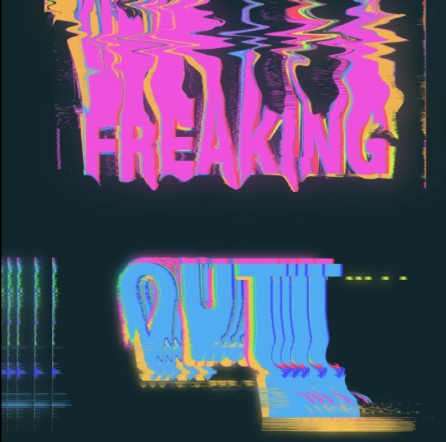
n a m e o f a r t p i e c e : f r e a k i n g o u t
|
|
|
|
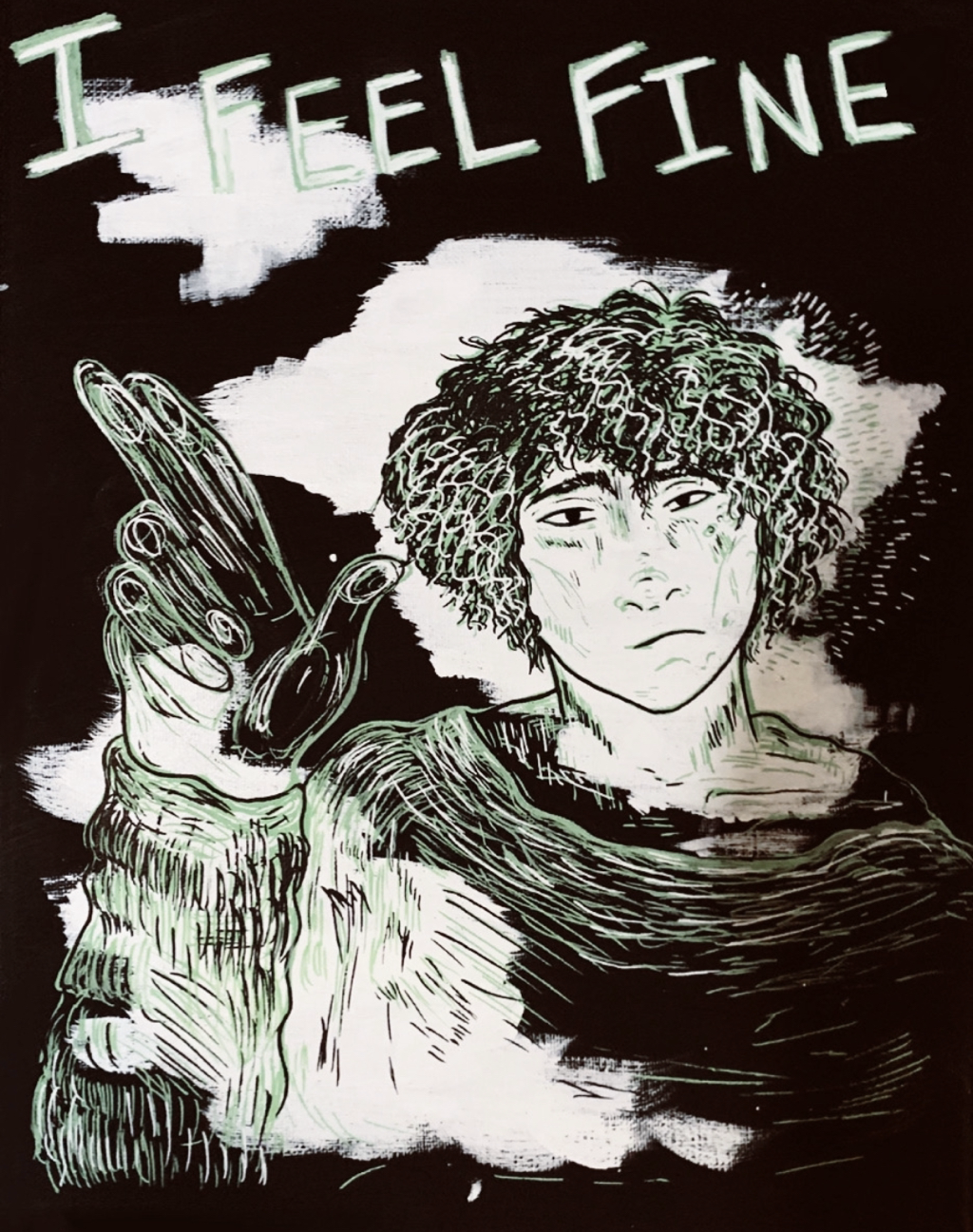
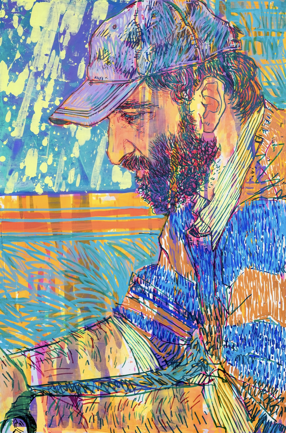
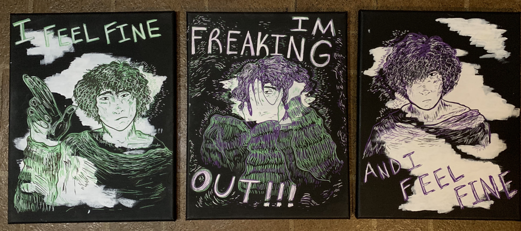
Title: Freaking Out Size: 38.1 x 33.02cm Medium: Posca Paint Markers on Acrylic painted Canvas Completion: October 2019 |
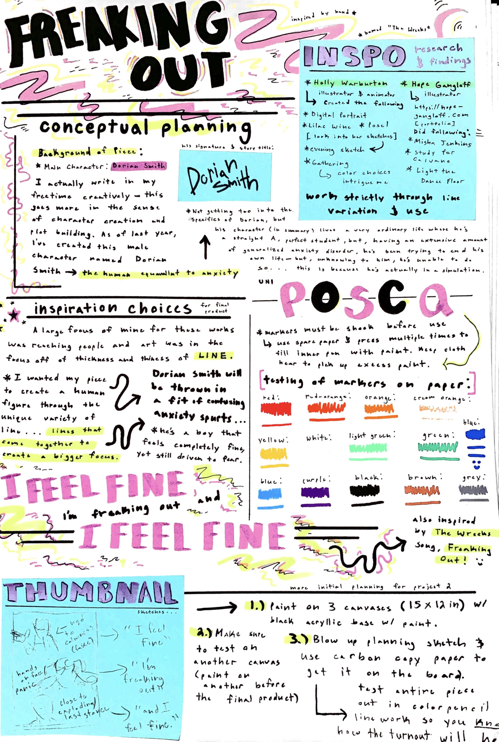
Exhibition Text:Exploring an original character of mine, my art series "Freaking Out" explores the inwardly calm, yet outwardly panicked emotions of Dorian Smith. My piece was created using Posca paint markers and black acrylic paint on canvas, and it's inspired by artists Holly Warburton and Hope Gangloff, and their use of line variation (thick and thin) throughout their works. The piece is supposed to communicate the idea of how consuming one's anxiety can be in their day to day life, even as a teenager.
|
Inspirations:
|
Artist In Focus: Holly Warburton
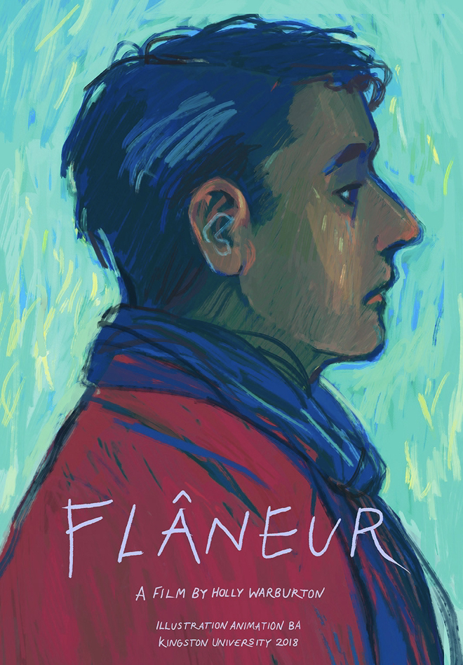
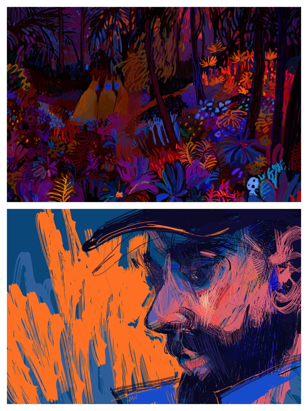
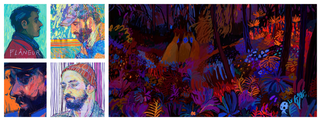
An artist I came across some time back, Holly Warburton, is someone I was meaning to use as major inspiration for a while now. Her work is just so visually appealing, the use of color and unique variation of line and form... her pieces spark artistic expression in every manner. To the right, I decided to include some of her many works that have drew me in more specifically: These include pieces such as "Flâneur" (the piece to the very left, this being a movie poster design), "Self Portrait: Man on Train" (bottom left piece) and "Gathering". Her use of line is something I wanted to replicate, alongside vibrant color choice. |
|
|
Some of the pieces above, to the top right, are named "Flâneur", "Self Portrait: Man on Train", and "Gathering". These pieces were chosen based on the vibrant, more pop-out like hue choices and in the way artist Holly Warburton created a piece through thick and thin lines. I'd be trying to execute the same in my work.
|
Artist In Focus: Hope Gangloff
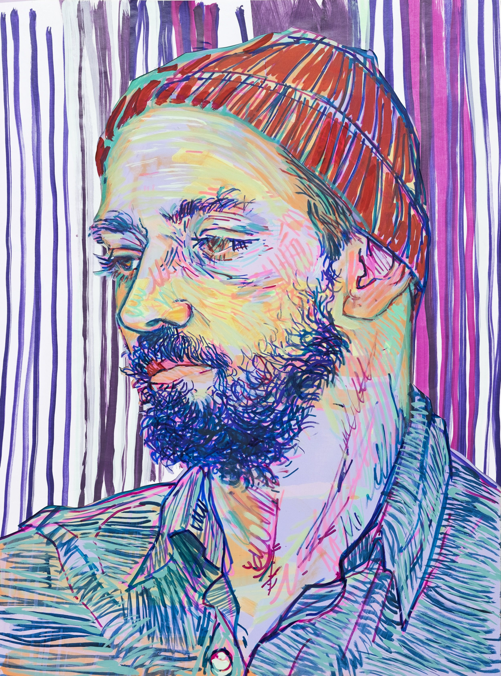
While breaking down Warburton's work, I also came across one Hope Gangloff. Her work felt a lot like Warburton's, but involved a lot more detail in tiny lines and realistic impressions. Her works look more realistic, but still carried over those alike qualities of vibrancy in hue and form. Plus, I liked the posing she does for her pieces. A lot of her work reaches the more personal, human side of things; this goes in the sense of using human figures as models for most of her work, which is something I'd be doing mostly in this piece with my main character. Dorian Smith, and his personal view. |
|
The illustration above to the left is named "Misha Jenkins". and the other illsutration, to the right, is named "Study for Carvano". I would also like to take a more human-related focus of the character in my piece, in my style of course, and use intricate line work and detail to perform my ideas in a similar stand point.
|
|
Freaking Out - By The Wrecks
Unsurprising to anyone who has viewed my work before, I found inspiration from a song I heard a while back named "Freaking Out" by The Wrecks. The lyrics, at least to my ears, tell the story of someone who admittedly explains that they're fine, living presently in some of the greatest moments of their life, but they're still freaking out entirely in the inside. The song literally oozes the vibe of my character, Dorian.
|
Planning for the Final Product:
|
My initial planning for this project, aiming towards the first planning page to the right, was to shape out the song "Freaking Out" by The Wrecks and expand it into a personal character of mine, Dorian Smith. I write more about the story he comes from on the page, but Dorian's character is more anxious than not, so he's constantly flipping from a sane state of being to a completely, on the edge of breaking down, mess of emotions.
|
Journal/Planning Page 1
|
Journal/Planning Page 2
|
Journal/Planning Page 3
|
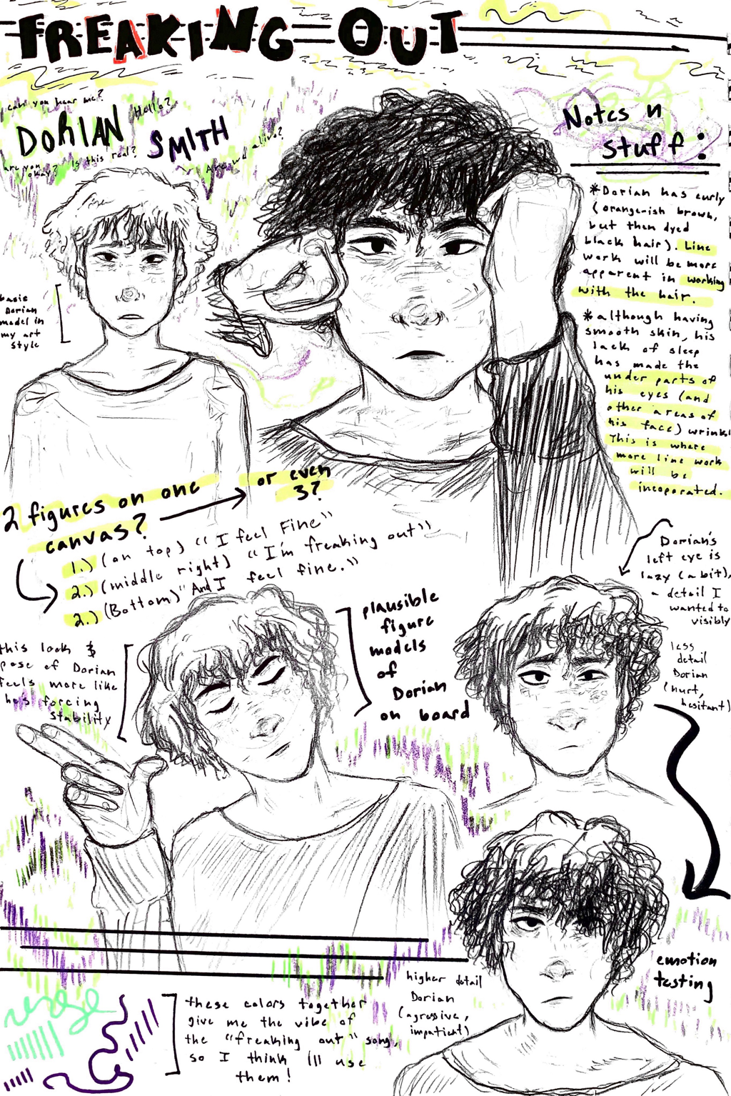
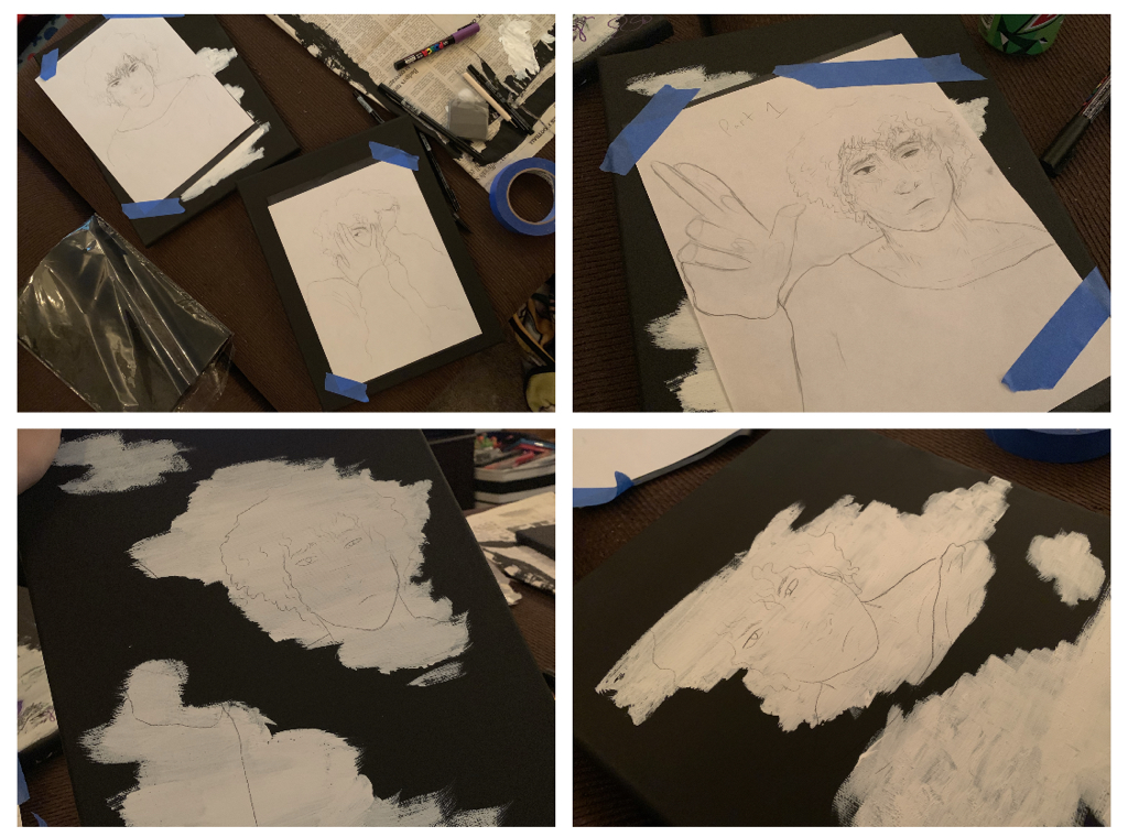
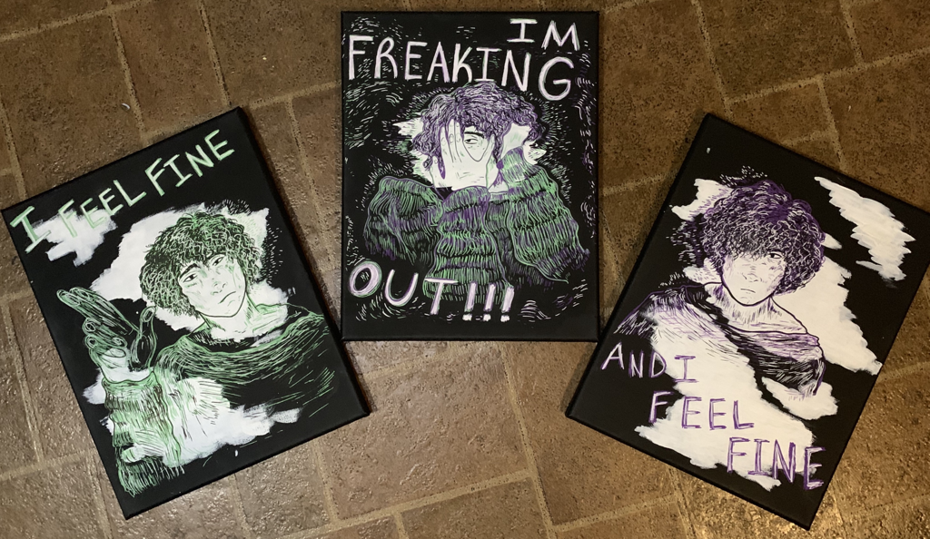
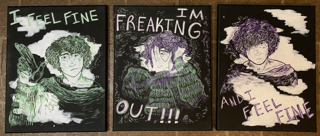
My next few sketches were of how the canvas would be placed out as. I was slightly indecisive about how I wanted the piece to look. My first assumption was placing Dorian on three canvases each (one for each "Freaking Out" lyric "I feel fine", "I'm freaking out", "And I feel fine"), then decided on one canvas to save time, but three canvases again felt like it would communicate my idea in a better lighting.
I drew out very tight, less detailed sketches of Dorian to begin with for planning, and then outlined them in colored pencil to test out how it'd look with my markers on canvas. 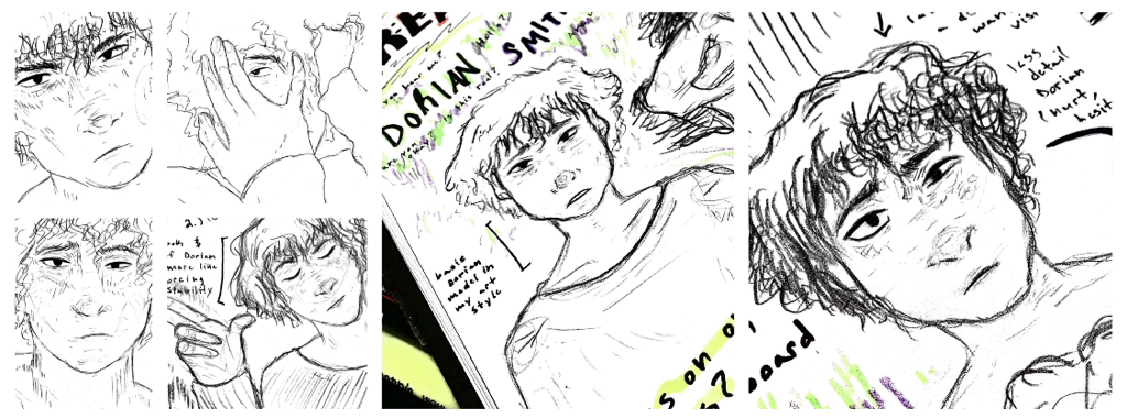
|
Again, per usual, I explore my planning also in Experimentation. This is all shown below, and can be seen reflected above.
Experimentation:
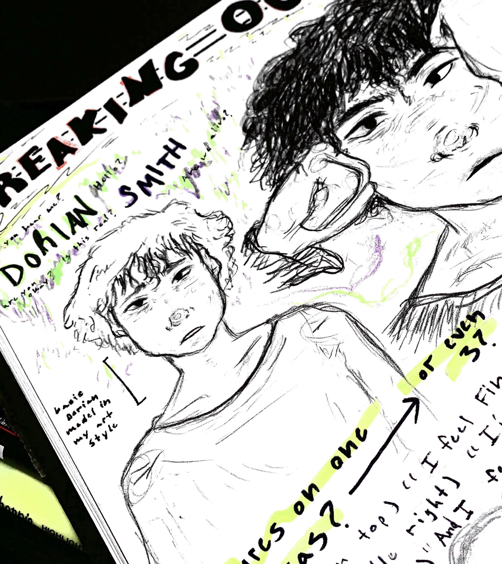
The image above is what Dorian's character mainly looks like. He has messy hair, usually reddish brown until he dyes it black, but it was important to get out a base of him for the overall final product so I was overall aware.
|
|
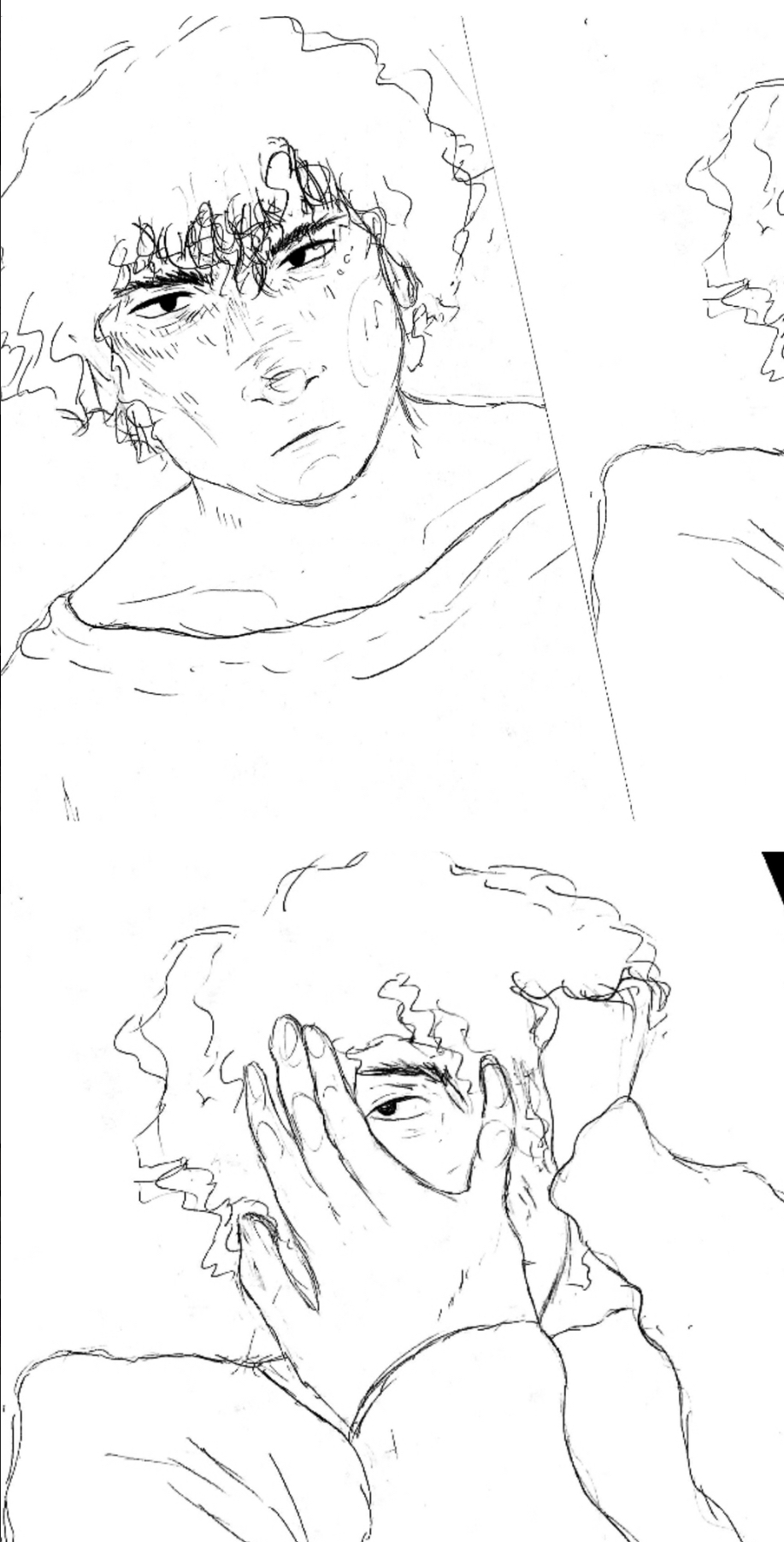
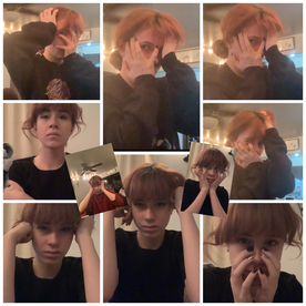
Posing and taking references for my final product was important. Lots of posing was done to model out how Dorian would be posed on canvas, so below are some of the few I took to help me sketch out plausible posing ideas. To the left, I choice to reposition the way I'd stand and communicate a collection of certain emotions outwardly with posing, and how this could be interpreted by second glance.
|
|
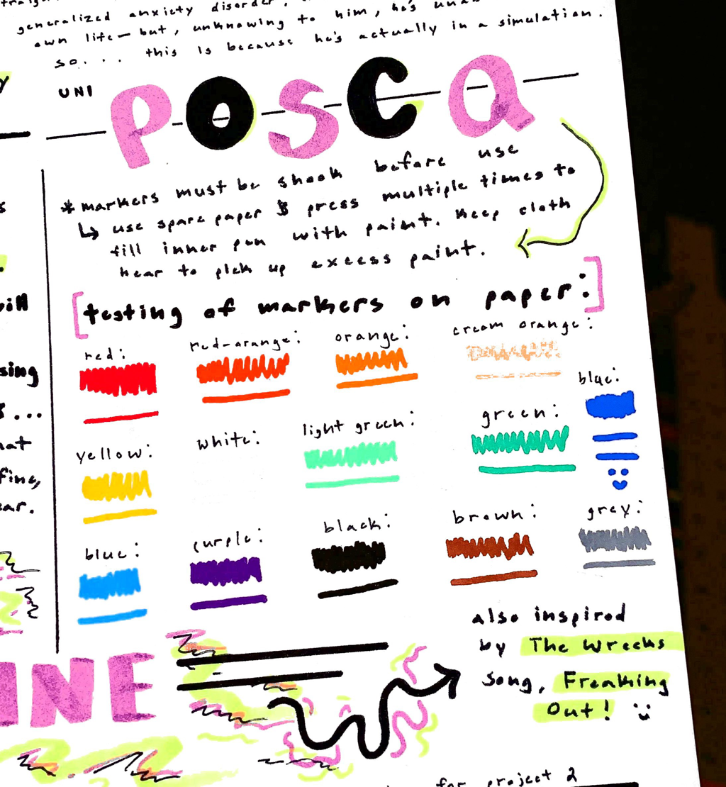
Going more into the actual medium, I recently purchased Posca Markers. They’re paint markers, the kind of markers that can go on any surface like paint, yet they’re presented in the form of marker-like packaging.
I liked the hard, thick colors that they could get onto canvas (I watched a lot of YouTubers using them, thus me taking a chance and buying them) and how they’re less loose than other art mediums are that can do the same— for instance, paint. Plus, I work way better with markers, so I thought it would be nice to try this since I’m not as efficient with painting. They're real beauties too... perhaps I'm just too invested in the aesthetics that markers can produce on paper, but I haven't experienced such nice tool interaction with paper through markers in a while that didn't, at the very least, fade a bit while I dragged it across paper. |
|
|
Experimentation with Medium: Posca Markers
The colors I wanted to use for this piece, at least initially, were green and purple. This references back to the album cover of “Freaking Out” by The Wrecks and those hue choices that kind of capture anxiety when used together. Moving more into experimenting with Posca markers, I put aside a black/white acrylic painted canvas so I could test what certain colors would look like on white versus black. When doing this, I found out that hue choices such as blue, red, and |
|
green looked very cool on both ends, but, say for example, purple looked the best on black rather than white. This would all break into what I’d be using for the final product. In both instances, I still really liked the colors neon green, and more seafoam look to colors, and how it could be mixed with a lilac purple to create a sense of unity. You can see this above to the right. I wanted to really use this in my final product as a main colors that went into creating Dorian’s character.
Process:
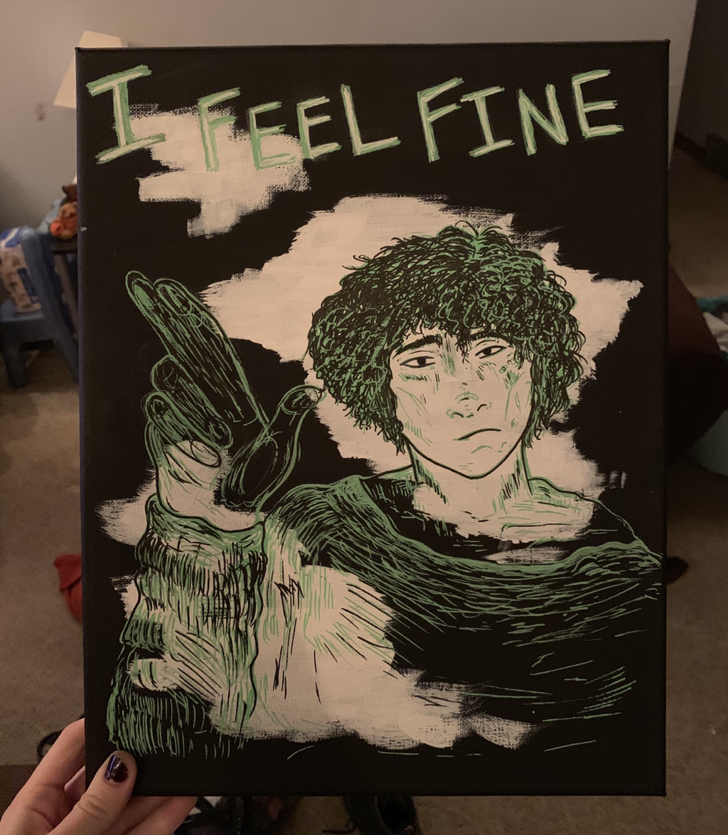
My first objective was to paint a series of white canvases black, and then to move in with white in some areas so certain marker colors would be more visible to the viewer when contrasted with others. I ended up doing this on three canvases. My goal with this piece was to complete a certain set of lyrics from the song by The Wrecks , these lyrics would be “I feel fine”, “I’m freaking out”, and “I feel fine”.
This would be an ironic take on how Dorian Smith is feeling. Again, his character really connects to the song I used for inspiration, He's at a toss and turn with in-between feelings, even as a teenager, and they've always been there.
|
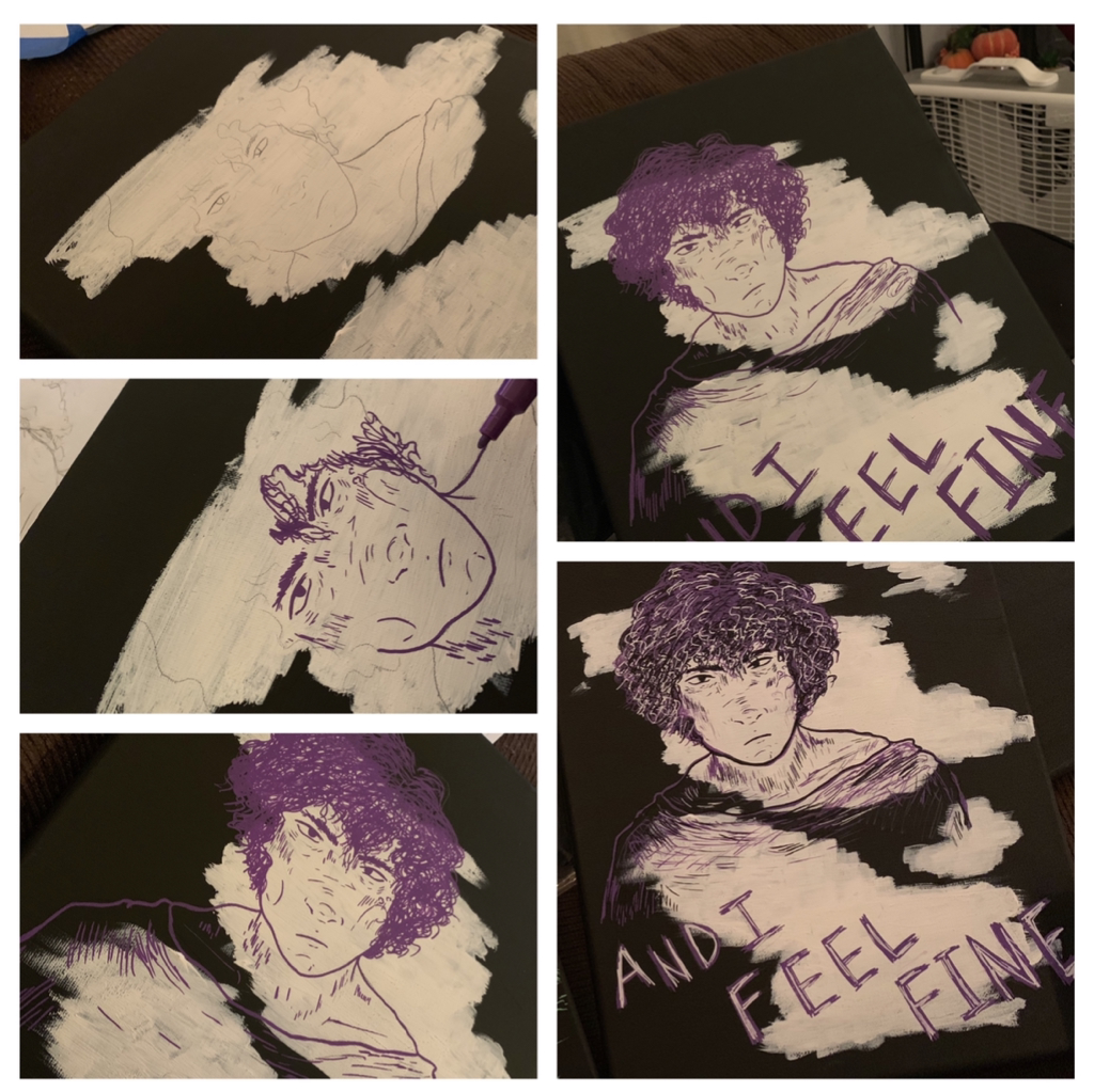
Next, after letting the canvases dry, I printed out larger copies of my planning sketches if needed and in large in them so I could use carbon copy paper and get them outlined onto canvas. These sketches already had where I put most of the line work in this piece and move in with the markers, and it would be easier to replicate what I had from my notes if I had a nice layout. I did this on all three canvases before starting, so I'd have a nice base to get certain marker colors on. This process of using carbon copy paper to outline each piece is shown clearly to the right. |
|
|
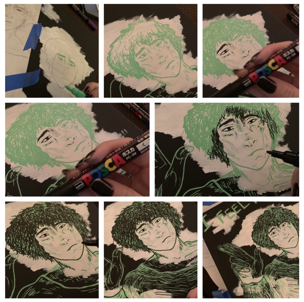
I started with the canvas that would be labeled, “I feel fine”. The message in this is to introduce Dorian, his initial feelings of this piece and how he acts normally. It’s supposed to show his uneasiness, how he’s raising a hand in false confidence and saying that he’s fine. If this was only in the peace alone, we just think that Dorian was totally fine, but when it’s fully covered with color and all the pieces are connected, then the full, realistic picture of Dorian's character is revealed, so there is a sense of unity in all of these being one series. It felt weird to only tell part of how Dorian is, since these lyrics... even being so simply said... can come together and formulate so much in someone's mind. |
|
Before moving on, I’d like to explain the color choices that I use for this part and how line work worked in the sense of peace.
|
|
|
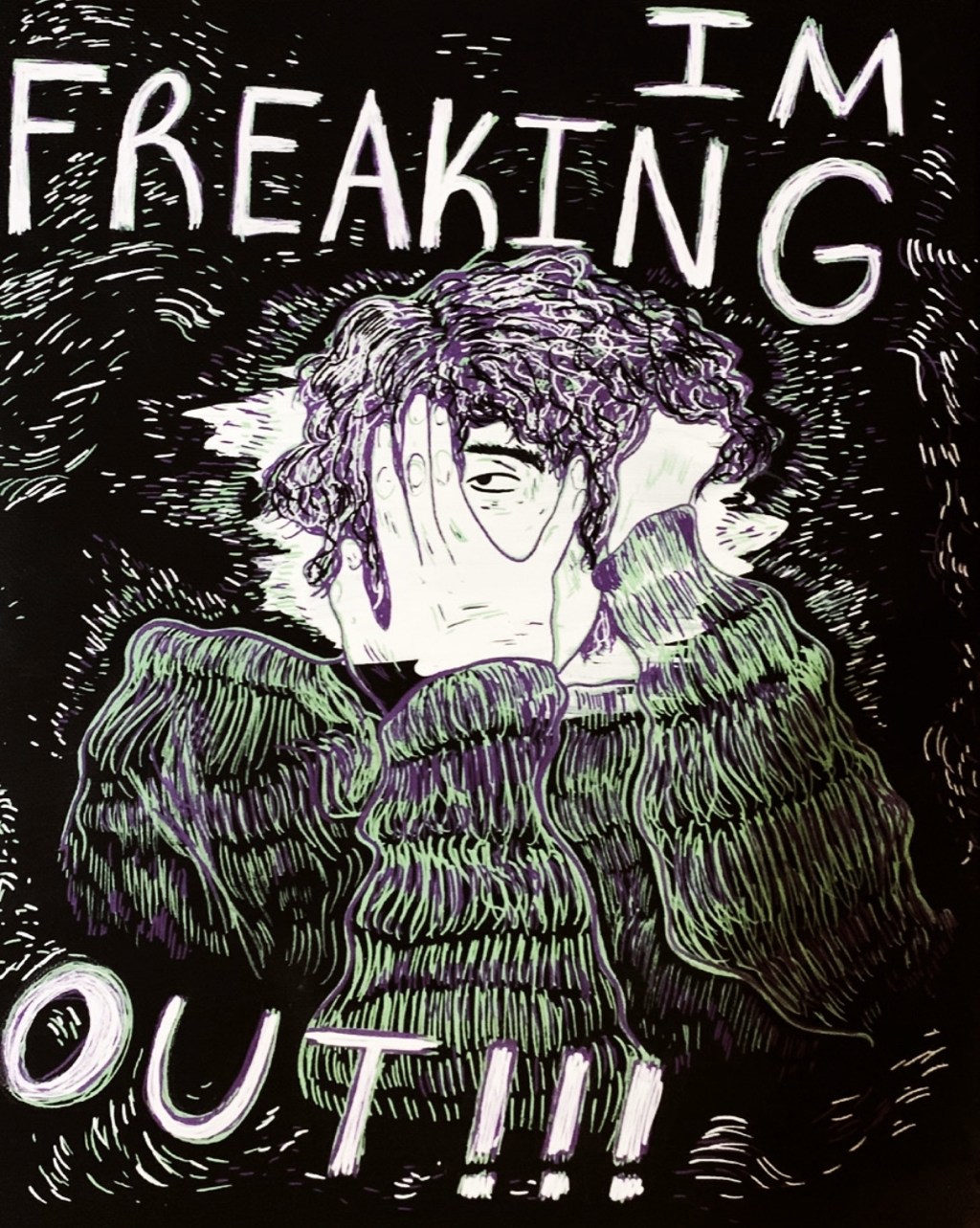
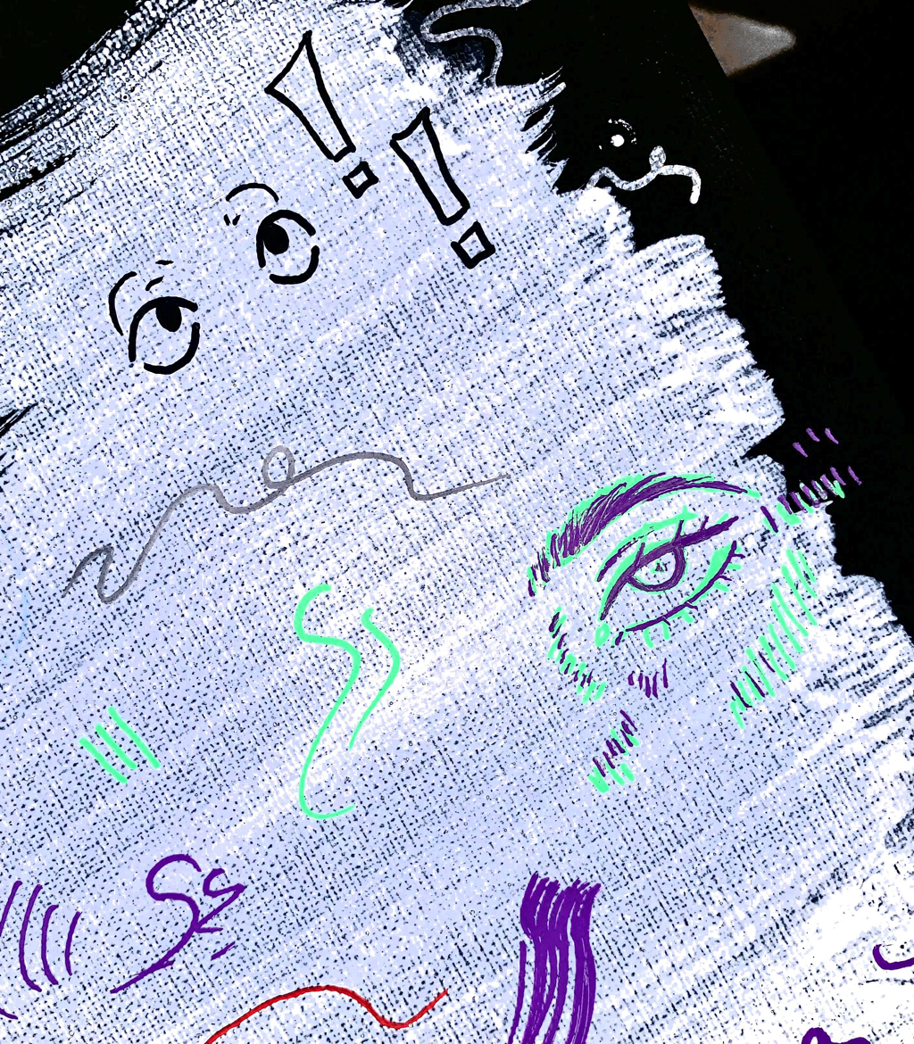
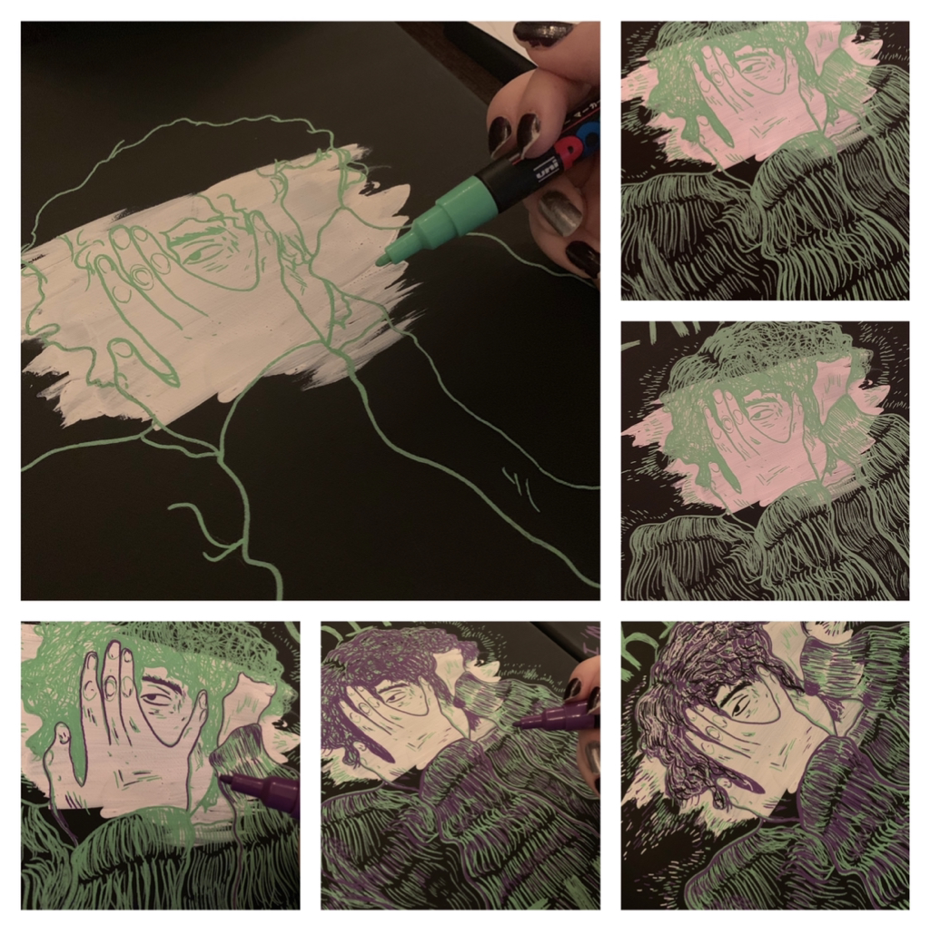
Moving onto the next canvas, this is where I’d have to use a lot of hue and line work to create a sense of insanity. Dorian’s character would be flipping back-and-forth from calm down emotions to an entirely anxious, outwardly ecstatic, personal state. Dorian Smith is totally not fine and is going through a massive emotions that are tearing him up entirely. I did this by making his hair even more unruly, incorporating colors that weren’t as purple and green, and adding more detail on his face in more things popping off of him to show that he is currently freaking out. Reflecting back to my artist inspirations, line and form were far more relevant here in production. |
|
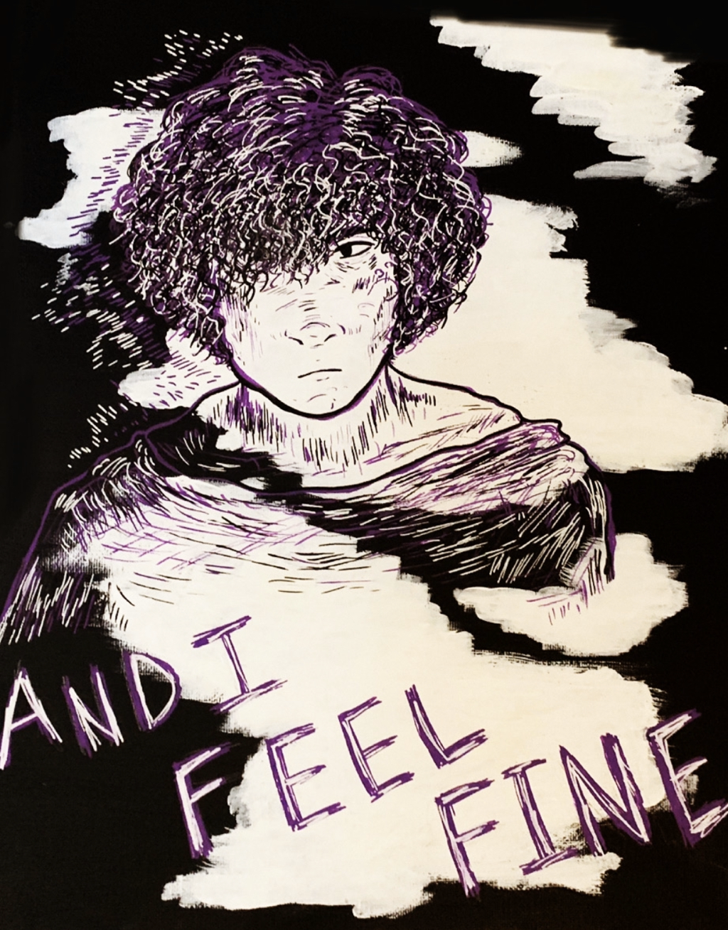
Moving on from that, I got thoroughly into my third canvas. The lyric for this piece is, "... and I feel fine" (a continuation of the lyrics that came before), which is showing how Dorian, although he’s still actively freaking out internally, is holding himself together (as best as he can) outwardly. This is just a sense of the kind of person he is and how he reacts to things in his life. Dorian Smith is just a teenager, and most of the time he has no idea what’s going on, and this is where his anxiety sparks even more vividly in life. This piece is a conclusion of the three, showing how Dorian just has to live with this over his shoulders and how this is just how he has to live now. |
|
How I ended this piece, was by laying out the three together in fixing up things with small tweaks and details. This is the part where I also chose to place the lyric choices that went along with each painting. I wanted to do this mess lineage, but with the lyrics would also fall together when looking at it as a whole. I did this carefully however. How I undid this piece, was by laying out the three together and fixing up things with small tweaks and details.
This is the part where I also chose to place the lyric choices that went along with each painting. I wrote these lyrics carefully onto each canvas, because if certain pieces of text went over others, then the entire final product would turn out less of what I wanted to be. |
|
Critique:
This next area will be comparing my piece to its original inspirations: "Flâneur", "Self Portrait: Man on Train", and "Gathering" by Holly Warburton and "Misha Jenkins" and "Study for Carvano" by Hope Gangloff. These are shown below in collage-like fashion.
For example, to the top and bottom left, we have Holly Warburton's pieces "Flâneur" and "Self Portrait: Man on Train". Then, on the middle left (up and down), there are two of Hope Gangloff's pieces.
Similarities May Include:
- There's a large amount of focus on the human figure. My final product reflects the feelings and emotions of one Dorian Smith, a personal character of mine, and some of the works included above from also use a male figure as the clear main focus for what they’re illustrating. These fall more relevant into making the human figure a focal point for modes of relevance and emphasis
- Also comparably, there's a strong use of line in both of our final results. This was something I initially wanted to incorporate in my final product from these inspirations, solving this factor in common is important in showing where inspiration was most relevant. For example, in things such as the hair (maybe look to Gangloff’s piece “Misha Jenkins”) and facial features, we both use of variations of thick and thin lines to create harmony in what the final result will look like.
- Finally, all of these pieces when relating back to mine use vibrant hue choice to emulate a sense or feeling in the viewer. Perhaps more relevant in my piece, these colors and the way they are mixed together seems to set the scene better than if I’d use, let’s say, black-and-white as a base. I would relate this back to Holly Warburton’s piece “The Gathering” because we both use colorful colors on a dark backdrop.
Differences May Include:
- When it comes to differences, my piece is of a series (three piece series) while a lot of what my inspirations did were mainly single sided pieces of work. When looking back to, say, Holly Warburton’s illustration of a man on a train ride, she did this really on the spot as a sketch. My piece however, is of a greater collection rather than just an observation I made and drew onto paper. These artists do a lot more observational stuff than I did with my piece.
- Next, my piece was of somebody who didn’t quite exist yet and who had a lot of background. Again, this could be me making assumptions about what the artist did, but their pieces didn’t really have any descriptions that told the reader what the work will be about. All I know is that my piece was of a character I’ve been writing short stories about for sometime now, and I wanted to include the lyrics of a song to do the job of telling his story in the slightest bit.
- Something very visible to the viewer, we also differ in medium choice. I ended up using Posca Markers to create my final product, while these are the other artist used digital tablets and/or paint to create the pieces shown above. This medium of choosing markers to do the job, more directly paint markers, was something I wanted to experiment with for a while, so that’s why I did that for this piece.
Reflection:
I’ve been waiting to connect my final portfolio, and the pieces we were free to do whatever with for our senior year, with the ideas and emotions of some personal characters of mine into prime light. I’m a creator who likes to tell a story. It comes natural to me to create characters, concepting backstory and looks for people that don’t exist, but who can be someone another may realistically relate to. Dorian Smith is a teenage boy who, although having the life then many would dream of and having the privileges that would make one eternally happy, is taken over by his anxiety to the point of bringing him to very low areas of self deprecation and fear. I wanted to communicate the idea of teenage anxiety, and how disorders can be severely relevant in even those who aren’t fully adults yet. All of my characters carry a bit of who I am inside them, and Dorian Smith is a prime example of my anxious side of life.
When it comes to the turnout of this piece, I was very excited to use the Posca markers I bought. Their look and style on canvas is just so riveting and a bliss to the eyes, so, for me, just working with these made me really happy even if the turnout wouldn’t be efficient.
When it comes to the turnout of this piece, I was very excited to use the Posca markers I bought. Their look and style on canvas is just so riveting and a bliss to the eyes, so, for me, just working with these made me really happy even if the turnout wouldn’t be efficient.
Connecting to the ACT:
1.) Clearly explain how you are able to identify the cause-effect relationships between your inspiration and its effect upon your artwork:
My artists of inspiration were both Hope Gangloff and Holly Warburton. They make illustrations and paintings that depict certain feelings, locations, or people in them through unique choices of line and hue vibrancy. I tried to do the same in my series, especially in line work to create a sort of “anxiety-ridden” feeling with my character in focus.
2.) What is the overall approach ( point of view ) the author ( from your research ) has regarding the topic of your inspiration?
Anxiety can come in all sorts of people, especially in teenagers who don’t know how to deal with their feelings yet. Some just live with it and try and ignore the sense.
3.) What kind of generalizations and conclusions have you discovered about people, ideas, cultures, etc. while you researched your inspiration?
Posca markers are a very interesting medium. I quite liked the thick, paint-like way that they could go on any material. They looked really pretty too, the way they shine when placed on any background is just amazing, and I want to use them more in the future.
4.) What was the central idea or theme around your inspirational research?
Anxiety is something that anyone can deal with, but for others it’s what drives them in life and sometimes living with this sense of panic seems easier than making it disappear.
5.) What kind of inferences ( conclusions reached on the basis of evidence and reasoning ) did you make while reading your research?
Line can do so much for creating a piece. Depending on how thick or thin you make lines, and the color choices that you do it with, there can be a sense of unity in what a piece might turn out to be like.
CITATIONS ( DONE IN MLA FORMAT )
“Holly Warburton.” Illustration, https://hollywarbs.com/work.
“Hope Gangloff.” Hope Gangloff, https://hope-gangloff.com/.
“The Wrecks - Freaking Out (Official Audio).” YouTube, 21 June 2019, https://youtu.be/V8QcQgz0cjM.
“Hope Gangloff.” Hope Gangloff, https://hope-gangloff.com/.
“The Wrecks - Freaking Out (Official Audio).” YouTube, 21 June 2019, https://youtu.be/V8QcQgz0cjM.
