n a m e o f a r t p i e c e : g r o w i n g p a i n s

|
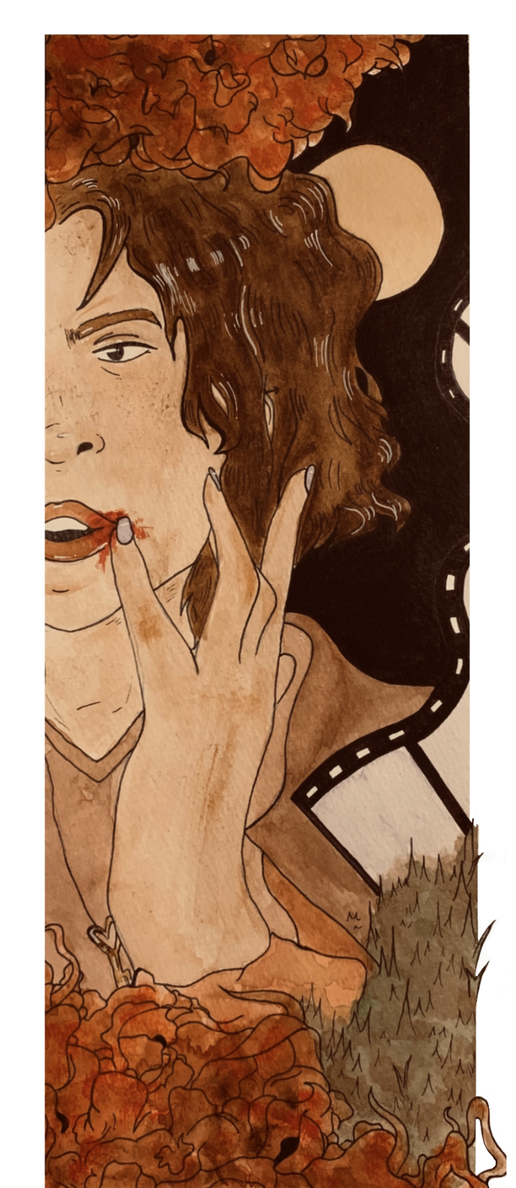
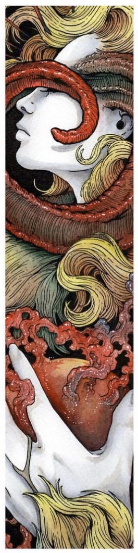
Title: Growing Pains Size: 14.5 x 6 inches Medium: Illustration w/ Watercolor Paints & Marker Completion: November 2019 Exhibition Text:Resurfacing qualities of our childhood self and seeing how, even as we've grown, that we still carry them with us, my piece "Growing Pains" is a two-part watercolor illustration inspired by Instagram artist Crap Panther's style of illustrating and artist Norman Rockwell's replication of human emotions and moments through pose and choice of motion.
The piece explores this idea through a character of mine, Melanie Baker, and demonstrates her instilled link to an alike clumsiness that her childhood self had. |
|
Inspirations:
|
Artist In Focus: Norman Rockwell
Norman Percevel Rockwell is an American illustrator famous for his painting series illustrations that are usually produced of human society and culture. His pieces depict a realistic perspective of real life situations, creating illustrations using value variety in color and contrasting shapes to formulate certain atmospheres onto canvas, and the work he does is very inspiring... at least to me, of course. I take note of his ability to replicate certain emotions out of nothing, and how he can use realism as an asset to enhance emotion and mode of feeling in |
|
the work. He uses unity in actual people and surrounding atmospheric sentences to almost create a story in each of his illustrations. I've also loved the power of storytelling in art; anything that contains a much larger meaning or incorporates unique features to make a deeper connection with the subject material... it's what I wish to do in my work.
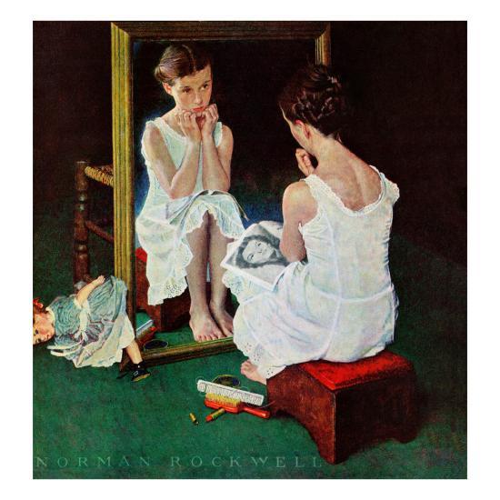
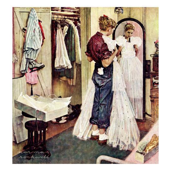
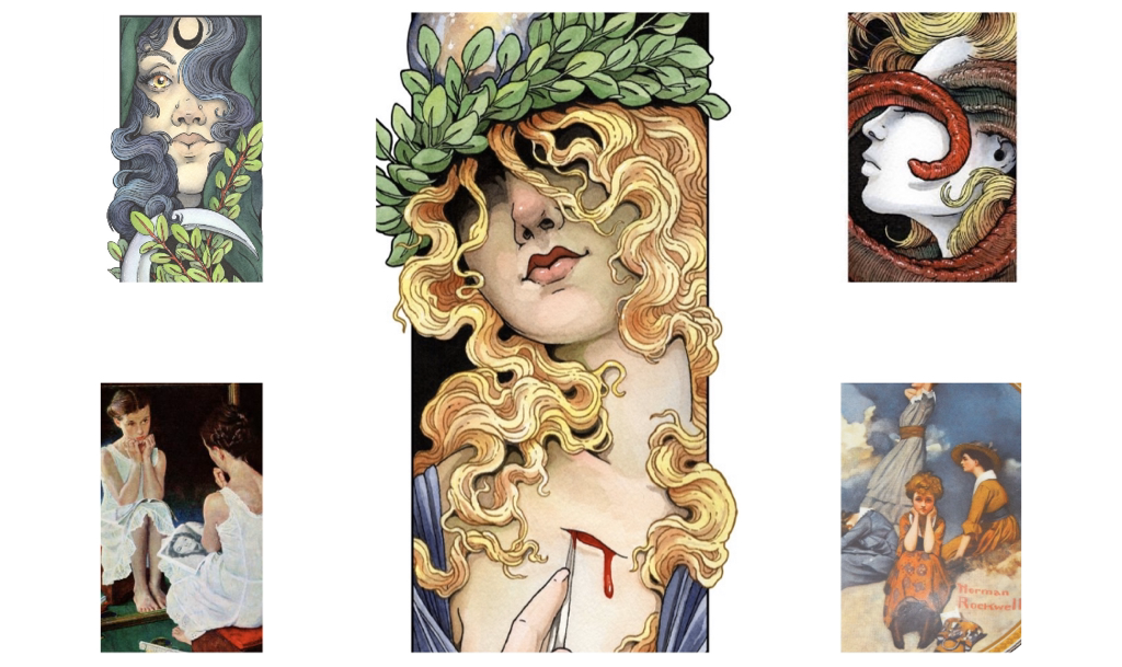
Above, to the right, I have two inspiration examples of Norman Rockwell's Work: "Girl At Mirror" (to the left) and "Prom Dress" (to the right)
|
I've decided on Norman Rockwell as a main source of inspiration, and these specific pieces of his, because of the very human emotions and style of curiosity/internal contemplating that they hold.
Although the medium I will be using is different than what Rockwell used for his painting illustrations, I included him as a starting point for me because of the human-like aura induced pieces, like those to the side of this, have. They represent characters and emotions captured in real time, and I want to always look back to Rockwell when doing illustrations like this. |
|
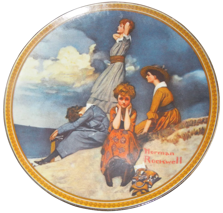
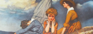
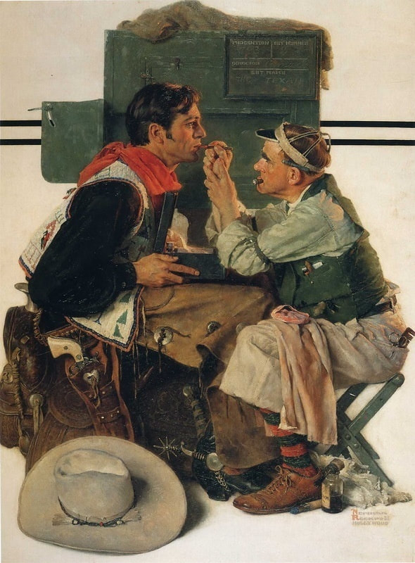
Above I have two more inspiration examples of Norman Rockwell's Work: "Waiting on the Shore" (to the left) and "Gary Cooper as the Texan" (to the right)
|
|
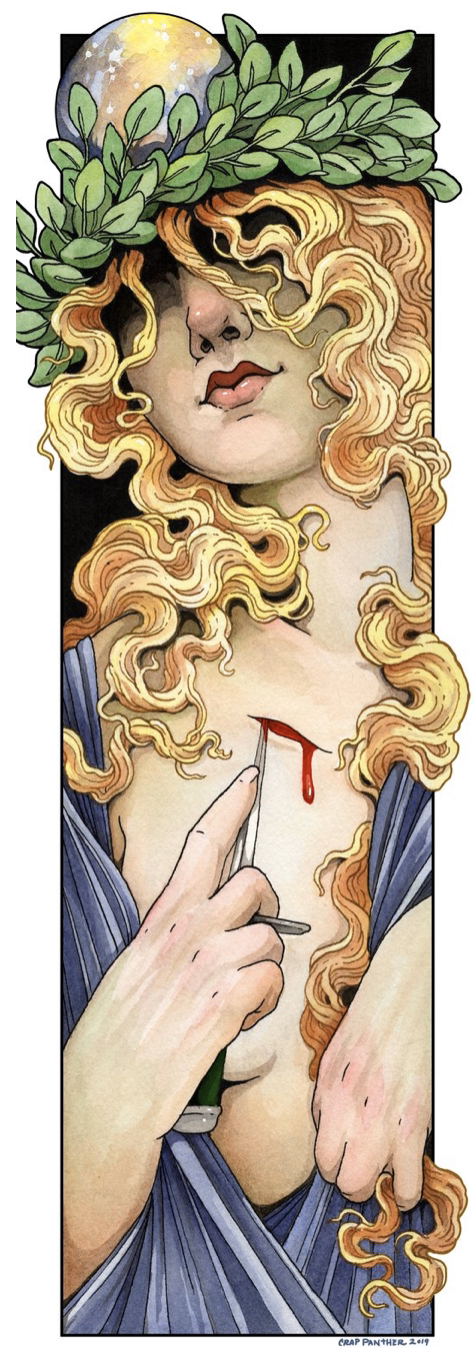
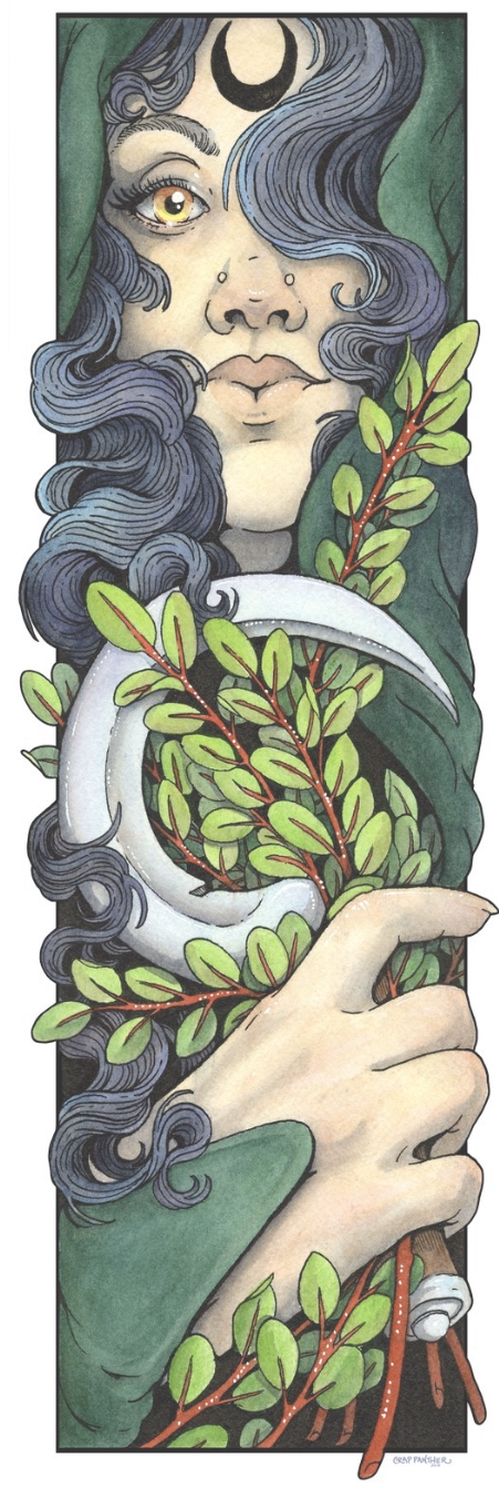
Artist In Focus: "Crap Panther" (pen name) Crap Panther, otherwise known broadly on the social platform Instagram as @crap_panther (check out her print site), is a self-taught female illustrator I've recently come across by accident. She mostly works in ink and watercolor mediums which is what I'm going to take on with my piece "Growing Pains", so I looked into her technique as a guide towards mine. I quite like the color choices, and the style of creating a portrait illustration that stretches in length, limiting width, while other details break that border. It's just... seriously incredible. Her line work in ink is admirable, and ultimately the choice of value that compliments the form for each of her pieces is invigoratingly beautiful. |
|
Planning for the Final Product:
|
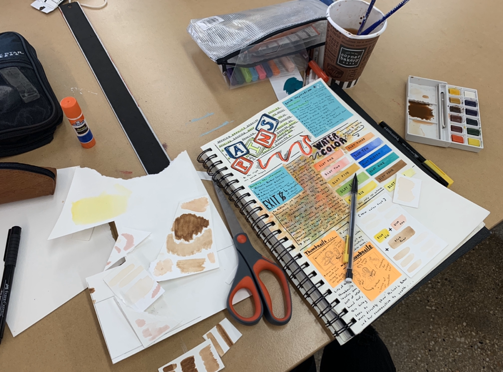
To the right involves a combination of both Experimentation with the medium at hand, and my pathway towards achievement for this specific illustration series. Purchasing new watercolor paints and even watercolor-based markers, I wanted to see how this could create a sort of aesthetic in my work through hue variation and value.
|
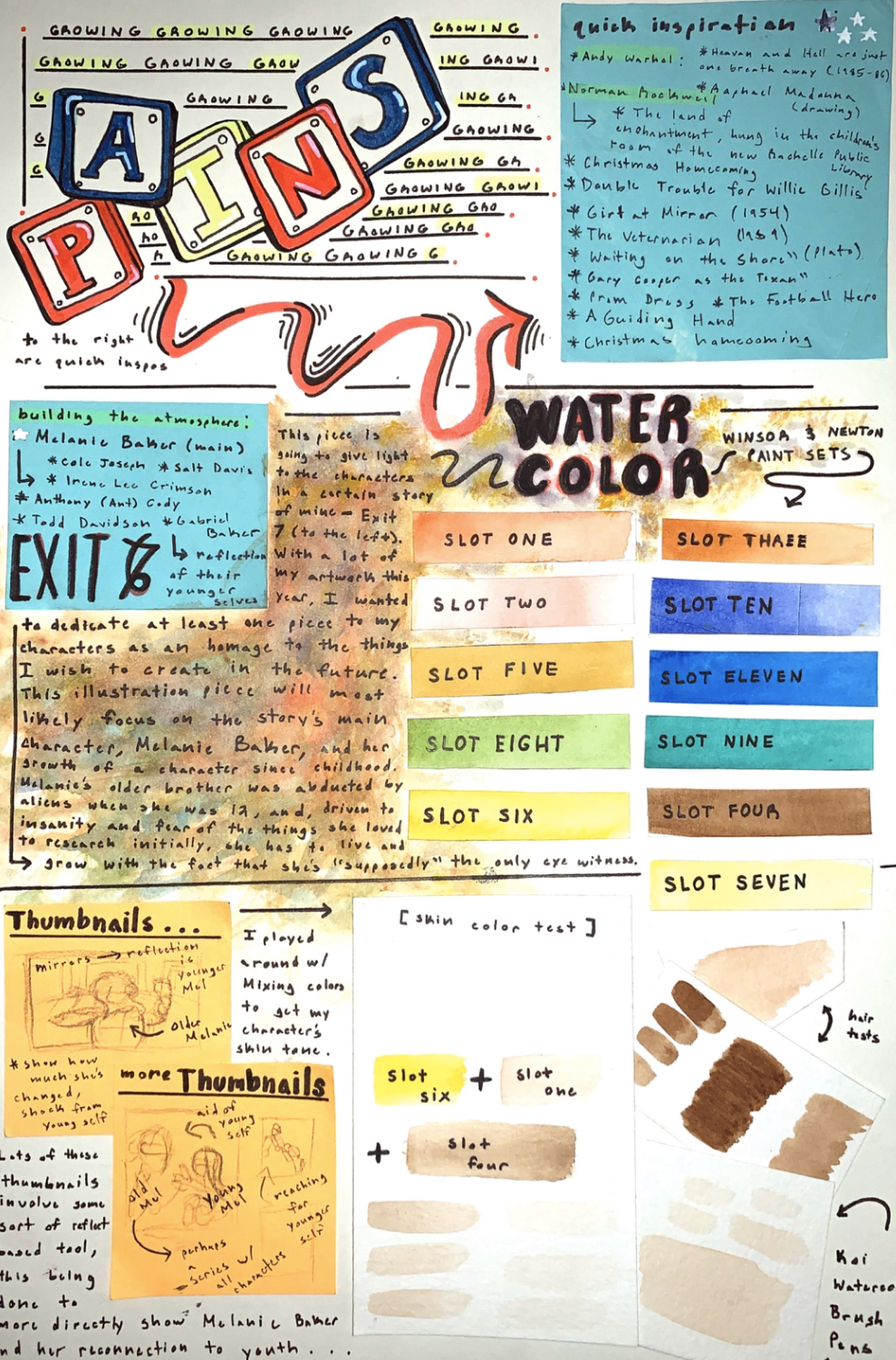
Journal/Planning Page 1
|
Journal/Planning Page 2
|
Closeups of the drawings above...
|
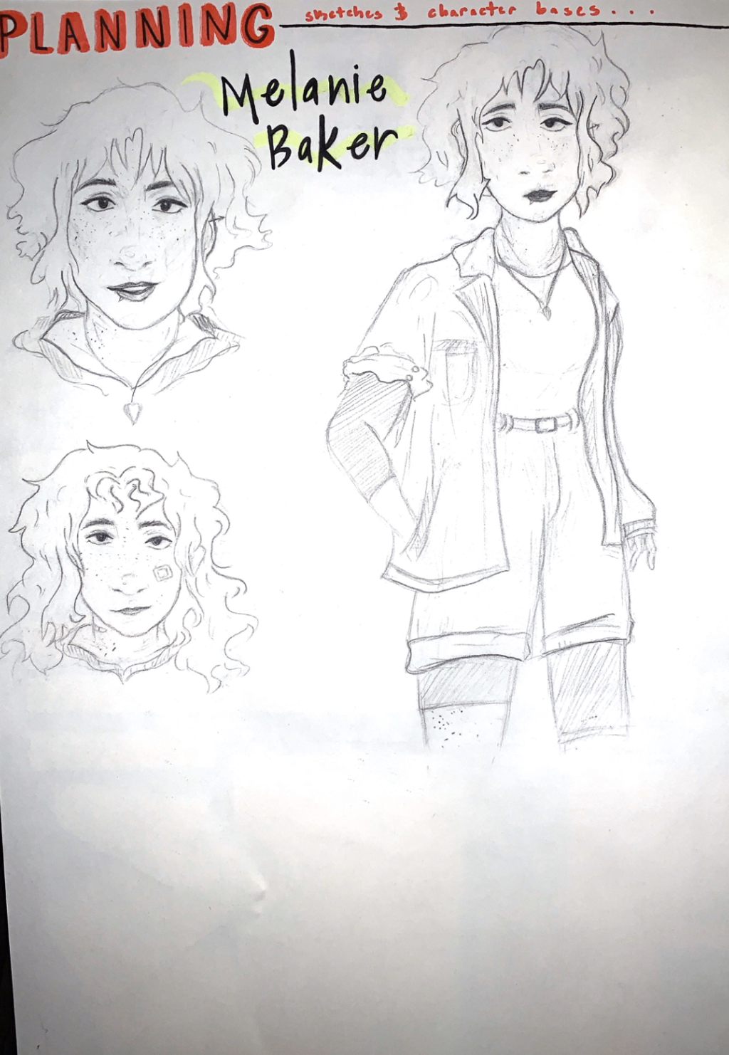
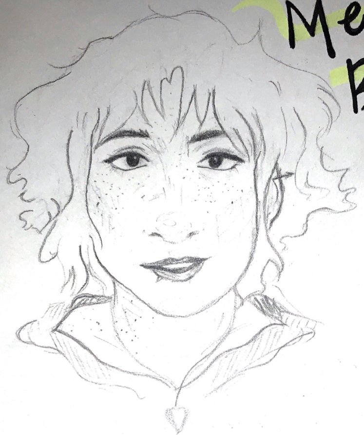
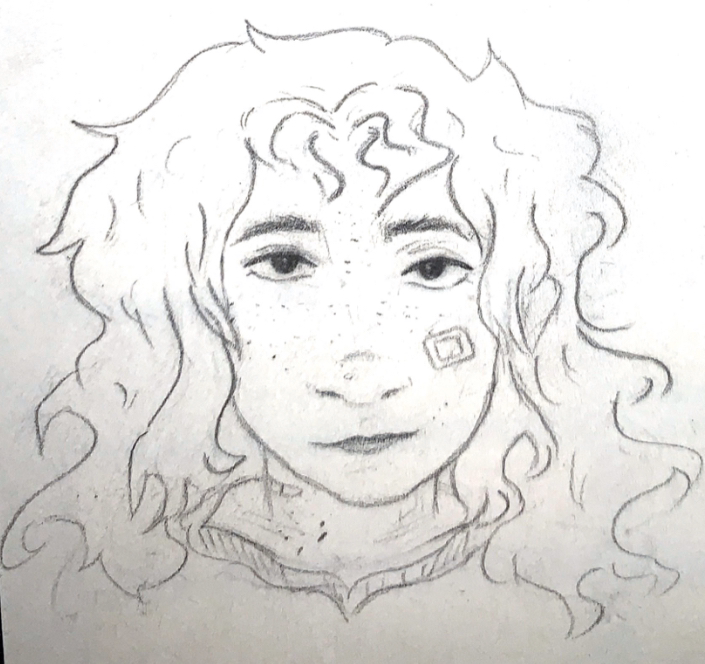
Above, and even around here, you can also catch a glimpse at character design for Melanie Baker (both younger and older). She is a character I've had attached to my mind since around the fourth grade. yet, as time moves on, characters like these alter in appearance and story line, even if the name sticks. That being said, personal development and the change one can have from childhood into near adulthood is something I felt her character could significantly replicate in a piece like this.
Here's some context to her story, Exit 7: Melanie Baker is a 16 year old girl who had her life turned on its head when she witnessed the supernatural abduction of her older brother, quite frankly her biggest support system, Gabriel Baker, at only the age of 12. Resulting from such trauma, as she has always been interested in the paranormal (even to the point of following local news reports of "alien" activity with her childhood friend group) and the fact that no one believes her (not even said friends), Melanie is forced to erase her youthful tendencies and urge to find out the truth to grow as a person. However, Melanie must confront her past when a man named Todd Davidson asks of her assistance to find Anthony Cody, this character's best friend, who is also a childhood acquaintance of Melanie's who hated her... but even more significantly, was a large part of the friend group that split apart because of her older brother's |
disappearance. She must put aside the drama and personal fears of getting back together her childhood friend group in order to save Anthony Cody, but, in that, Melanie must also learn the truth in how ignoring confrontation to problems and youth was not only damaging to herself, but to the people she was closely involved with.
This 2 part illustration series wants to narrow in on the significance of personal change in both the present and future version of one's self, but, by Melanie experiencing damage to her body in both the younger illustration and older, it shows that some things just aren't altered because of time. We all come from somewhere; our younger selves may carry a different aura than our older self, but there will always be instances, for Melanie is could be her clumsiness, where who we used to be still shows in our reflection to the world.
This 2 part illustration series wants to narrow in on the significance of personal change in both the present and future version of one's self, but, by Melanie experiencing damage to her body in both the younger illustration and older, it shows that some things just aren't altered because of time. We all come from somewhere; our younger selves may carry a different aura than our older self, but there will always be instances, for Melanie is could be her clumsiness, where who we used to be still shows in our reflection to the world.
Again, per usual, I explore my planning also in Experimentation. This is all shown below, and can be seen reflected above.
Experimentation:
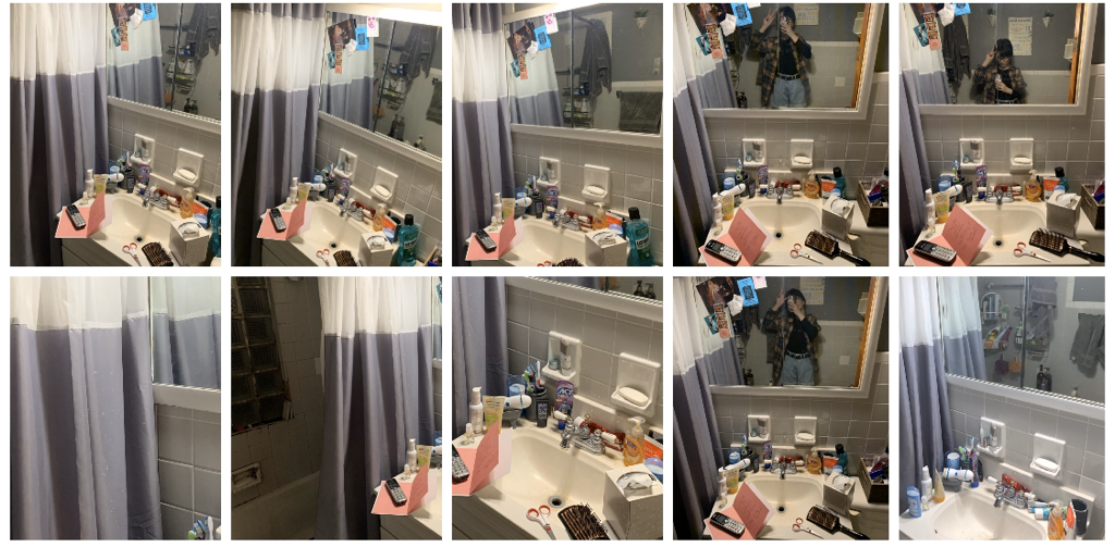
As said above, my initial ideas for figuring out how this piece would look changed more drastically as I got into the final product. Below, starting to the very left, I photographed my bathroom quite a bit (even setting up props and so forth to really set the scene) to get together a room for Melanie's character to ultimately look into the mirror and see her younger self. This idea ended up sticking in the air, however, as I really wanted to find a way for Melanie's expression to be seen in the mirror while her younger self had an alike attention to detail... the problem that surfaced here would be older Melanie's face being blocked by stance of mirror, so I scrapped it.
|
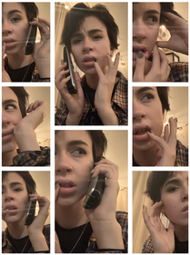
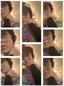
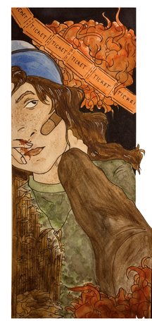
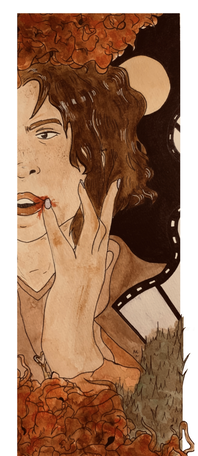
Moving forward from that, I decided on reflecting further off of my original inspiration, Norman Rockwell, into the work of Crap Panther and her style of making prints. I quite enjoyed the limit to only some parts of the face and body, the way arms could fall in and out of frame, and wanted to have my own try at this for the piece. I would be creating two tall illustrations, one with Melanie Baker significantly older in age (told by face shape, hairstyle, makeup, etc), and then another of her younger self (her wearing her brother's baseball cap, long hair, more face marks, etc). Photos taken for reference of this idea are shown:
|
|
Now better understanding my plan for this piece, I produced a series of reference images with both in-character clothing styles of Melanie (old and young), but with poses as the ready to show injury even with growth. To the left, you can see me play around with my hands to emit some sort of feeling or energy... my aim for this pose is to have Melanie struck with possibly a bloody lip or some sort of hand scar. To the right, younger Melanie will have band-aids over her face to signify clumsiness; my aim here is possibly for a bloody nose to be more apparent or for here face just to be damaged a bit... some sort of accident is present in the shot for both. It's significance again will be to show how, even as Melanie has aged, she is still not prone to injury.
|
|
Experimentation with Medium: Tool(s)
I recently purchased a new set of watercolors and watercolor markers to try out, as this will be the medium I'll be using.
I recently purchased a new set of watercolors and watercolor markers to try out, as this will be the medium I'll be using.
|
My last watercolor project didn't go as planned, perhaps blame it on the unfamiliarity with tools, but I wanted to tackle things this time with better quality products. I've always practiced mixing and blending colors on watercolor paper, so going into this project doesn't seem as foreign to me.
To the left, you can see my test with watercolors and watercolor markers. The brand I will be using for watercolors is the Winsor & Newton set of 14, and then the watercolor brush brand is called Sakura Koi. I previously watched a few youtubers review these products before purchase, and, throughout this entire process, I'll be carefully mixing and putting watercolor onto paper with ease rather than in a rushing sense. |
|
Process:
|
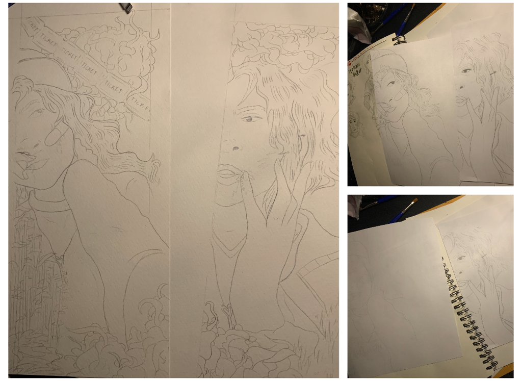
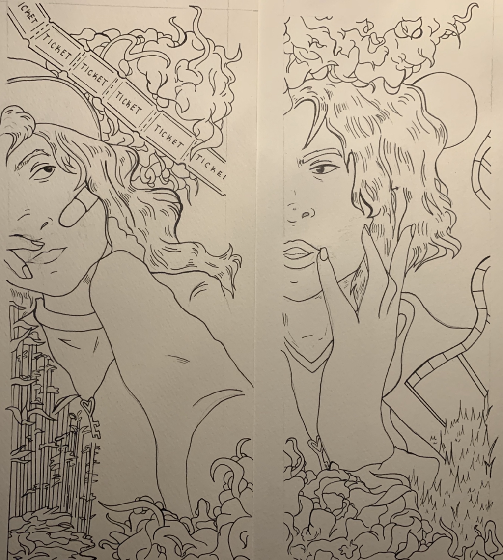
My first step was to reflect on my inspiration and draw out two bases, one of younger Melanie Baker and one of her older. Looking to the right you can see the farther left sketch being a younger Melanie, baseball cap and band aids, and the right is of older Melanie, more makeup and much larger face structure. They will both have an instance of injury to their form as well, a reference to the piece being named "Growing Pains". Younger Melanie will have a bloody nose while the older version will have a bloodied up lip. This is to demonstrate gradual age change with the alike clumsiness to personal damage of body, |
|
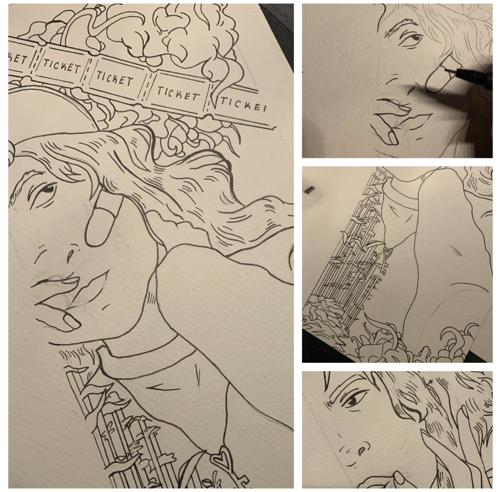
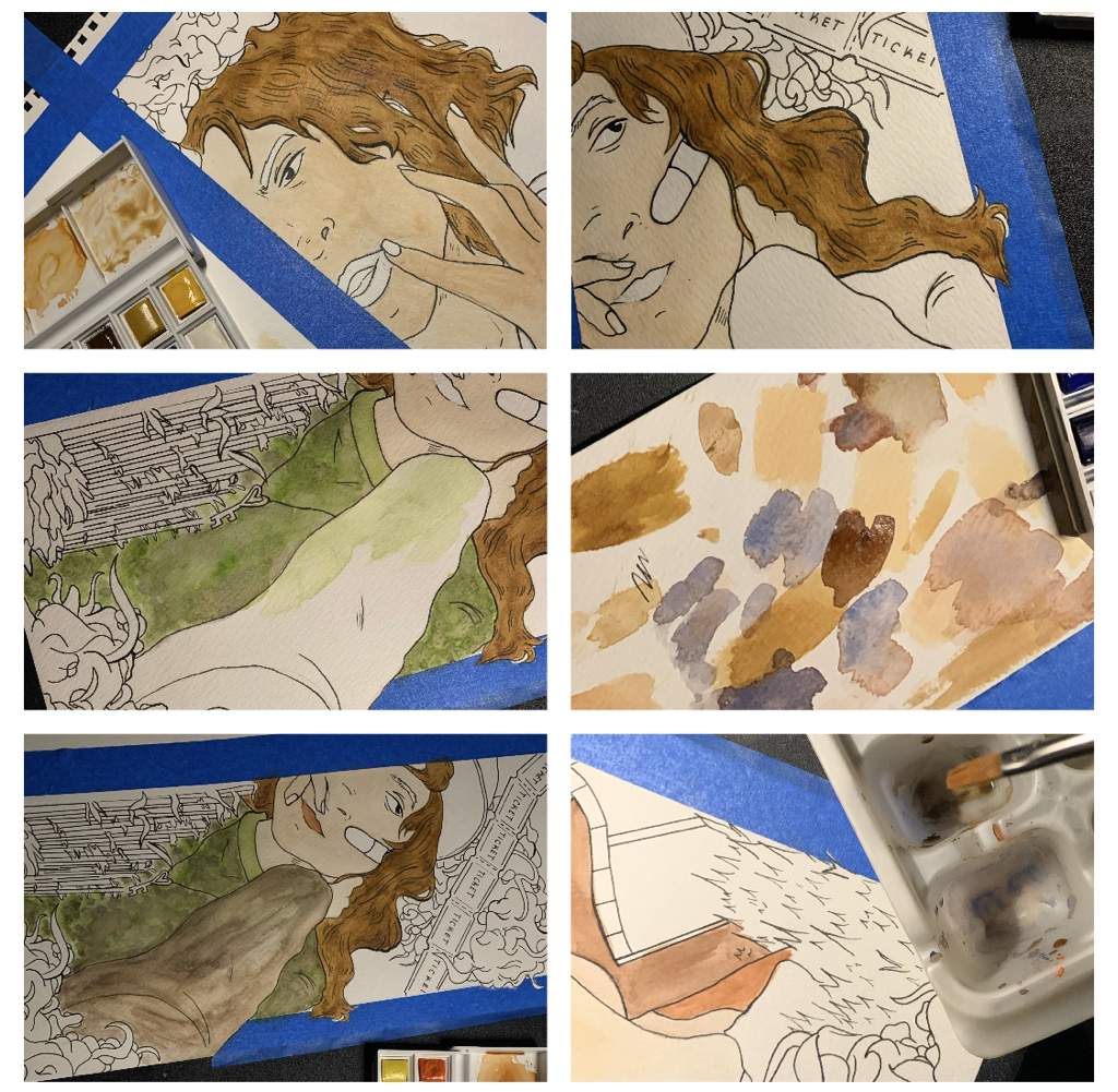
To the right and left of this text is the line art produced, using a Faber-Castell (Black) Artist Pen, for these two illustrations. I researched local watercolor artists and the way they fill in color in relation to both pencil and pen, and, since I did the last project by overlaying watercolor paint on pencil (and this turned out very runny, as the pencil was a bad mix with the watercolor), I wanted to see how marker would work (after a day of drying) with watercolor on top of it. |
|
That being said, I cut out watercolor paper at a size of 8x4, a lot like the style of Crap Panther's illustration pieces, carefully portioned out a sector for the sketches I previously made to put over, used carbon copy paper and transferred the design carefully. With this done, I could move in with ease and a quickness to carefully outline every important portion of the illustration. I played around with the power of line, using thicker or thin on certain areas, and also with unity in the way that things were sorted on each piece.
|
My first objective for watercolor was to mix colors with the objective to create a peach-like, soft non-blush prone skin color for Melanie. In her character bio I define her as someone who has something a lot like a warm ivory, maybe even a beige, but her skin liters in freckles and scratches. Laying would be important to consider for the skin factor of this piece...
|
|
|
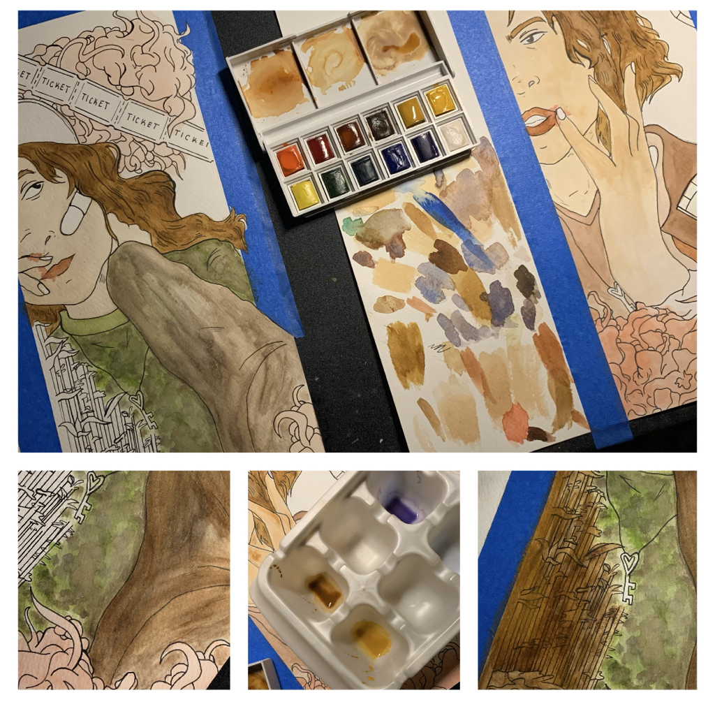
The watercolor painting process, at least for me as I experiment on and off, really jumped all over. As shown to the right, I led into filling in the lips with this lush, rose-like pale color (this was done because I had accidentally mixed a pinkish hue in experimentation and I liked it enough to the point of inserting it into my figure's lips. I made sure they were alike colors, as to show the similarity of Melanie's younger and older self.
|
|
Moving on from this, I used browns, types of crimson, and variations of all types of colors to create this organ like blobs. This was done to compliment the things that my artistic inspiration, Crap panther, does in her piece, and I thought that it'd be cool to incorporate a bit of horror to reference the scary aspect of my story. Later on, I'd use the strength in line variety to make the blobs |
|
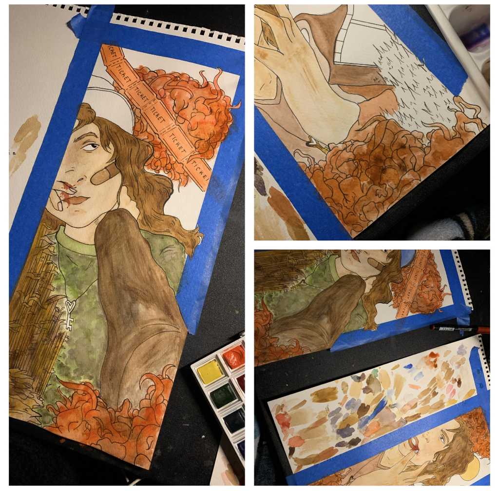
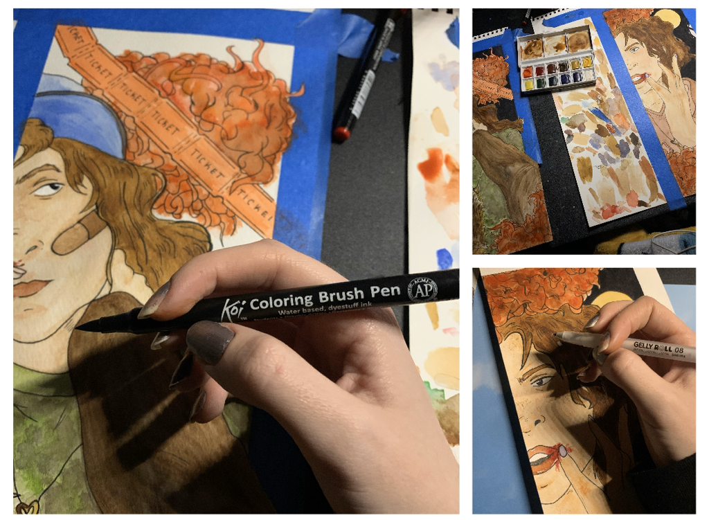
look even creepier to the common viewer. I thought I'd be cool to use a stylistic choice I had also used in my Silhouette Storytelling piece Loosen Up! Moving away from that, I tried to finish up on some small details like painting the tickets, the grass on the older Melanie piece, and then I completed the process my inking out the background to be all black. I had a discussion with a few of my family members on the stylistic choice of incorporating a darker background, a black hue, and we all agreed so I did so. After that, I moved in with a Gelly Roll white pen and outlined some small details on both human figures on the shot.
Critique:
This next area will be comparing my pieces to their original inspirations: Norman Rockwell and Crap Panther.
Below I am reflecting the following pieces to my final product: Norman Rockwell with "Waiting on the shore" and "Girl at mirror" and then Crap Panther with her Zodiac Prints.
|
Similarities May Include:
- The human body is a large factor of the entirety of the piece. A lot like the art pieces chosen from both Rockwell and Crap Panther, I wanted to focus on the human form... a close up of the human form... and use it as something that would have emphasis put on it.
- I, and both of the artists I used for inspiration, have pieces that fall on the more feminine side of things. This is prevalent in the hair variation, the play with makeup and lipsticks, and even into how the hands are displayed onto paper. It was good that I achieved a more feminine look, as I am disclosing a more feminine character of mine. |
- Crap Panther and I both have pieces that hold a very slim, tall lay out to them. I quite liked the idea of making an illustration with a length significantly longer than the width. It may limit the viewers details of what a full piece would naturally had, but the limitation again puts a strong emphasis on the main figure in focus and the elements that surround it.
|
Differences May Include:
- My art piece significantly differs than that of Rockwell's work. Rockwell was an initial artist I found when trying to construct a piece with this concept, so when I found Crap Panther and her unique artistry, my ideas altered a lot more. Rockwell and I may use the human figure enormously to set the mood of our piece, but the entire aura of our pieces differ greatly.
- My piece explores teen-related problems and discusses more in depth the idea of change with age. In their work, the pieces usually don't try to tackle such a deep meaning as mine does. Rockwell is known for life-like illustrations that don't usually hold characters that have immense backstory, and Crap Panther's illustration series is of the Zodiac signs and breaking those down. Mine differs in mindset; there's a lot of different initial thought going into each of our pieces. - I feel as though my piece, especially when being one |
|
that is compared to the works of Rockwell and Crap Panther, holds a more cartoon, almost animated look to it. My personal art style is something I've been constantly trying to develop and transform over years. As for now, the figures and style of which I use for many personal art pieces like this shows as follows. I want to head into a future of illustration where this style can stretch out even farther, maybe to even fall more complimentary to the artists I used as inspiration above.
Reflection:
I haven’t been this excited to create project like this in some time. I feel like creating art based on personal characters you’ve practically carried along with you all your life is one of the best feelings. This piece, illustrating my stories onto paper… it’s something I wish to do into my college and career life, so this was a good process to go through. My favorite part of these pieces as a whole go in Melanie’s figure, I quite like how they ended up looking like a younger and older version of each other, and seeing them side by side just makes me really happy. If I’d change anything, I’d actually make the piece a lot other than it is. Perhaps I’d get more space to add imagery and so forth, but I feel like it still looks cool the way it is.
My piece explores the idea of personal change and growth, how, even into adulthood, we carry a batch of qualities with us. For Melanie Baker's character, although she has chosen to zone out her childhood life, the clumsiness she held at a young age still digs its way into her life. This message is thrown by the similar positioning of younger and older Melanie; Younger Melanie has a bloody nose while her older counterpart has a bloody lip. I felt that recognizing where we came from, acknowledging the person we used to be, is something that should be valued to greater importance.
My piece explores the idea of personal change and growth, how, even into adulthood, we carry a batch of qualities with us. For Melanie Baker's character, although she has chosen to zone out her childhood life, the clumsiness she held at a young age still digs its way into her life. This message is thrown by the similar positioning of younger and older Melanie; Younger Melanie has a bloody nose while her older counterpart has a bloody lip. I felt that recognizing where we came from, acknowledging the person we used to be, is something that should be valued to greater importance.
Connecting to the ACT:
1.) Clearly explain how you are able to identify the cause-effect relationships between your inspiration and its effect upon your artwork:
Of the illustrators, both Norman Rockwell and Crap Panther, that I used for inspiration, I tried to focus in on the uniqueness of the human form and in color variation to really define an art piece. I wanted to make something characteristically interesting enough, like Rockwell's work in building character in those in focus, and in beauty, something a lot like Crap Panther's illustrations.
2.) What is the overall approach ( point of view ) the author ( from your research ) has regarding the topic of your inspiration?
Focusing on the human form and playing around with the features and posing of a human can really redefine the aura of a piece.
3.) What kind of generalizations and conclusions have you discovered about people, ideas, cultures, etc. while you researched your inspiration?
Positioning and style of illustration, even with the medium in which an illustration can be done in, can really capture a certain feeling and/or emotion into reality.
4.) What was the central idea or theme around your inspirational research?
Growth, change from childhood to adulthood of one self.
5.) What kind of inferences ( conclusions reached on the basis of evidence and reasoning ) did you make while reading your research?
We all come from somewhere; our younger self may carry a different aura than our older self, but there will always be instances where who we used to be still shows in our reflection to the world.
CITATIONS ( DONE IN MLA FORMAT )
Girl at Mirror, http://www.nrm.org/MT/text/GirlMirror.html.
“‘Prom Dress’, March 19,1949 Giclee Print by Norman Rockwell.” Art.com, https://www.art.com/products/p9388040462-sa-i5447040/norman-rockwell-prom-dress-march-19-1949.htm.
“Shop.” Crap Panther, https://www.crappanther.com/shop.
“Waiting on the Shore by Norman Rockwell, Edwin M Knowles Collector Plate.” Ruby Lane, https://www.rubylane.com/item/1393517-RL-00088/x22Waiting-Shorex22-Norman-Rockwell-Edwin-M.
