Artwork: Imag(e)ine
|
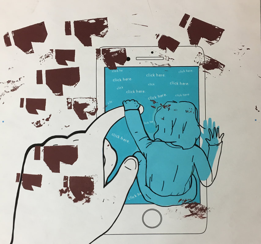
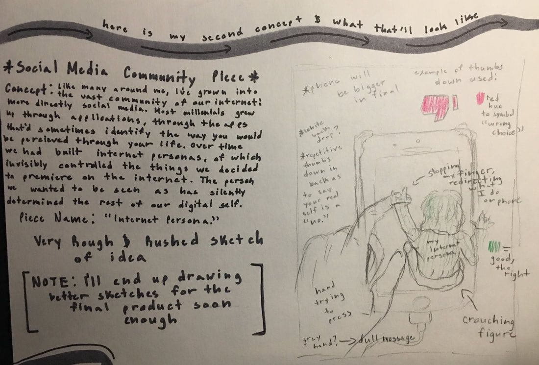
Title: "Internet Persona"
Size: 91.44cm x 91.44cm ( 36in x 36in ) Medium: Silk Screen Printing Completion: October 2018 |
Exhibition Text:
"Internet Persona", a piece inspired by the futuristic symbolism incorporated in works by artist Harry Campbell, is a Silk Screen printed piece that explores one portion of the Teen Community, Social Media. Every user of social media has gradually created an invisible internet "persona" that silently decides how we express ourselves online. This is especially inclusive for teenagers of this generation who live and breathe the power of technology, and my piece links into that concept.
[ The Teen Community - Social Media Community ]
Both of my pieces all draw back to the original concept of the world's, more directly my world point of view's, Teen Community. I dig into the first two concepts that hit me most when being a teenager: The Social Media Community and The IB Education Community.
A common chain amongst most teens can be recognizable the moment you approach them. Electronics. Whether it's for leisure or socializing, the majority of teenage culture grip their phone like a life line.
A study done by the Pew Research Center found that 60% of teens they spoke to, around the ages from a low 13 to 17, admit that they're even becoming the slightest bit concerned on all the time they spend online. That being said, everything a teen approaches on the internet suddenly becomes that more real than it ever would've stood normally. Being mobile is a common occurrence, being in the new is what teens usually draw more into, and it's hard to break away from that silent addiction if further use is taken. According to a research group named Common Sense Media, teenagers spend just about an average of 9 hours on social media networking a day.
With news like that, my piece becomes an even bigger portion of what makes up The Teen Community.
Inspiration:
These four art pieces are by the artist Harry Campbell. These are involved in his portfolio, found on his official art website, yet that don't have names for the pieces. Click on the images to get a closer look!
“Harry Campbell.” Harry Campbell, www.harrycampbell.net/.
|
Artist In Focus: Harry Campbell
Campbell is a modern day artist that uses an illustrative and futuristic symbolism to really bring a piece together, perhaps linking it more into an overall deeper meaning. The four pieces to the right are some of the many pieces of his work that inspired me the most while creating both of my pieces. Since I've decided to dwell into the community of Teens, this being more into the Social Media Community for this piece, Campbell seemed like a good inspiration. He's good at using symbols and colors in a way that conducts a message well enough while pulling in an audience to analyze his work. I adore the art style, it immediately caught my attention, so in my pieces I will try to use the simplistic hues while drawing things with a delicacy.
I'm working with the Teen Community as my focus where things can get overwhelming and intense so having a fragile and "alone" style to my work will be better for the messages I'm displaying. Teens are put on the spot everyday, say through social media or even by the school related responsibilities they're give, so every intricate detail should feel "on the edge" or "fragile". I want to change the background of both of my pieces to white, a straight connection to his work, so the message delivers more clearly. |

Planning:
Sketch/Journal Page 1.
Sketch/Journal Page 3.
|
Sketch/Journal Page 2.
Sketch/Journal Page 4.
Take a closer look at the planning sketch that ended up turning into what is now my "Internet Persona" Silk Screen Printing piece. Click on the photo to the left!
|
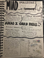
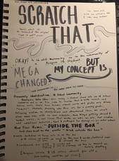
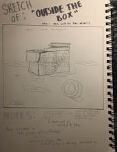
Planning Sketches & NotesFor my "Internet Persona" piece and my other MIAD piece "Outside The Box", there were three planning sketches produced for the final product. You can see the first at the bottom right of Sketch/Journal Page 1, another at the top right of Sketch/Journal Page 2, and then the last sketch has it's own page on Sketch/Journal Page 4.
Both pieces had a combination of three planning sketches. This was because of how, when I initially started planning, I focused on one solid piece, thus creating three sketches for it. However, two of the three became ones I quite liked, so they were used in the development of my final product.
The MIAD project demanded two final pieces, so two of the three planning sketches did end up being my final product.
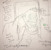
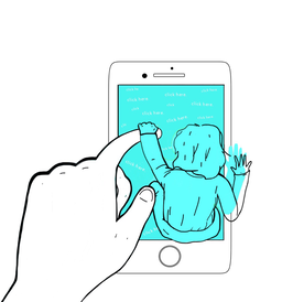
The first sketch, located at the bottom right of Sketch/Journal Page 1, was my original sketch concept. Although it was focused more towards the IB Community, it ended up being scraped because of different ideas. This being planning sketch 1 and planning sketch 2 instead. You can really see the beginning plan of my final result in the 2nd Sketch/Journal Page. To start off, I drew a cellphone as the main base of this piece over a blank background. The blank background, as used in both of my final pieces, was there to symbolize how alone some teenagers feel growing up. In a way, they're surrounded by confusion and misunderstandings and so forth; I'd see this like being in the middle of a blank space thus the white background usage. By the phone, a put a human hand to represent "us". This hand originally would be colored red, but ideas re-developed themselves while I was screen printing. I put a small illustration of myself over the phone to represent my mini internet persona, someone who guides my every move on the internet, as she guides the hand around to click things. I wanted her to be the same color as my phone to symbolize being a creation of the technology. The phone screen and her should be the same hue in some way, shape, or form to formulate this idea well enough. |
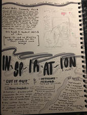
Experimentation:
All of the following photos relate into the experimentation and testing of how I wanted this piece to turn out as. I'll explain what each thing is for better understanding of how this artwork came to be the way it did.
|
Experimenting with photos...
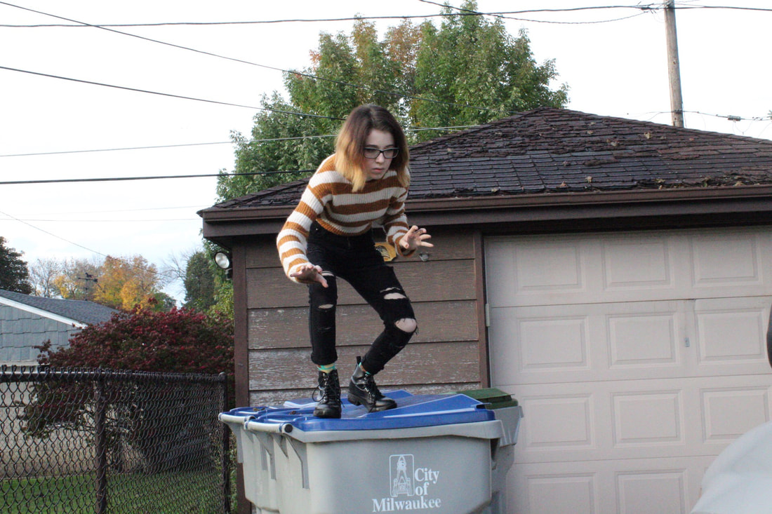
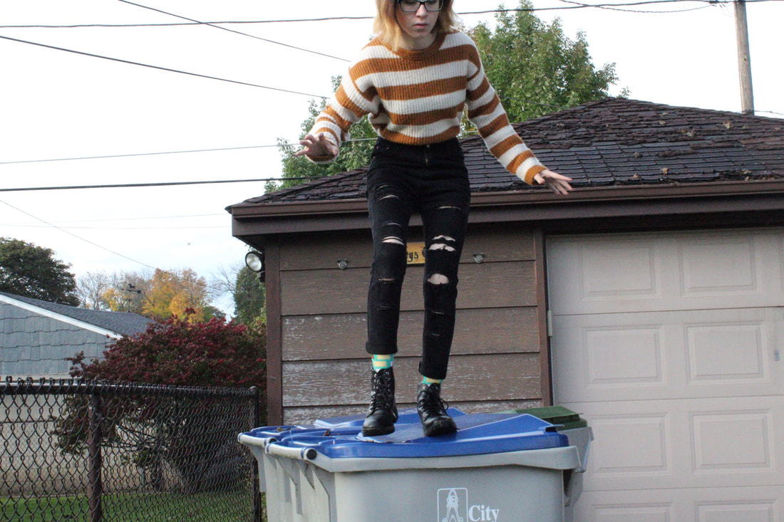
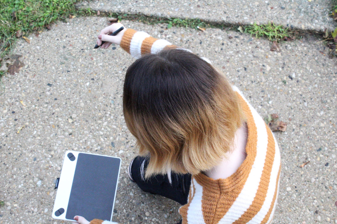
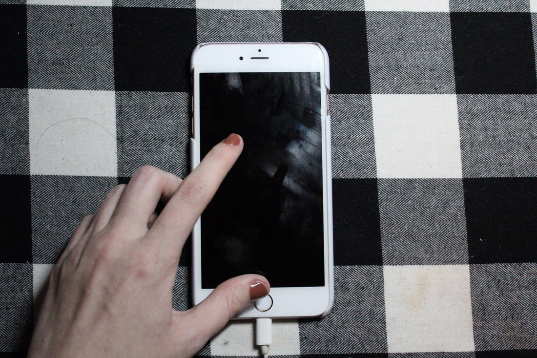
The first four photos of my project, the two to the left and the two to the right of this text, were my initial ideas for the concept. I explored the idea of having myself photoshopped onto an app like I was crawling out of it, but I decided to scrap that idea for a different one.
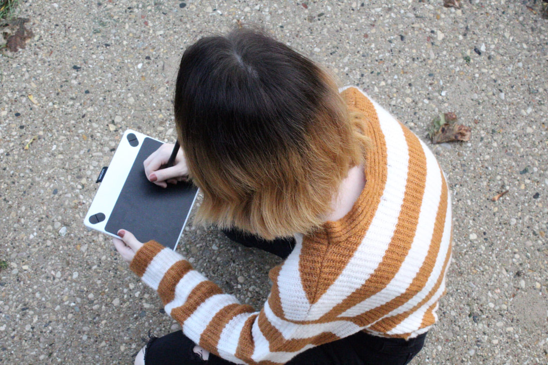
That's when I started crouching with my digital drawing board, pretending to be some sort of system that my internet persona could use to direct me. I soon enough decided to take a different approach, however, so it'd seem like I was seriously influencing the decisions my real self would make through social media. |
|
|

|
|
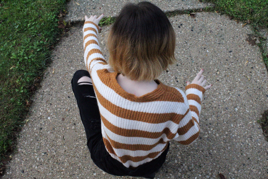
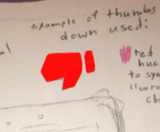
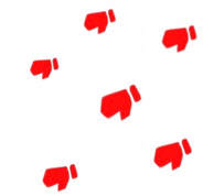
These three images above are actually the three that ended up being used for my overall final art piece. The first image's hand and cellular device is obviously seen when compared to the outcome, the thumbs down was taken from YouTube's thumbs down design to be re-designed only a little bit by myself for use, and then my last photo of myself reaching out was a great enough internet persona for my piece to have as a main focus. I was planning to draw all of this digitally, tracing it on a trusted application to both color in and resurface my original concepts expressively.
Process:
[ The first few photos are of the making of my background, and then on the process of creating an overall finished product. ]

|
[ the image to the left & right of this text ]
I began the piece here. I was starting to construct a background while digitally designing what the piece ideally would look like when finished. As referenced above in the Experimentation, I'd be looking at the YouTube design of a thumbs down and slightly tweaking it for consumption of my piece.. I wanted the thumbs down to be red to symbolize a very dark and dull negativity. It'd represent the idea of being "wrong" later on. |
|
|
[ the image to the right of this text ]
I began to lay out my sketch for "Internet Persona" on one of my digital drawing software's, an application named , that I was fairly familiar with using for outlining and so on. I wanted to begin with coloring in the spaces of what'd be in main focus: The hand, the internet persona version of myself, and the phone. |
|
|
[ the image to the left of this text ]
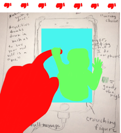
Moving on to adding color, my true original idea was to have the hand a negative and wrong hued red, the internet persona being a green to symbolize "correct:, and then the phone blue because of it's blue implication of being electronic-based. These schemes would be altered later in the finalization of the piece, but, for now, I stuck with this and moved into outlining the subjects with a black brush tool. |
|
[ the image to the right of this text ]
Like said above, I moved into the outlining area of this process where I used a black brush tool at a size of 2, and carefully outlined the objects filled with color in the sketch. I started out with hand, detailing it in relation to ways artist Harry Campbell would draw hands at times in his pieces. I also started to outline the shapes and curves of the base: A cellphone. Since this would definitely end up influencing the social media approach of the artwork, I made sure it looked like I phone as simplistically as it could. |
|
|
[ the image to the left of this text ]
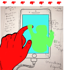
I finished my outlining of the hued objects in my sketch, and moved everything done digitally neatly onto a white background. This white background again would pinpoint on how alone teens feel, sometimes at the center of things they don't quite understand. My original concept also had the reddened thumbs down neatly on the outside of everything. This was to symbolizes on how things in real life can be seen as wrongful or dull compared to the world online. |
|
[ the image to the right of this text ]
After this, I tweaked my piece in a more enormous way by changing the original color schemes and concepts. I took out the red in the hand, a result of criticism I received when we were approached by Jason of MIAD. For the future of re-adapting from this change, I wanted to aim my silk printing colors into a nastier, duller red, and slap a bunch of these colors as the Thumbs Down stencils on the outside areas of my hand. I also thought about putting some of them on the hand to symbolize real life being "wrongful". |
|
|
[ the image to the left of this text ]
Here were the red thumbs down models that I'd be tracing into stencils to later on silk screen my piece with. This red shade was only a test, I had been given the idea of making them more dull and gross red hues so their main idea becomes far more apparent. |
|
[ the image to the right of this text ]
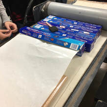
Gaining freezer paper for the production of stencils, I brought a few pieces home so I could create what would be used at MIAD. I'd sketch out a main stencil, three thumbs down, onto a paper, and this stencil would be used rapidly on the creation of my final product. |
|
|
[ the image to the left of this text ]
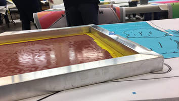
Entering MIAD, I was given the following tools to use for the silk printing process... - A Silk Screen Printer ( used to tape the stencil onto, which would later be pressed onto the main piece ) - A Squeegee ( a tool used to spread the acryllic ink around on the final base. You use it on the more open side of the Silk Screen Printing board ) - Acryllic Paint ( For example, the nastier red that I use in this photo ) |
|
[ the image to the right of this text ]
Using the Squeegee tool, I spread the acrylic paint around the board in a pleasing amount that would soon enough transfer onto my original piece. My original goal was to lighten my grip and force, pressing with ease, so many of the thumbs down would come out blotchy and messy. This did end up happening, thankfully the way I actually wanted it to, and I kept repeating this process to around my main piece to spread these thumbs all over. |
|
|
[ the image to the right of this text ]
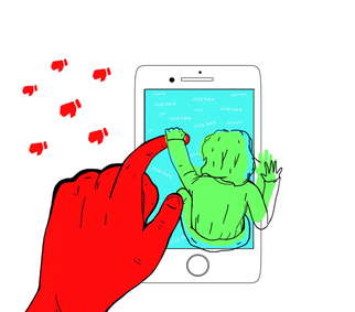
This is my final piece. |
|
Critique:
Looking back towards both my final product and inspiration, you can immediately pick up on a few similarities and differences. I ended up becoming heavily inspired by artist Harry Campbell and the pieces from his art portfolios. His modern approach to art representation and style of sketching out things impacted everything I did quite a bit.
|
Similarities May Include:
- Both pieces include Technology. this can be in the view of a cellphone and then in the minor hints to social media use within both pieces.
- Campbell's piece and mine both include a hand. This can be important for the point of view the piece settles an audience into. It's more in your face. - Both of our pieces dive more into a hidden meaning that relates to technology use in a modern setting. They both seem to give out very similar vibes when looked at side by side. - Both art pieces have a white background. This is more noticable. |

|
Differences May Include...
- My piece includes a cell-phone that looks more flat, 2-D, rather than how Campbell makes the cellphone in his piece look more 3D in design. My piece doesn't give off that alike 3D overall tone that Campbell displays in most of his pieces like this one.
- Our pieces may both ride around the idea of Technology, but his doesn't connect with the same concepts mine rode on. For example, my piece goes more towards the Teen Community and the way it sort of directs teenagers to do things, especially on the internet.
- Campbell's pieces are usually used in advertisement, while my piece was used for a community to acquire.
Reflection:
Thinking back to my initial opinions about my piece's turnout, "Internet Persona" was always my second favorite out of the two MIAD ideas I had. However, after acquiring and tweaking my piece with silk screen printing and so forth, I ended up growing more fond of this piece than I did the other. What I like about it most falls into the way my printed thumbs down look so frail, so weak, on the base of background. It creates this very messy outer sphere, drawing back to my originally intention enormously. I wanted to make the real world outside of a cellphone seem inadequate with a smidge of imperfection everywhere that wasn't the smooth, blue hues of the cellphone screen. If I'd have to change the piece, I would go back and edit my background a bit more so my small "internet persona" has a color I'm more satisfied with. The only issue was that I had never experienced nor watched the process of silk printing beforehand, so everything I took on was at a strong beginner's level of skill. That's where mistakes were usually made.
My piece was supposed to be a metaphorical and, sort of, a 4th wall breaking view into The Social Media Community. My artwork may look simplistic, plain even in certain sections, but every bit of included detail meant a whole lot more to the overall message of the piece. Whether it lied in the gross red thumbs downs hinting to the way real life is looked at as "wrongful" or "gross". or if it stood in the cool blues of a phone screen to symbolize a calm yet attractive hue a viewer would usually draw into... I was always drawing it back to how far technology has altered our ways of thinking. We're constantly building up opinions and quirks and so forth as teenagers, especially through technology access nowadays, so it isn't so difficult to picture an invisible instructor demanding us in our heads to follow and like and subscribe and so forth. It has become so easy these days to be shoved into The Social Media Community.
My piece was supposed to be a metaphorical and, sort of, a 4th wall breaking view into The Social Media Community. My artwork may look simplistic, plain even in certain sections, but every bit of included detail meant a whole lot more to the overall message of the piece. Whether it lied in the gross red thumbs downs hinting to the way real life is looked at as "wrongful" or "gross". or if it stood in the cool blues of a phone screen to symbolize a calm yet attractive hue a viewer would usually draw into... I was always drawing it back to how far technology has altered our ways of thinking. We're constantly building up opinions and quirks and so forth as teenagers, especially through technology access nowadays, so it isn't so difficult to picture an invisible instructor demanding us in our heads to follow and like and subscribe and so forth. It has become so easy these days to be shoved into The Social Media Community.
Connecting to the ACT:
1.) Clearly explain how you are able to identify the cause-effect relationships between your inspiration and its effect upon your artwork:
Well, both my piece and some of artist Harry Campbell's pieces hold a more futuristic and modern appeal to it. This may be seen in phone art or tech metaphors, as that's an enormous portion of community these days, I also use the same white background as Campbell to really put a perspective on my main focus, a centerpiece, if you will, of what I'm trying to express in the piece. Small details and styles of Campbell's portfolio art pieces gave a lot to what my final product would look like.
2.) What is the overall approach ( point of view ) the author ( from your research ) has regarding the topic of your inspiration?
Harry Campbell, from what I've learned, is an illustrator for bigger news companies. His job is to unusually create a futuristically interesting art piece that contains both subtle and obvious meanings in between the lines. It's as if he creates a whole other world just by object placement and art style, so I was naturally drawn to his work for producing a piece like mine. He likes to make things from our everyday life more complex in messaging than they usually would be. He'd be very much into the idea of teenagers suck in the social media rage of today, as he's worked alongside those concepts many times before in his own work.
3.) What kind of generalizations and conclusions have you discovered about people, ideas, cultures, etc. while you researched your inspiration?
I gained a better understanding of how much technology and the power of social media has shaped who I am today online. It's mindboggling to see that our world has transformed so many of it's citizens into the same situation.
4.) What was the central idea or theme around your inspirational research?
My central theme was to focus on one portion of what I think of as The Teen Community: The Social Media Community.
5.) What kind of inferences ( conclusions reached on the basis of evidence and reasoning ) did you make while reading your research?
That we will only continue to develop as human beings the more technology is expanded into the near future. We, even being as young as a teen, need to make sure that the way we use it tumbles more onto the good side than bad. We shouldn't let everything online disrupt the true person we are on the inside.
CITATIONS ( DONE IN MLA FORMAT )
AI-AP | Pro Photo Daily - Around the Net » Books: How Polaroid Seduced the Art World, www.ai-ap.com/publications/article/13398/illustrator-profile-harry-campbell-design-is-v.html.
Anderson, Jenny. “Even Teens Are Worried They Spend Too Much Time on Their Phones.” Quartz, Quartz, 23 Aug. 2018, qz.com/1367506/pew-research-teens-worried-they-spend-too-much-time-on-phones/.
“Harry Campbell.” Harry Campbell, www.harrycampbell.net/.
Anderson, Jenny. “Even Teens Are Worried They Spend Too Much Time on Their Phones.” Quartz, Quartz, 23 Aug. 2018, qz.com/1367506/pew-research-teens-worried-they-spend-too-much-time-on-phones/.
“Harry Campbell.” Harry Campbell, www.harrycampbell.net/.
