Artwork: Imag(e)ine
|
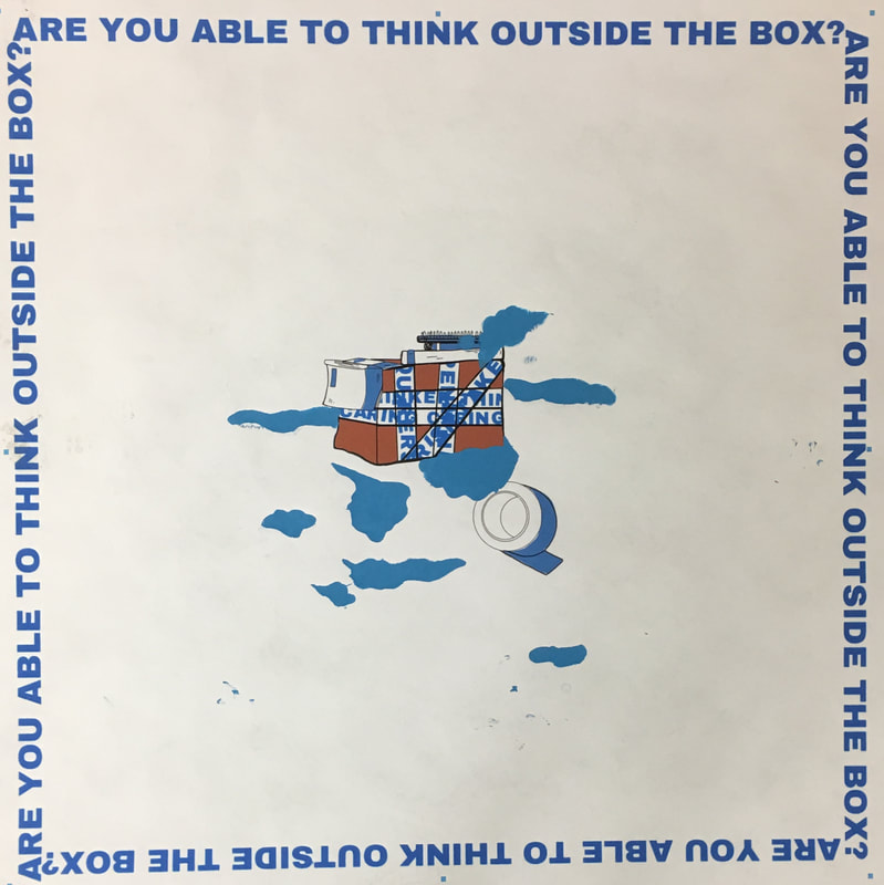
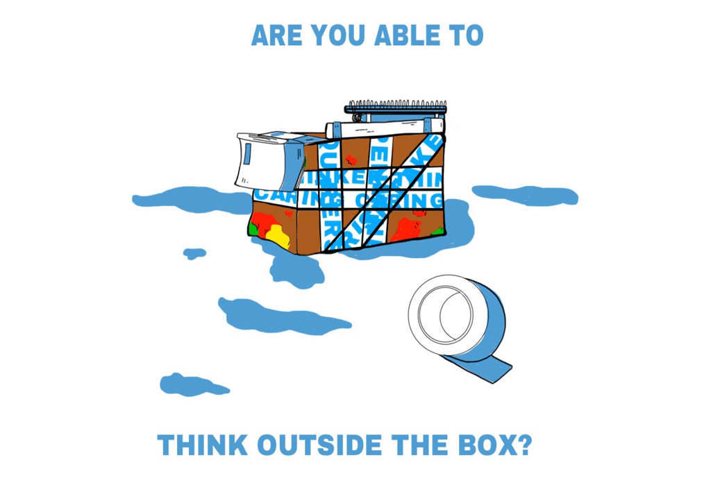
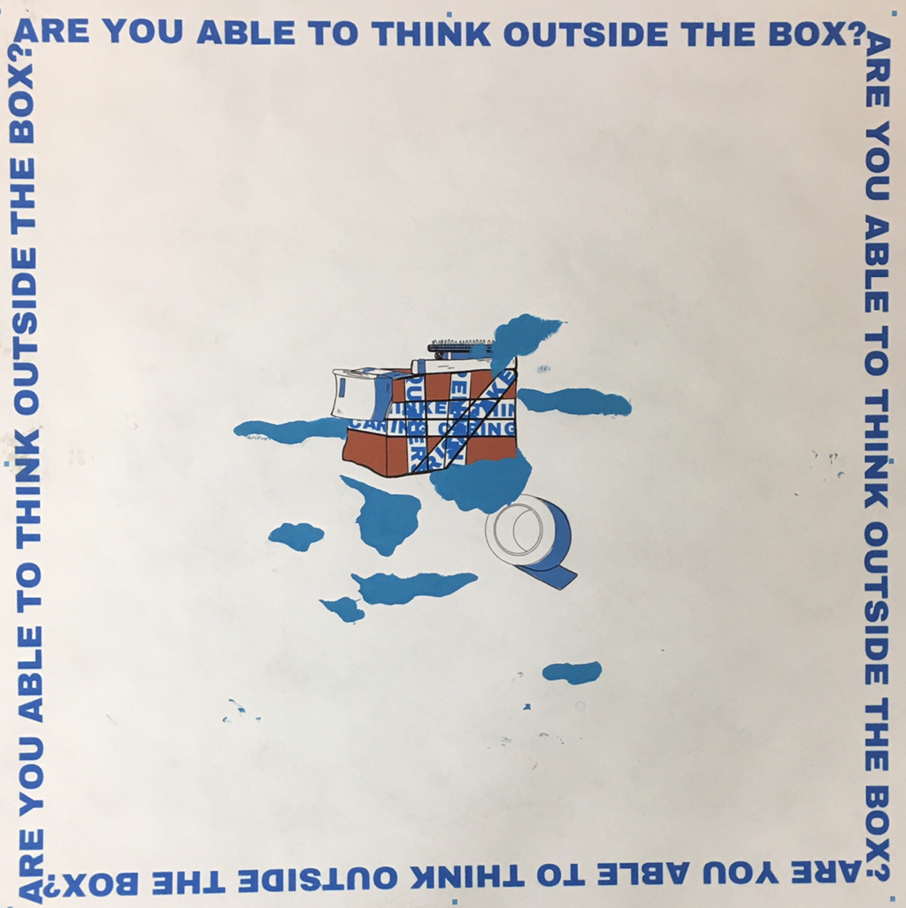
Title: "Outside the Box"
Size: 91.44cm x 91.44cm ( 36in x 36in ) Medium: Silk Screen Printing Completion: October 2018 |
|
Exhibition Text:
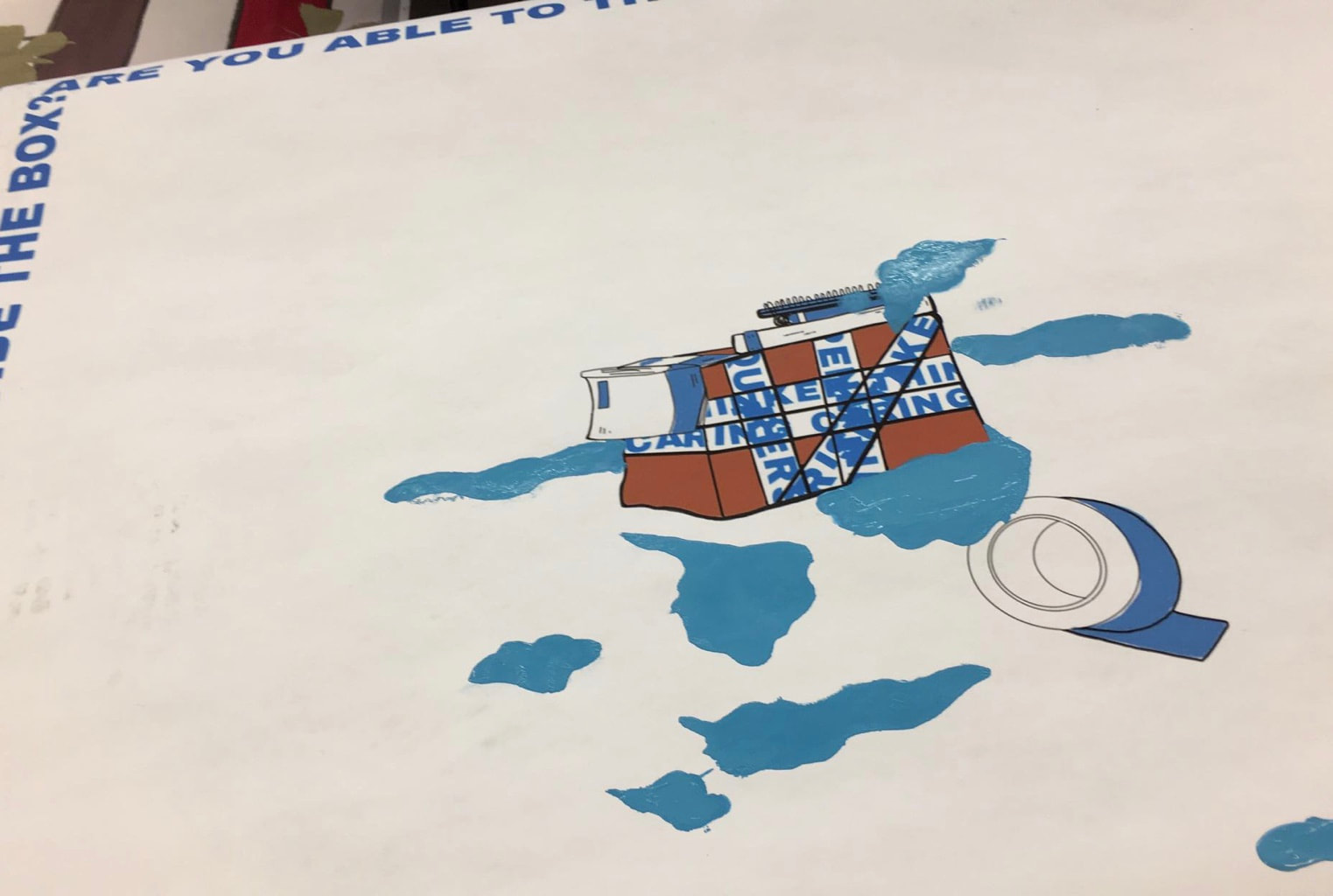
Incorporating the simplistic hues and real life referenced artistic ideas of artist Harry Campbell, my Silk Screen printed piece "Outside The Box" shows off one side of the overall Teen Community: The IB Community. With the box in the center symbolizing a student, I use the color schemes of the IB symbol and IB Learner Profile traits to crowd up the chance for the box to breathe. It's a quiet critique of the IB system and how hypocritical it can be at times with the idea of student expression.
[ The Teen Community - IB Community ]
Both of my pieces all draw back to the original concept of the world's, more directly my world point of view's, Teen Community. I dig into the first two concepts that hit me most when being a teenager: The Social Media Community and The IB Education Community.
"Well, going full diploma can have nice challenges that come with it... but sometimes it's way too much pressure. It's like you're always trying to be perfect."
"I'm a CP student, but I've heard from friends that it's very stressful. There's just so much work, and most people debate on whether to keep it or drop it constantly."
" Unnecessarily overrated."
"I'm a CP student, but I've heard from friends that it's very stressful. There's just so much work, and most people debate on whether to keep it or drop it constantly."
" Unnecessarily overrated."
Reflecting off of what my peers told me about the concept of IB or going "Full Diploma", you can definitely pick up on a similar correlation in the information. The basis of IB learning can be so structured, so narrowed towards constant workload and pressures, that a student comes out of it thinking negatively. I hardly ever hear someone admittedly say that IB was something they enjoyed doing. Maybe that's just a bias of my own knowledge, but my peers tell it all in body language and mournful sighs. It's in those opinions that arose the concept of my piece "Outside The Box."
My motivation was to create a subtle reference, a metaphor, really, to what school has piled on the average student. The piece spoke quietly about the the assignments, the projects, the extremely demanding rubrics, and the overbearing pressures no teen should really be facing so early on in their teen lives. From my own experience, I can see how school dials down one's motivation or ability to create. That creativity you had captured over years and years of self-exploration can suddenly be so over weighed by the responsibilities of a school education. It ends up raising a generation of dried out young adults who may be on their last few ounces of ambition, and there's something really saddening about that. And this is what I found very important to express in my community, The Teen Community.
My motivation was to create a subtle reference, a metaphor, really, to what school has piled on the average student. The piece spoke quietly about the the assignments, the projects, the extremely demanding rubrics, and the overbearing pressures no teen should really be facing so early on in their teen lives. From my own experience, I can see how school dials down one's motivation or ability to create. That creativity you had captured over years and years of self-exploration can suddenly be so over weighed by the responsibilities of a school education. It ends up raising a generation of dried out young adults who may be on their last few ounces of ambition, and there's something really saddening about that. And this is what I found very important to express in my community, The Teen Community.
Inspiration:
|
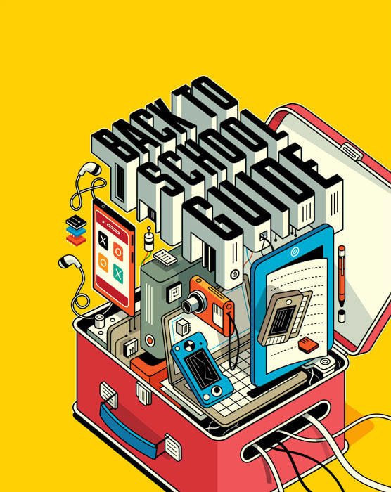
Artist In Focus: Harry Campbell
Campbell is a modern day artist that uses an illustrative and futuristic symbolism to really bring a piece together, perhaps linking it more into an overall deeper meaning. The four pieces to the right are some of the many pieces of his work that inspired me the most while creating both of my pieces. Since I've decided to dwell into the community of Teens, both through the Social Media Community and IB Community, Campbell seemed like a good inspiration. He's good at using symbols and colors in a way that conducts a message well enough while pulling in an audience to analyze his work. I adore the art style, it immediately caught my attention, so in my pieces I will try to use the simplistic hues while drawing things with a delicacy.
I'm working with the Teen Community as my focus where things can get overwhelming and intense so having a fragile and "alone" style to my work will be better for the messages I'm displaying. Teens are put on the spot everyday, say through social media or even by the school related responsibilities they're give, so every intricate detail should feel "on the edge" or "fragile". This is a reason for my white backgrounds in my final products and why the detail is simplistic; It all draws back into the teenage mind. |

These four art pieces are by the artist Harry Campbell. These are involved in his portfolio, found on his official art website, yet that don't have names for the pieces. Click on the images to get a closer look!
“Harry Campbell.” Harry Campbell, www.harrycampbell.net/.
|


Planning: |
|
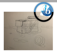
Sketch/Journal Page 1. Sketch/Journal Page 2.
Sketch/Journal Page 3. Sketch/Journal Page 4.
"Can you think outside of the box?"This quote, which is casted out onto my piece as well, links to the original creativity influenced idea of "thinking outside of the box". I wanted to point out how schools that work under the IB system suggest this rule, telling a student to do all these things to express themselves, yet become hypocritical with all the regulations and expectations that a student must meet as well. It's a lot for most students to take it, so I wanted that to be expressed in this area of the Teen Community.
|
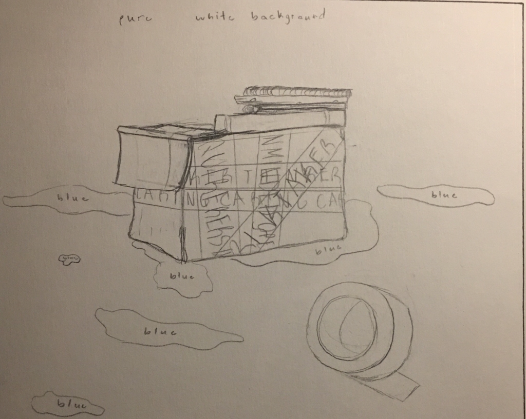
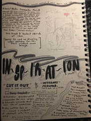
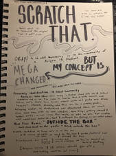
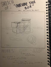
Planning Sketches & Notes:Four pages taken right out of my Art Process Journal, you can see them to the left and right of this text, were where I did most of my brainstorming.
Both pieces had a combination of three planning sketches. This was because of how, when I initially started planning, I focused on one solid piece, thus creating three sketches for it. However, two of the three became ones I quite liked, so they were used in the development of my final product.
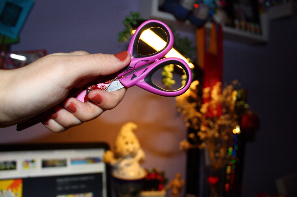
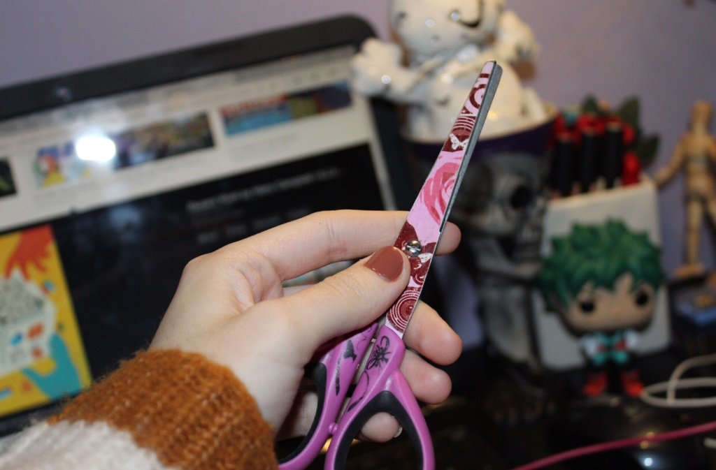
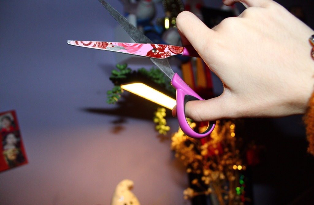
Starting off on the first page, if you narrow your sight more towards the bottom right corner you'll pick up on my initial idea. It was residing around the first concept that rung in my head, the IB Education Community, and even though the idea was soon scraped, I decided to implement it on here as a good starter. The scissors, ideally being blue and white to symbolize the IB colors, would gradually cut out the qualities and colorful personality of the hand holding it. I wanted it to symbolize the way students are cutting out their dreams and creativity for such a structured, demanding school system. They were making grades and scores their only goal, shoving off aside all of the wonderful quirks they built over years. "Cut it out!" was a piece I ended up scraping, however, as stated earlier.
Leading into the sketches that shaped out my final product, you can see these ideas & sketches shown on Sketch Book pages 2-4. My final product, given the name "Outside the Box", is a piece that views a box in the center of a plain white background. Again, the white would represent the feeling of standing alone and lost as a teenager, but in this piece I incorporate in other types of hue to express an overall concept. By using the additional blue and white color schemes of IB, I crowd the box in the center with hints of the IB system; Kind of like the student is the box and everything crowding it being the structured ideals of the IB system. I made the tape around the box look like fragile tape, but, instead of that, it spells out some of the IB Learner Profile traits. Everything, really, that isn't the brownish box in the center correlates straight to the control IB has on everything a student, the box, does.
|
Experimentation:
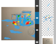
All of the following photos relate into the experimentation and testing of how I wanted this piece to turn out as. I'll explain what each thing is for better understanding of how this artwork came to be the way it did.
I wanted to include these first few images below as an example of how close I was to pursuing my first idea, the piece called "Cut it out!". These were the first photos I took for the final product, but, of course, inspiration struck somewhere else. I simply narrowed my vision to the right of me, caught a glimpse of a sticker on my bookbag that read "FRAGILE" in big, bolded letters, and suddenly my world was rotated. That's where "Outside The Box" began to take it's form.
|
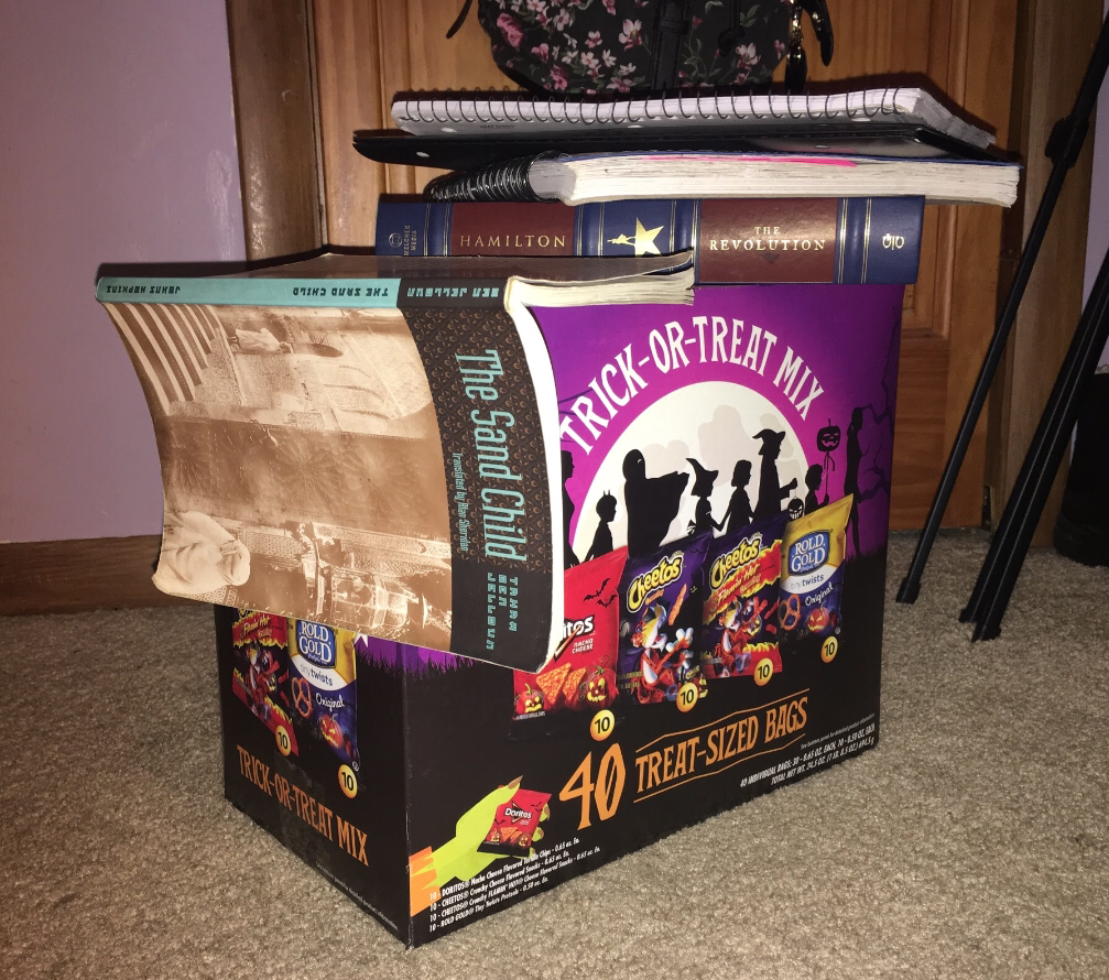
I needed a box that I could use as a base, so I grabbed whatever was closest to me... which was this 40 bag box of chips I had casually had at my bedside. Conveniency at it's finest, I know, but also great for modeling art off of. I put a few books I had lying around on it's edges to symbol "school work pile-up" and so forth. You can see all of this in the photo to the right.
|
|
Process:
[ The first few photos are of the making of my background, and then on the process of creating an overall finished product. ]
|
[ the image to the left of this text ]
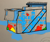
So, my first job was to create a pleasing enough background for the silk screen to later be printed onto. This meant that digital work was in order. I began with coloring in, with a paintbrush tool, all desired areas with blue. A blue that was used directly from the IB symbol. |
|
[ the image to the left of this text ]
I moved into different hues: Red, yellow, and green. With these colors, I filled in portions of the box with paint splatters. I correlate paint with art, thus drawing into creativity, and since they're only barely there on the box's surface it may symbolize the containment of creativity. That's what I wanted to go for. |
|
[ the image to the right of this text ]
Next, I made the paintbrush tool a smaller size and turned it black to finally outline all of the areas of the piece. this was to separate color and make things look more finalized and half-done. |
|
|
[ the image to the left of this text ]
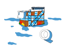
After filling in the box with a brown, something I did to make it look more boxlike, I decided to place it on a white background as is to see if I liked the turnout or not. |
|
[ the image to the right of this text ]
This was the original final product of the piece. I was critiqued in a few points, so this has changed a tad when compared to my final product. I put the text "Are you able to think outside the box?" so people would understand that there is a box in the middle, and that the quote is a main focus of what the artwork means. |
|
|
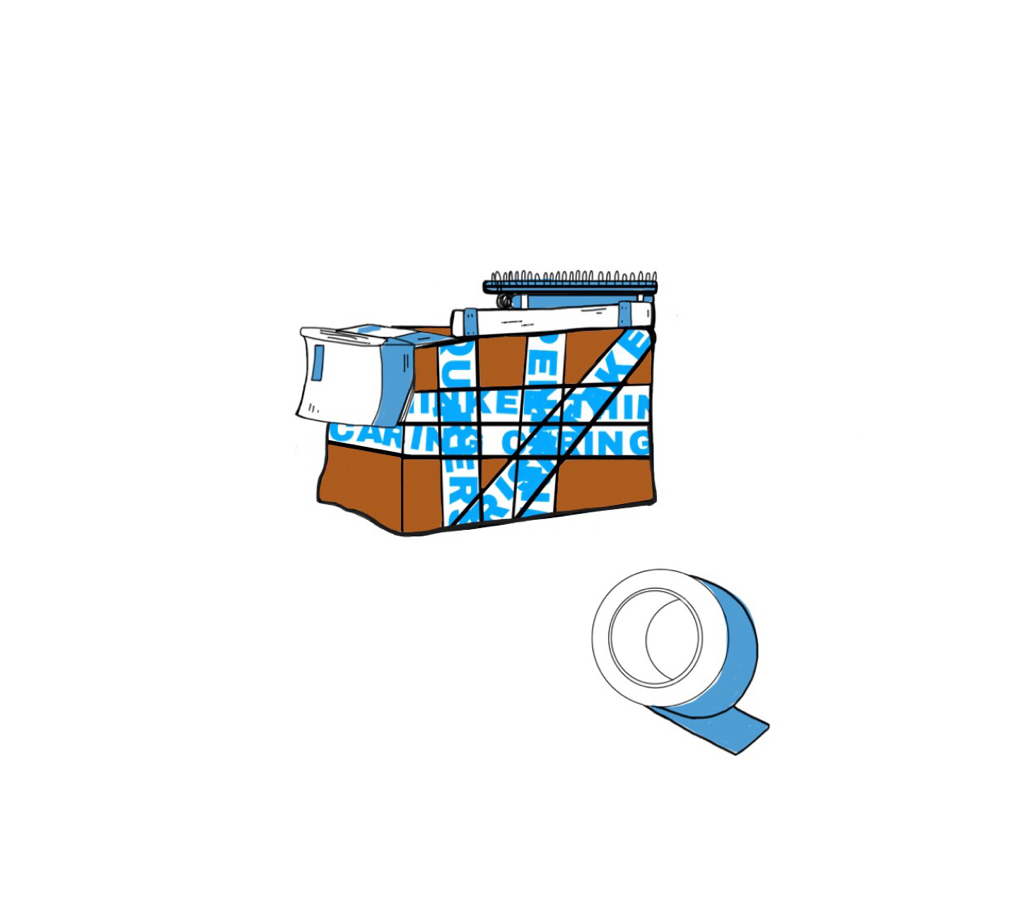
[ the image to the right & left of this text ]
The next step was incorporating the ideas given in my critique and placing it into my final background. - Jason recommended that I place the text from earlier in a box formation around the center piece. It was to create a more isolating and "walls closing in" type of approach to enhance my original concept. I ended up doing that. - I also took the blue ground splatters away from the background, so there would be room for my stencils to be silk screen printed on. |
|
[ talking about the photos below this text ]
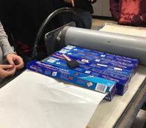
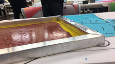
Entering MIAD, I was given the following tools to use for the silk printing process...
- A Silk Screen Printer ( used to tape the stencil onto, which would later be pressed onto the main piece )
- A Squeegee ( a tool used to spread the acryllic ink around on the final base. You use it on the more open side of the Silk Screen Printing board )
- Acryllic Paint ( For example, the nastier red that I use in this photo )
You can see me work through the process of silk-screening in the three photos below. I began my smearing acrylic paint onto the open side of the screen board, this would soon enough apply to my main piece underneath it. After doing this a few times, I'd simply raise the board from where it sat and continue this process for as long as I needed to,
|
|
|

|
[ the image to the right of this text ]
This is my final piece. |
Critique:
Harry Campbell, the artist I considered a lot during the creation of my piece, when whipping up this piece, explores very subtle messages digitally and through community based symbolism. I ended up incorporating a few concepts form him.
|
Similarities May Include...
- Both of our pieces have a single colored background. In Campbell's artwork, he usually intends on using plain backgrounds to put a main focus on whatever's in the center of the piece. I tried to incorporate the same with mine.
- There's a box look to both of the pieces. Mine is more straight forward: A box covered on top by books. Campbell uses a lunch box in his. - Our pieces quietly have the idea of "School". Campbell uses a more ad-like approach, a back to school guide, while mine links more into the IB School System. |
|
Differences May Include...
- Campbell, in this piece, seems to have the purpose of influencing an audience with a more advice-orientated goal. Although both relating back to school, my piece tries to represent a critique rather than a helping motive. Perhaps my piece gives advice in it's own way, but they still differ in that area quite a bit.
- His piece is more 3-D looking than mine. Everything I draw is slightly more flatter than his piece looks, and that does seem to be a significant enough difference in our pieces.
- Even though both of our pieces use the power of text to signify a message, his work seems more like the title to some sort of informational source while mine uses the text to intensify a message. They're both pieces of artwork, but again we differ in the audience that we're aiming for and how we want them to interpret the piece as.
Reflection:
"Outside The Box" was a piece that hid symbolism and bold criticism underneath a box and a few books. It's a piece I wanted to not only express my inner opinions into, but the outside opinions of my peers so they can relate to something strongly. It's what my community speaks about daily: School and IB life. I grew a fond attachment to this piece, and the ideas I constructed behind it. I got to express so much detail in something so intricate, and I truly enjoyed that aspect of this piece. If I'd be in the position to change things, I'd for sure add back the colored paint splatters on the brown areas of the box. These were initially removed because I thought I'd get time to stencil and print them on, but the silk screen printing material was already new for me as is... that meant that I had to ease up my creativity so the piece didn't look so messy. I was new to this, I needed to take it slow.
My piece serves the purpose of asking a simple, yet bold, question to all students working in IB related courses: "Are You Able To Think Outside The Box?" The question only signals flashes of creativity in my own mind; A student being able to show off what makes them, them in their day to day life through different ideas. It's odd when schools ask this question, especially at Reagan, since we're all working under the same strict rubrics and the same pressuring grading processes. It brings us to a stern hold. Should I think creatively and risk the chance of hurting my grade or follow the rubric to get an easy A? The limitation of creativity as a student progresses through school shouldn't be so common. Striping someone of everything they've grown into being just to fit into the same system seems very disheartening, in my opinion. I believe that everyone should have the chance to express themselves. They shouldn't have to pack, place away into a box, and duct tape tight away their inner ambitions. They should be able to truly think outside the box.
My piece serves the purpose of asking a simple, yet bold, question to all students working in IB related courses: "Are You Able To Think Outside The Box?" The question only signals flashes of creativity in my own mind; A student being able to show off what makes them, them in their day to day life through different ideas. It's odd when schools ask this question, especially at Reagan, since we're all working under the same strict rubrics and the same pressuring grading processes. It brings us to a stern hold. Should I think creatively and risk the chance of hurting my grade or follow the rubric to get an easy A? The limitation of creativity as a student progresses through school shouldn't be so common. Striping someone of everything they've grown into being just to fit into the same system seems very disheartening, in my opinion. I believe that everyone should have the chance to express themselves. They shouldn't have to pack, place away into a box, and duct tape tight away their inner ambitions. They should be able to truly think outside the box.
Connecting to the ACT:
1.) Clearly explain how you are able to identify the cause-effect relationships between your inspiration and its effect upon your artwork:
Campbell's use of simplistic white backgrounds and flat colors instead of anything dramatic were large emitters to my final product. Campbell was also a great user of text in photos, as he uses the text to display core messages, so I was inspired by that to place the quote "Can you think outside the box?" in a box formation around my the main focus of my piece.
2.) What is the overall approach ( point of view ) the author ( from your research ) has regarding the topic of your inspiration?
Campbell likes to link to the small issues of day to day life in the most simplistic of ways. He dives into topic with plain bases of imagery, sure, but what comes out of it is a whole other perspective. It's in the small, minor details and the artistic style that brings artist's like Campbell to narrow into topics like mine. if he can shed light on something and spare a pinch of his talent to do it, he seems like the kind of artist to do it.
3.) What kind of generalizations and conclusions have you discovered about people, ideas, cultures, etc. while you researched your inspiration?
Well, as I've spoken to more people about my piece's true meaning an watched their reactions, I've come to realize that this truly is the sad reality for most students. Boxing up their creativity for a good grade, trading their happiness away for a diploma at times, even; I've learned about how overworked us teenagers can be at time to shut out things we'd usually find amusing.
4.) What was the central idea or theme around your inspirational research?
Since I was diving more into two parts of the Teen Community, I decided to focus this piece of artwork on that of my peers emotions around me. This ended up being school, or more specifically, The IB Community.
5.) What kind of inferences ( conclusions reached on the basis of evidence and reasoning ) did you make while reading your research?
That we've all got to figure out a way to balance the things that make us happy from the things we have responsibility to do. Teenagers all around me are struggling to keep it evened out thus destroying the individual they've built of themselves over years because of the duties of the educational system. There's got to be a better way for teenagers to express themselves without the fear of repercussion because they aren't as focus on what's set in stone for education.
CITATIONS ( DONE IN MLA FORMAT )
AI-AP | Pro Photo Daily - Around the Net » Books: How Polaroid Seduced the Art World, www.ai-ap.com/publications/article/13398/illustrator-profile-harry-campbell-design-is-v.html.
“Harry Campbell.” Harry Campbell, www.harrycampbell.net/.
“Harry Campbell.” Harry Campbell, www.harrycampbell.net/.
