a r t w o r k : c h o i c e - i l l u s t r a t i o n
|
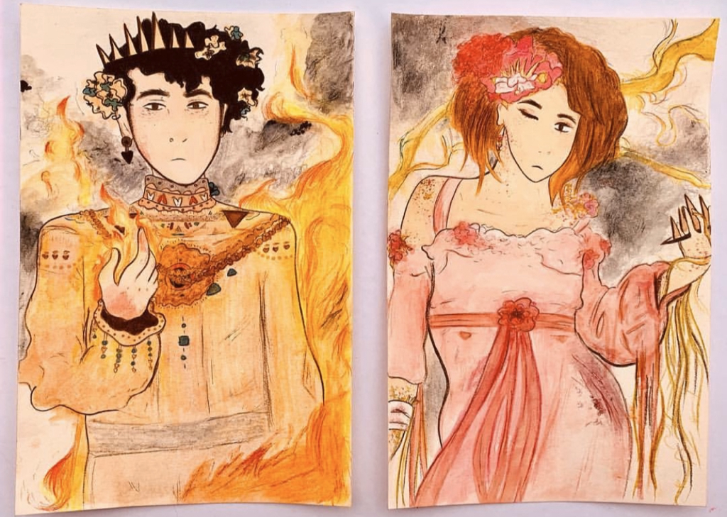
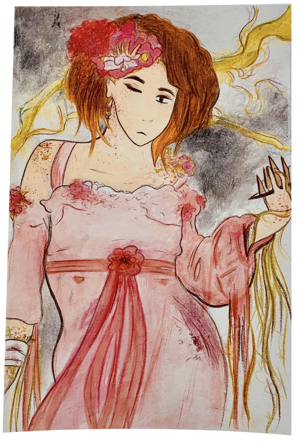
Title: Next In Line
Size: 15.5cm by 24cm Medium: Watercolor Colored Pencils & Markers Completion: March 2019 Exhibition Text:
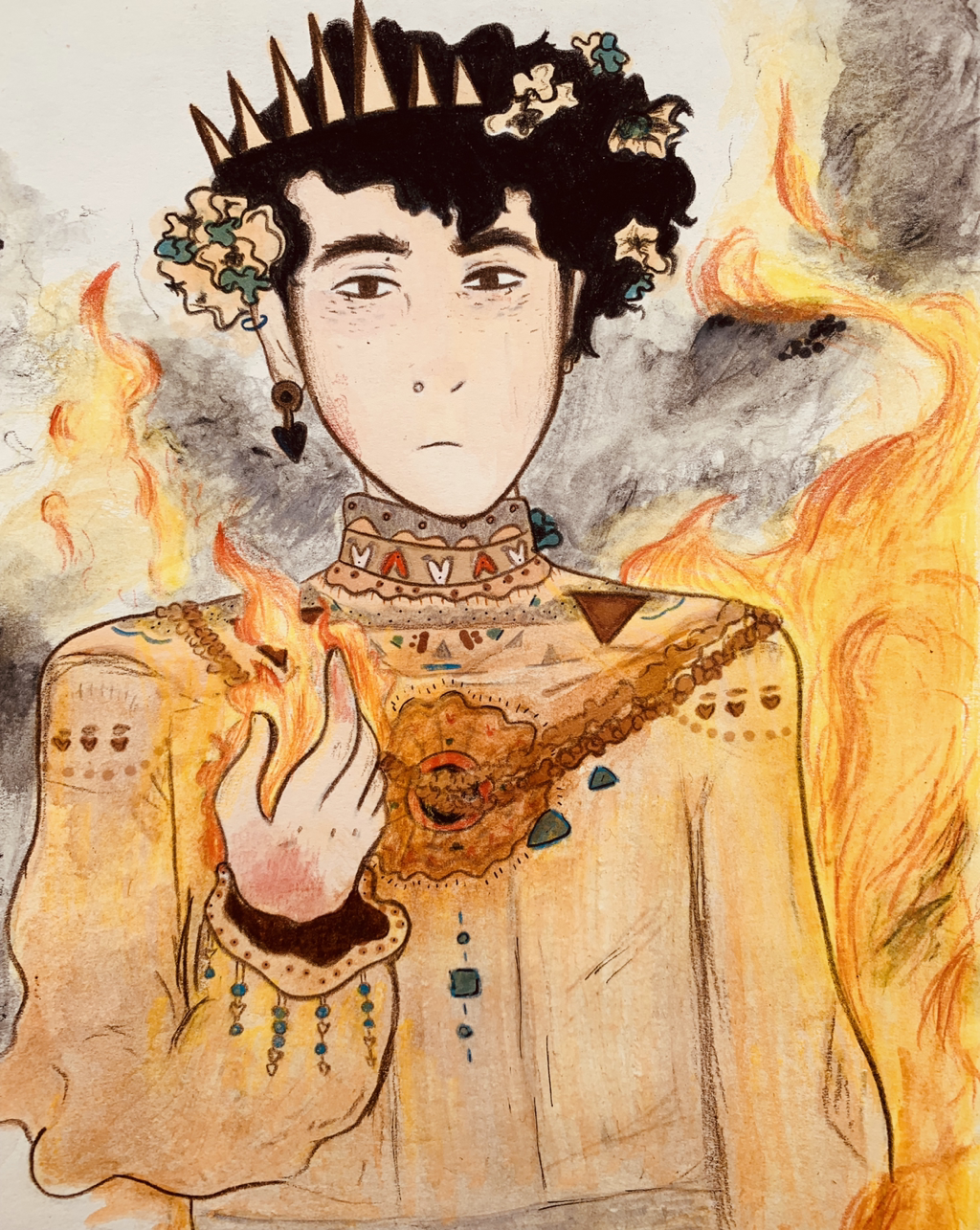
"Next In Line" is an illustration series produced of markers and water color pencils, that strongly links back to my inspiration, artist Alphonse Mucha, and his royal-like art style. The piece shows an upcoming prince and princess, both of different neighboring kingdoms, being "next in line" to the thrown , despite their cursed nature. For the prince, a constant battle with fire control, and, for the princess, an allergic reaction to her own ability to grow plants from skin.
|
Inspiration:
|
Artists In Focus: Alphonse Mucha
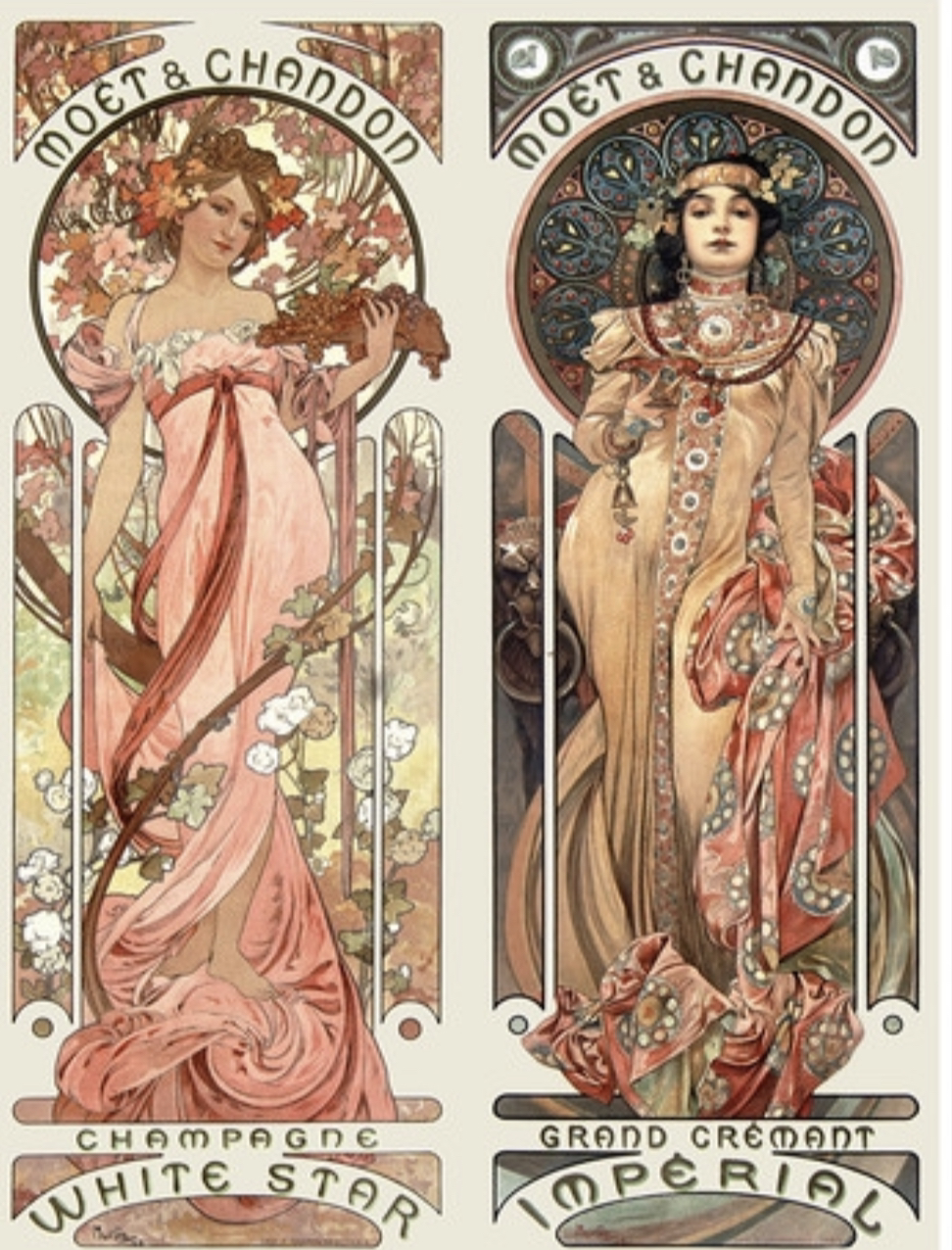
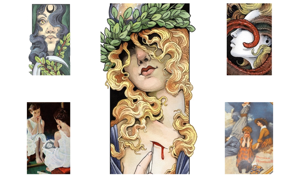
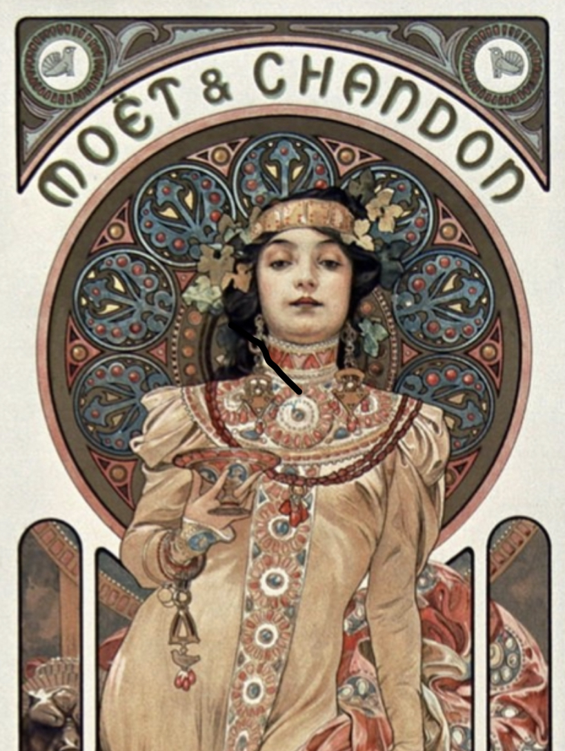
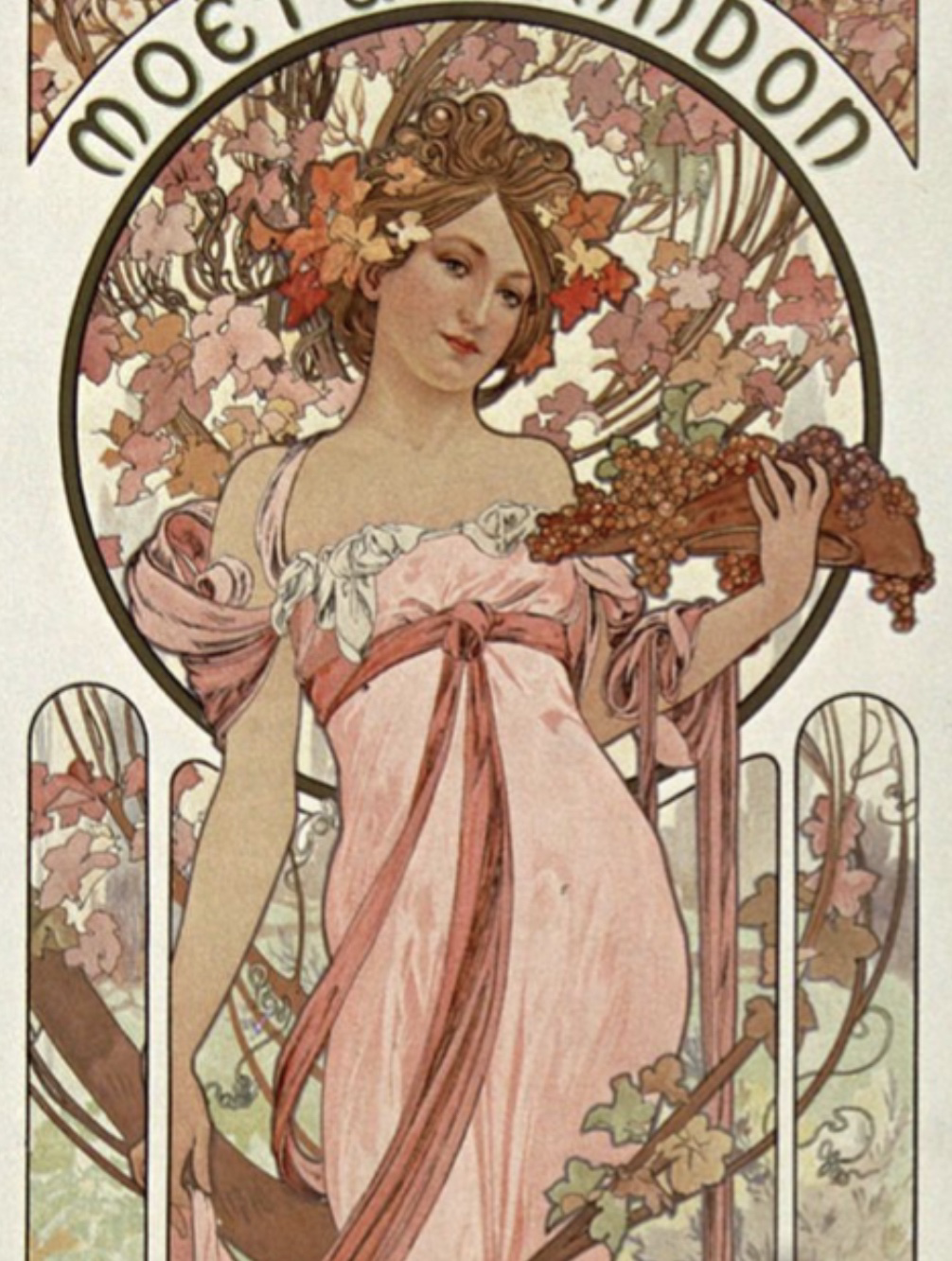
My inspiration was Alphonse Mucha, an artist I studied in Art History last year as a sophomore. He's an Czech painter, illustrator, and graphic artist who usually created posters like such to the left and below, I was extremely fascinated by this artist's style of work, the flowery and delicacy to his pieces, and I wanted to study a fantasy genre for this illustration. I wanted to draw out something loosely medieval that also held a silent story behind the beauty of it. Hue variety, contrast in light and dark, and harmony of piece elements will all be of heightened values in the completion of my pieces. You can see the panels to the left and in the panels below this of what I got direct or even slight interest from for my final products. I wanted to play around with facial expressions to intensify an uneasiness and, even, a tired dread to being in the piece. |
You can see several photos of Mucha's work around this that I used as direct inspiration pose wise. These end up being the piece above to the left named "Moet & Chandon". I used the poses and color scheme variations of these two characters for mine.
|
Mucha has an enormous "rich" and "luxurious" tone to his work. It reminds me immediately of mystical creatures, and, obvious to the turnout of my pieces, royalty. I wanted to try a hand at designing through colored pencil and watercolor, while also capturing the formality of a figure's front profile, in my series.
|
The two works to the side, "Moet & Chandon", were cropped closer up from their lowhalf to head, so I could focus on these parts of the figures for my pieces later on.
|
Planning:
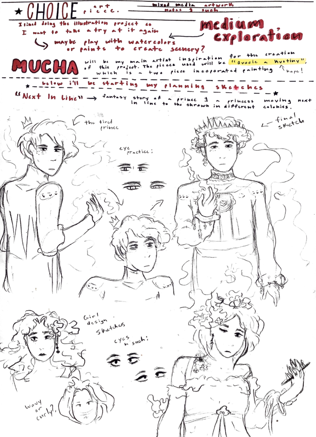
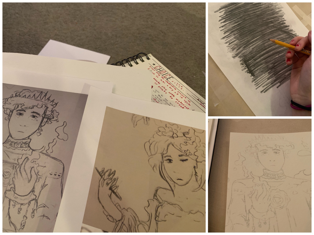
Journal/Planning Page 1
|
Digging into planning sketches & character design:
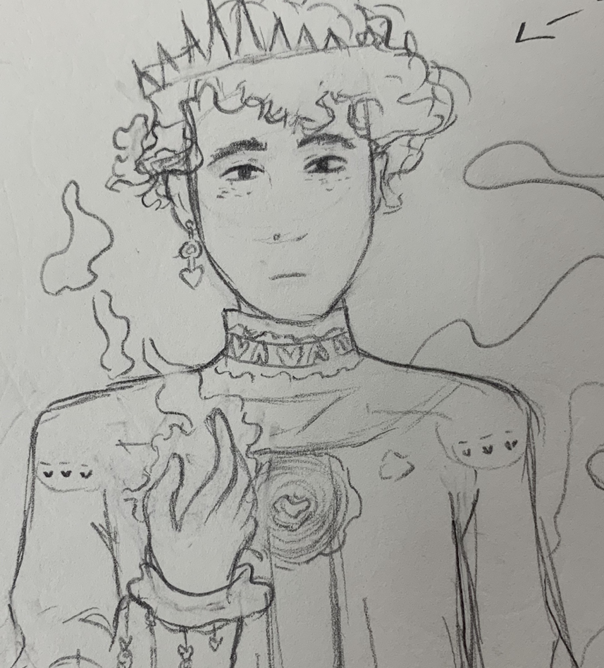
As seen to the left, I began the project as I usually do by scoping out the basic intel I'll need to actually produce my piece... not taking and medium selection! I enjoyed doing my last project, my two piece illustration series, so I definitely wanted to spend my choice project doing something I quite liked. This piece would also take in consideration my personal art style. I began sketching the prince, as I had a lot of idea for how his character would look first... plus, I draw female characters a lot more than male, so I wanted to test out styles and so forth. The prince would connect more to the yellow, brown, and even more highly detailed female figure (the one above shown on the right of "Moet & Chandon") because his character felt more structured, more precise and formal. I decided on giving him the ability to produce fire as a hard twist around his persona, and how this fire (of which I'd eventually inflect burn marks on his skin from) has lead him into this formality. Beside this figure (in Mucha's "Moet & Chandon"), I in turn made the female accompanied by pinks, whites, and flowers to be a princess. She would still be surrounded by flowers, but, in her case, she'd possess the ability to sprout plants and other greens from her skin. However, like the difficulty the prince had with his fire, she'd have a allergic reaction to the growing of her plants, and thus that same difficulty occurs, |
|
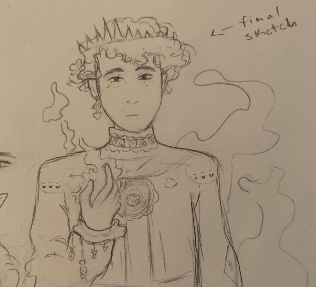
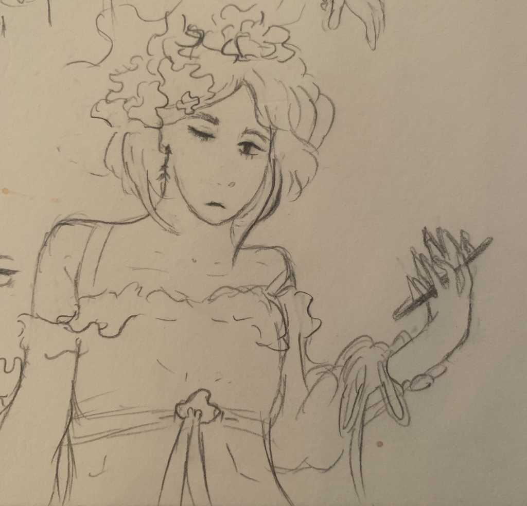
To the right, you can see the two sketches that I'd be taking into the final product of my pieces.
I tried to make them both emulate the same facial expressions and emotions as eachother, as if they're both stepping up into the position they were practically "born to play into" while also ultimately hinting back to the harsh reality of their inner struggle with power, both cursed with and by blood. I usually get really into the stories I create with characters like this, so both of them were increasingly fun to make up and draw out onto paper. |
Journal/Planning Page Closeups
|
Experimentation:
Below will be a mixture of all kinds of experimentation. Whether this be during the process of my project, or in the initial planning.
Per usual, it's more helpful for me to draw hard things like hands without a direct reference, so here's me posing my hand for the drawing seen to the right.
|
|
Here is the drawing I created from the pic I took of myself to the left. I replicated mainly the hand and my form, centered to the photo, into this drawing.
|
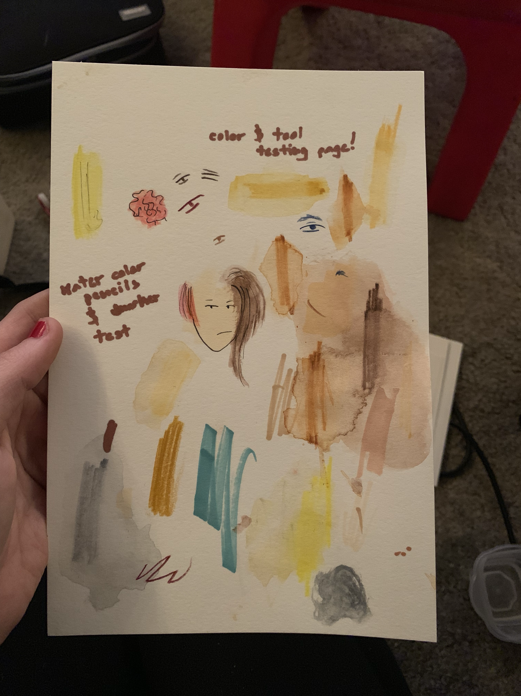
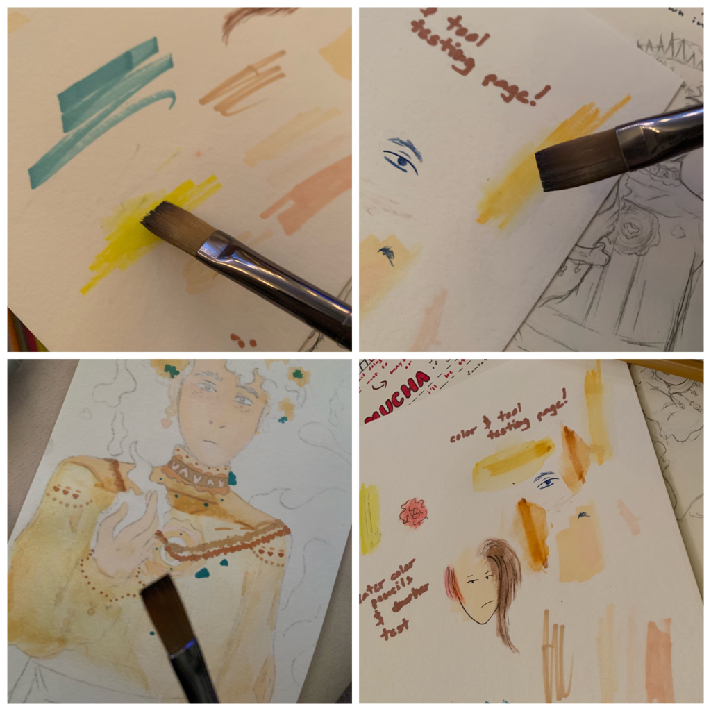
In the middle photo, looking above at the three, I singled out one of my watercolor pages specifically to test out watercolor pencils beside my regular colored pencils, and then with my marker variety. I wanted to test everything out before applying it to paper to avoid any type of mess up with variation and etc. It may look like a mess, because it is honestly, but it did help me in the long run to know how different types of watercolors worked when applying water to the pencil.
Experimentation with Medium:
|
1.) Colored Pencils and Water Color Pencils
For these illustration pieces, I decided to use my pack of Prisma Colored Pencils while also using my Staedtler branded watercolor pencils that I originally bought to experiment with. The Prisma colored pencils were really good at outlining things such as the body and facial features, while the Staedtler water colors provided these smooth, delicate hues I wanted to get by smoothing out features on the watercolor paper. 2.) Markers (TouchNew Branded Markers) I also used these skin color markers I purchased some time ago for skin color variation and blending! These were used primarily for those reasons. |
|
Process:
|
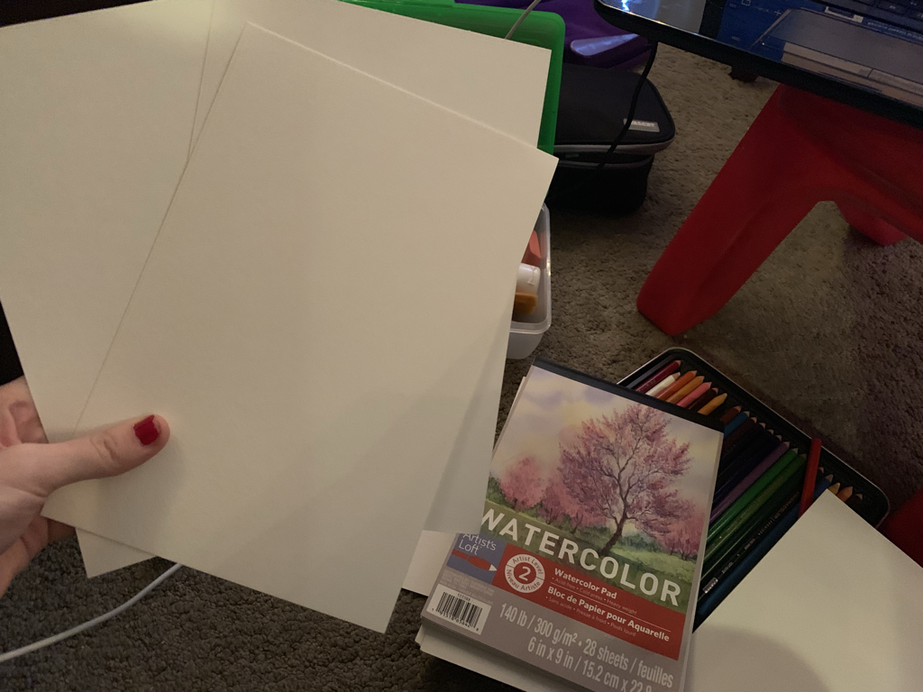
I began by collecting watercolor paper, so, when I’d apply water the piece, the material would hold up. Using illustration board was my first thought towards doing this piece, but, after a lot of hard thinking and preference, I decided on using watercolor paper. It was mostly to ensure good material that would hold up while using water and colored pencil all at once, and I didn't want to risk it on the illustration board material I was limited to.
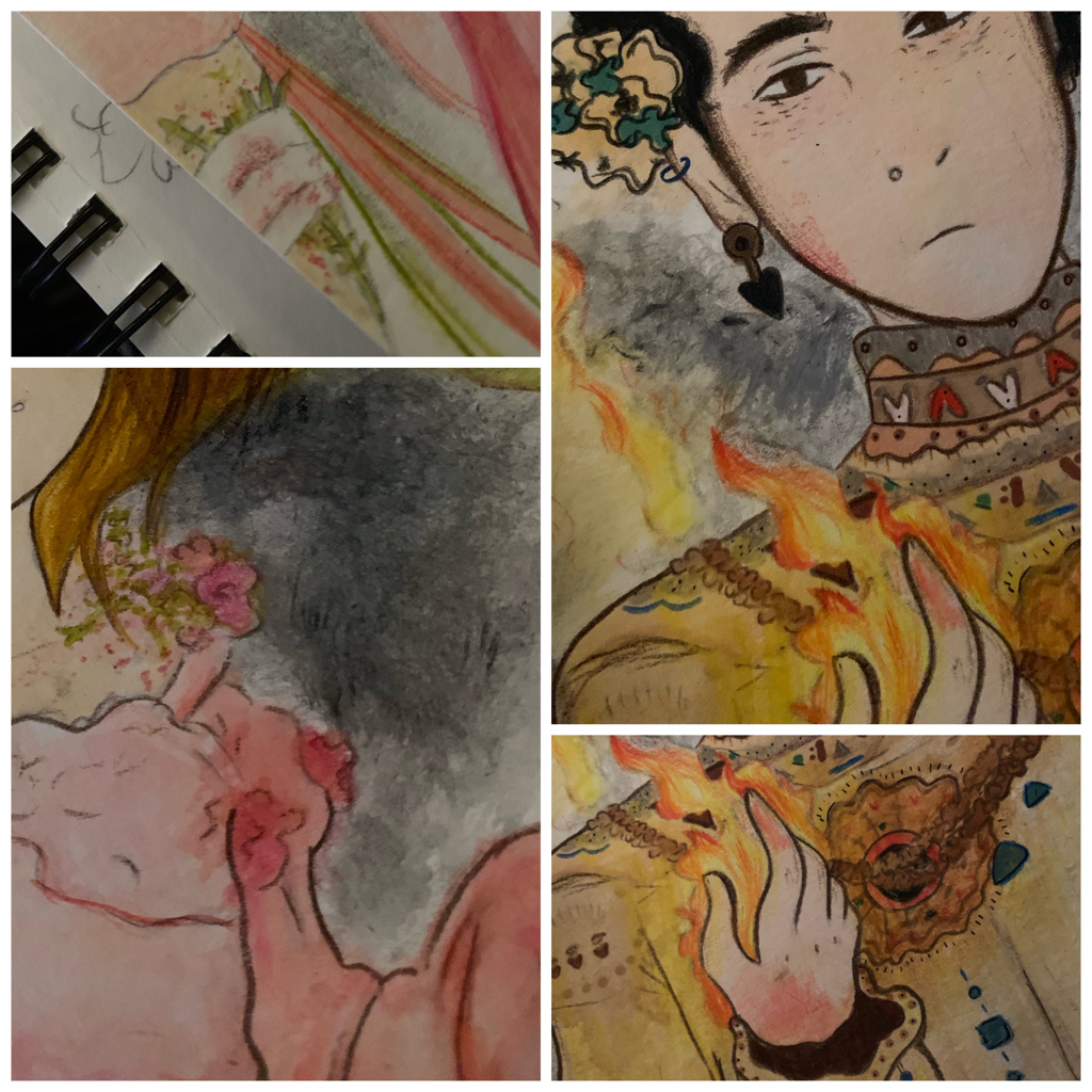
You can see the type of watercolor paper I used, and it's size, to the right. |
|
|
Starting the illustration, I needed an outline of my sketches onto the watercolor paper so I could color it in. This lead me into blowing up the two sketches on a phone editing app I used called PicsArt and ultimately printing them out. I used the pencil press method (I believe it might be referred to as that) with the drawings, tracing them out in pencil and then shading it onto the watercolor paper.
This would easily apply the outline onto the paper without me having to hassle a replica. I just liked how they looked already a lot. |
|
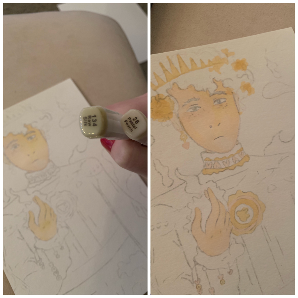
I began this piece by filling in the skin color first, as this is how I started out with my other illustrations. It was easy to carefully shape around the figure of his face with my marker, but it was specifically hard in terms of mixing the wet end with the pencil markings. This would shmear grey, and I was really unhappy with how that looked, so I tried my best to ese the marker from crease to corner. I used the markers "Raw Silk" and “Pastel Peach” to produce this.
|
|
Once I was satisfied with the skin tones, I lead more into designing the outfit and picking out the color schemes I'd use for his uniform. As a reference back to the Mucha's piece I was inspired from, I decided eventually on yellow, blue, and brown hues. It would also become complimentary to the fire I'd add later on. His personality seemed very crisp, a hard yellow, as well.
|
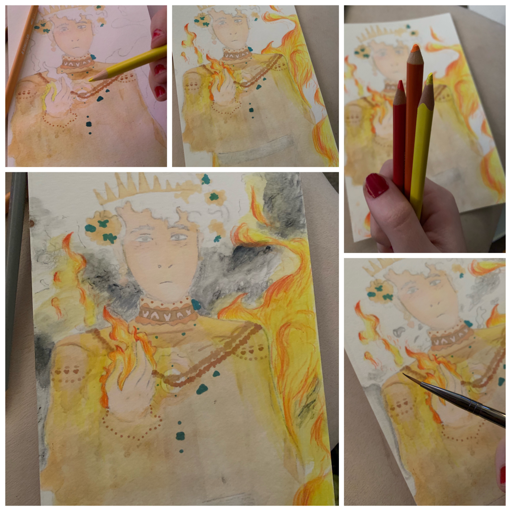
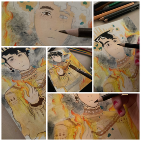
Having this upcoming prince accompanied by fire was important towards what this series meant to the audience. So, using different shades of red, orange, and yellow, while also using watercolors to create smoke in the background with grey and black, I incorporated this idea in.
I searched online for a few tutorials on how to create fire, or the illusion of actual fire, with the way you draw it on paper. I'm not that familiar with using colored pencils in this manner, so I tried first with the yellow to shape out and fill in the majority of fire. Next, I picked up the orange colored pencils and lightly brushed certain areas in the fire to create a hotter effect to it; it wouldn't just look plain yellow. Lastly, there was that harsh red placed at the tips of the fire, the highest portions of where it naturally flowed off of the prince. I finished off by covering my paint brush in a bit of water, then brushed around the flames and smoke to create a softer look. |
|
|
My next mode of annihilation for this piece lied in outlying the figure and adding small details. Throwing it back to Mucha’s piece, “Moet & Chandon”, I wanted to include a lot of detail in the clothing while also keeping the formality and look to the person wearing the clothing. I used a dark brown color pencil to outline the eyes, the hair, and the body of the prince. This was because, in Mucha’s piece, he also outlined the figures in a brownish color and I wanted to replicate that in mine. This meant that I was nearing the end of my piece, so I also had to add detail in his face in some areas like in the eye bags and the earrings and things like the texture on his skin.
I felt like there ended up being a strong unity in the way I placed colors in this piece, which is something I'm still enormously satisfied with. This had to be my favorite part of the process, as outlining sort of becomes equivalent to the bow on top to a piece. |
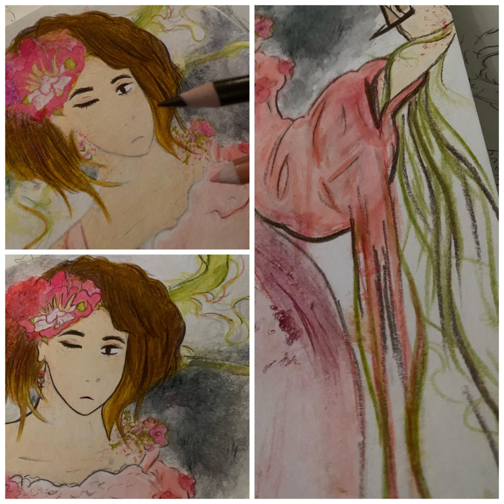
The next portion of my process is based in my second part of this series; the plant cursed princess.
|
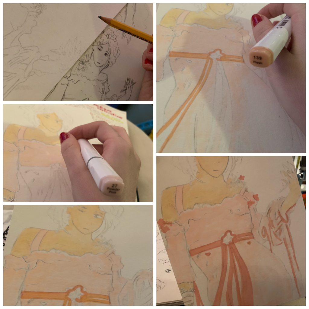
Reflecting off of how I did with the first piece, I again started off by filling in skin tone with the markers I had. I used the marker with the label called “Flesh”, as this seemed way more closer to the model I used from Mucha’s piece. Also in Mucha’s piece, he uses softer pink hues and even lightened-like red colors to complement the fragile ness of the female in focus. I decided to go with my recreation in the same way where the flowers, and the harsh marks they made on her skin, would cancel out that soft and calm appeal to the work.
There’d still be this silent batch of harmony in the form of my piece, however. This would lie in the yellow and almost sun kissed skin tones of the princess around the variations of pink I’d add in with, at first, different types of markers I had of which you can see to right in the illustration. |
|
|
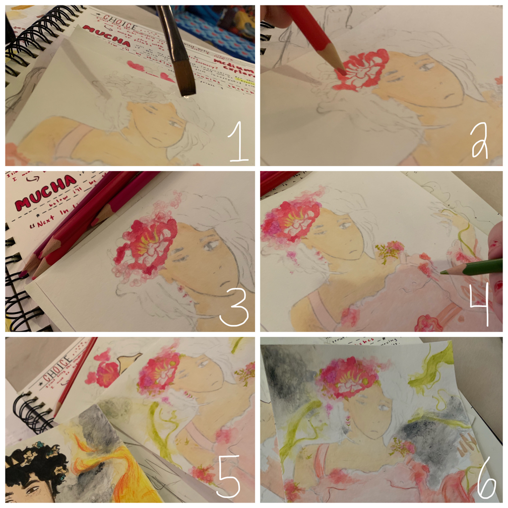
At this point, I began experimenting and carefully filling in pieces of my work with watercolors. This was done in the following order and way as numbered below and to the left.
|
|
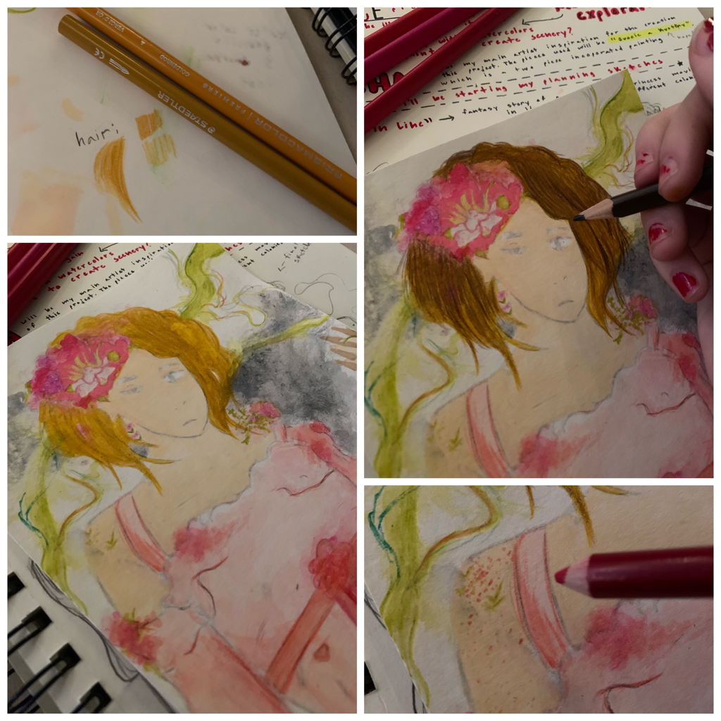
At this point, I was getting around to coloring in and picking out colors for the hair the princess. In Mucha’s piece, this female figure had blonder hair than mine, but I wanted to mix both brown and a lighter brown to test out what I could do with colored pencils for for the use. It also looked nicer in my opinion and after using only black and purple with my last piece for the haircolor, I wanted to experiment with browns and so forth. To the right of this, you can see me use the same brown color pencil that I used before to get an alike outline look from Mucha’s piece with mine.
|
|
|
The last part of this project was important because I wanted to connect back to the original idea I had for both my figures. Both of them are next in line to the throne, and that’s a big responsibility to any upcoming a prince or princess of their kind. Perhaps I get a little too into the story of my art pieces, but I wanted to show how these people of royalty have to deal with leader ship well also fending against their own curses and insecurities. For the prince, I added burn marks on his cheek and on his hand to show his struggle with controlling fire and anything of the stores. As for the female, she has the ability to sprout all types of plants from her skin, but it’s to the point of where it occurs in a brutal allergic reaction, so she is permanently cursed.
|
|
Critique:
The following will be the compare and contrast of my pieces to their original inspiration; Mucha's "Moet & Chandon".
|
Similarities May Include:
- We're both putting emphasis on our centered figure. Per usual of Mucha's work, there's a single individual in focus.
- Our figures hold the same position and pose. I tried to replicate the formal silence of the female in Mucha's with the prince in my piece, so they look a lot alike. - Mucha's piece and mine use detail to enhance a sense of royalty and formality. I practiced detail around the clothing area like Mucha did in his piece to the right. I wanted my prince to look more like his kind, to wear a suit full of life. |
|
Differences May Include:
- The piece is a painting rather than a piece created with marker and colored pencil like mine. This difference in medium gives us a different set of texture, hue, and overall form of things and figures in the piece. Plus, his piece has more hard cut colors and edges, while mine feels softer in some areas and rougher in others.
- My piece uses a warmer shade of color than the flat, dull colors used in Mucha's. As you can see, Mucha's piece to the right still uses those quant yellow, blue, brown, and reddish hues like I incoporated in mine, but there's a a constrast in vibrancy. My piece has a brighter look to it from the intense fire, while Mucha's piece seems to be set in stone. There's less movement in Mucha's.
- My piece is pretty much more of a story like creation. I usually inflict personal backstory and character design in my art pieces to get me more interested i what I'm doing, and this is a relevant difference in both of our pieces. Possibly Mucha did have a mind conspired backstory to it like mine, but mine is a lot more fairytail like, medieval, and I don't feel that same vibe in his work.
|
Similarities May Include:
- We both have direct focus on a female figure. Mucha's focus is a female, as is mine, and that really completes the elegance of both our works.
- We both use alike, soft hues. I made it my goal to also stick with pink hues that were alike to the piece at the right. I wanted it to look equally soft. - Mucha's piece and mine have the same posing for our characters. Putting aside the face expressions of our females, they're both posed in the same (ish) way to still give off that fancy, gentle look I was wishing to keep strong in my work. I ljust iked how Mucha's female was posed. |
|
Differences May Include:
- Mucha's piece doesn't have the same disruption in flaw like mine does. As said earlier, I back up most of my art pieces with backstory so I can indulge more in their creation (I've just always done this, ever since I was real young). That being said, my female character takes on the flower theme from Mucha's by exemplifying it into a curse for my princess.
- My piece, although trying at the same colors, is brighter and more warm than Mucha's in hue variation. Since the prince is near by the princess in this shot, his flames reflect more warmer and heated tones onto her figure. This is where the difference bloomed.
- My piece, although trying at the same colors, is brighter and more warm than Mucha's in hue variation. Since the prince is near by the princess in this shot, his flames reflect more warmer and heated tones onto her figure. This is where the difference bloomed.
Reflection:
In the truest sense, this illustration series was for me to get my style to expand farther than it’s been. As mentioned a lot in my past art pieces, I enjoy drawing quite a lot in my daily life, leading to frequent experimentation with styles. There’s always been this dream of mine to create my own comic or animation someday based on the characters I’ve held inside my mind for fracases... It’s a little imaginative at the moment, it’s hard to picture myself in that position even though I’ve already had so much built inside my brain, but doing pieces like this helps me expand character creation and configuration.
My piece explores the troubles of teens falling into the position they were “set in stone” to take over. In this case, a prince and princess are expected to be the queen and king of their opposing kingdoms, but, with the nature of their cursed personas, it’s tough shoes to fill easily. One must put aside their difficulties to sit in a position that’s been so high up for all this time, and I think that’s genuine in the small details of my piece. I tried to formulate a serious motif in the way they both formally stand, while also including the small details of burn marks and blood splotches on skin to show the bad side to it all.
My favorite part about this piece lies in the faces, the fire in the princess piece, and I really liked the female piece a lot more than the males because I did it knowing well enough how to prince’s turned out... I could rethink how I’d take this one on. If I was to change anything, I would most likely touch up some portions of the male’s figure because I feel that the princess looks softer than the male, and I want them to equal out. Overall, I’m pretty proud of what I’ve produced, and I am simultaneously excited to see where my artistic style goes in the future. I’ve got a lot to work on and develop, I’m so close to being somewhere new again, and that’s so incredible to realize.
Connecting to the ACT:
1.) Clearly explain how you are able to identify the cause-effect relationships between your inspiration and its effect upon your artwork:
Mucha’s pieces have a more formal and royal-like look to them, a delicacy in the way he draws out females and makes them sort of beautify to the viewer. I wanted to practice my own artistic style alongside his because of my interest sophomore year with Mucha’s artwork. He’s surely got to be one of my favorite artists.
2.) What is the overall approach ( point of view ) the author ( from your research ) has regarding the topic of your inspiration?
because pieces didn’t really have a lot of backstory and they kind of just do it as advertisement or something of the sort for the audience. In my case, I wanted to expand on that, and see how I could make his formal, structured characters have a lot more background to what they’re doing and who they are.
3.) What kind of generalizations and conclusions have you discovered about people, ideas, cultures, etc. while you researched your inspiration?
Sometimes you’re not ready to take a new positions in life and that’s okay. Everyone is still human, they still have flaws and inner curses to their persona, but life will go on as is.
4.) What was the central idea or theme around your inspirational research?
The people in charge are still scared, cursed human beings too. Everyone’s got their own set of insecurities, even hidden behind formality.
5.) What kind of inferences ( conclusions reached on the basis of evidence and reasoning ) did you make while reading your research?
I’ve learned new ways to expand my personal art style, and I wish to expand this more in the future, if I may, in my art class.
CITATIONS ( DONE IN MLA FORMAT )
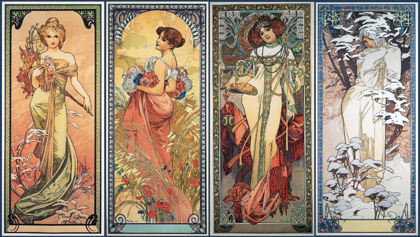
“Alberti's Window.” Albertis Window Alphonse Muchas Winter and Christmas Images Comments, albertis-window.com/2014/12/alphonse-muchas-winter-and-christmas-images/.
“Moët & Chandon – Dry Imperial.” Shop, shop.mucha.cz/en/moet-chandon-dry-imperial.
“Moët & Chandon – White Star.” Shop, shop.mucha.cz/en/moet-chandon-white-star.
“Moët & Chandon – Dry Imperial.” Shop, shop.mucha.cz/en/moet-chandon-dry-imperial.
“Moët & Chandon – White Star.” Shop, shop.mucha.cz/en/moet-chandon-white-star.
