a r t w o r k : b l o c k p r i n t
|
Title: "We're Being Abducted, Jan!"
Size: 7 by 10 inches Medium: Block Print Completion: January 2019 |
|
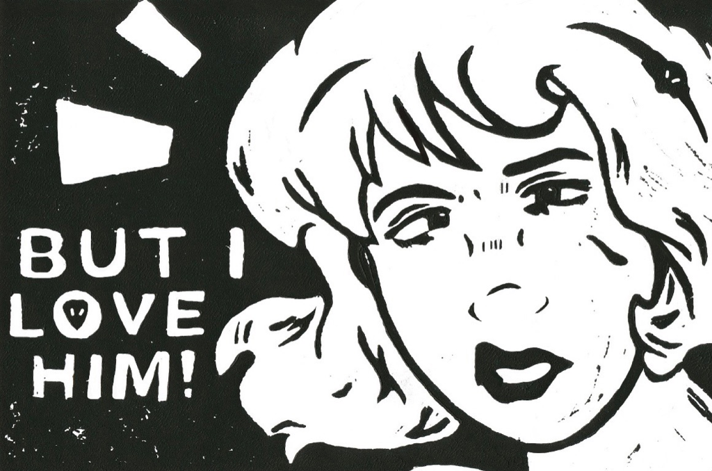
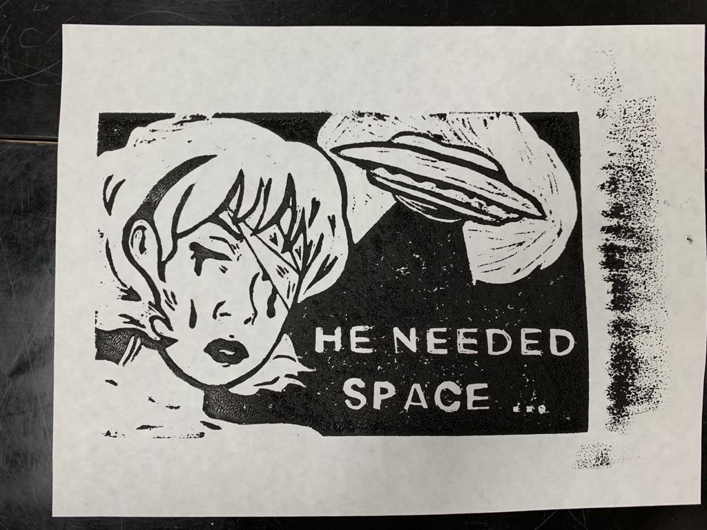
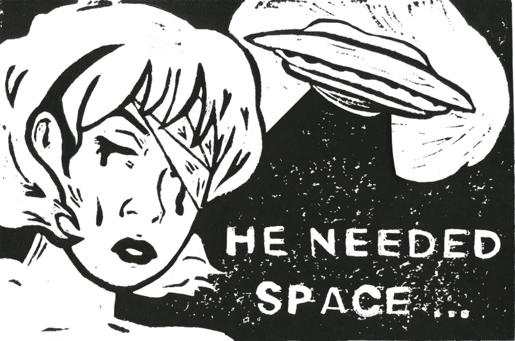
Title: "Jan, It Ate The Dog!"
Size: 7 by 10 inches Medium: Block Print Completion: January 2019 |

|
Exhibition Text:
My two part "Spaced Out" series, complimentary to the Pop Art movement and the style of Roy Lichtenstein's artwork, is a block printing piece surrounded around the naive-nature of a teenage girl in love. I over-exemplified my personal endearment with the paranormal, aliens per say, and told a story about a teenager who is being abducted by aliens alongside her family. The issue is, she's too distracted by her complete obsession with said aliens to take the situation at all seriously.
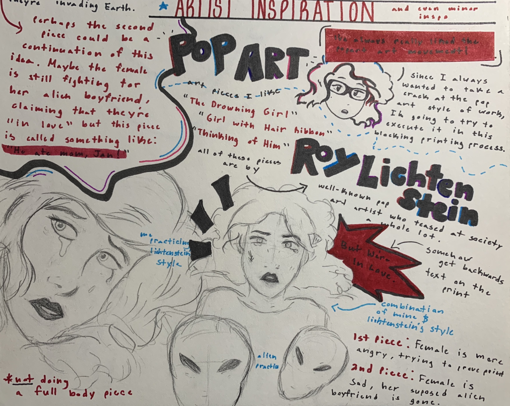
Inspiration:
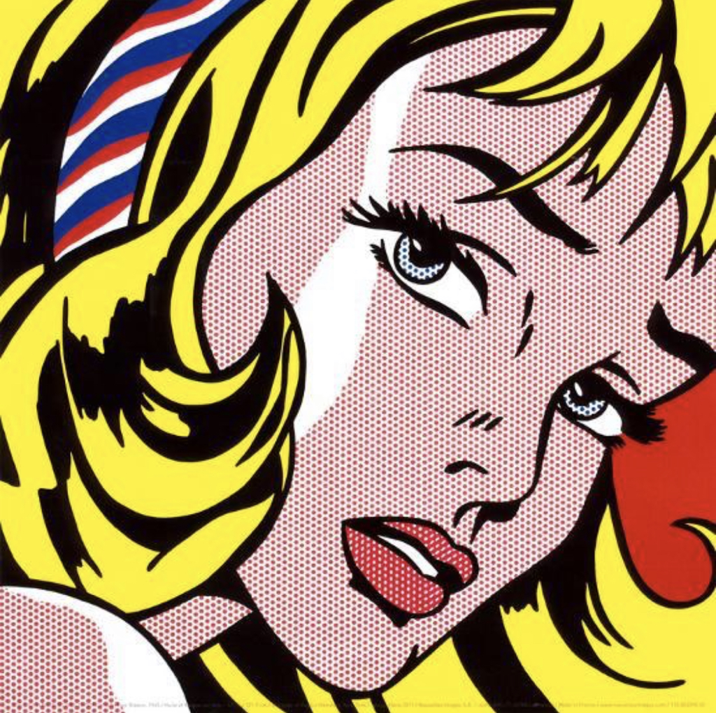
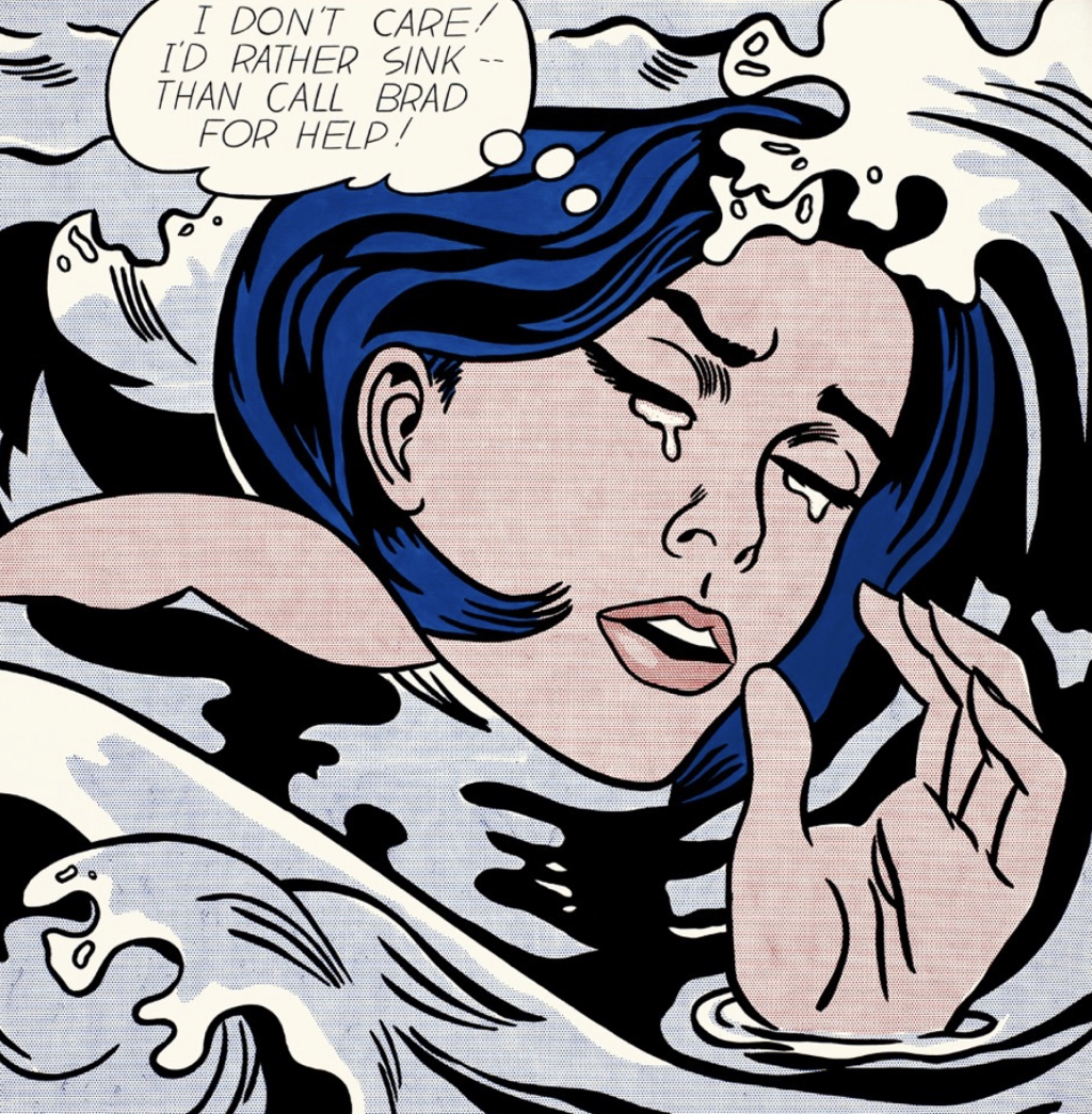
These were two major pieces of Lichtenstein's that truly inspired the way my two final prints would look. The left is "Girl with Hair Ribbon" and the right is "Drowning Girl".
|
Artist In Focus: Roy Lichtenstein
Roy Lichtenstein is a widely acknowledged Pop art artist who used his inspirations of comic, media, and advertising to produce a wide array of art pieces of society, His work, as shown to the left, usually used hue, form, shape, and an overall unique continuation of character to create story in each of his art works. He usually took on his ideas in a painting form, something that isn't quite included in the transformation of a block printing piece, but I wanted to finally do a piece around an art movement I am enormously drawn to. |
|
Beside the artistic composure of Lichtenstein, my other inspiration was more personally composed. I chose to link into my fascination with the paranormal; more directly, aliens. I'm known to be a little overzealous in my family when it becomes to things such as outer space or aliens. That being said, I wanted to incorporate my usual overdramatic nature in an art movement and style that captures it very well.
It became my goal to create a series of two pieces that'll capture the naive and overall odd manner some people will go to when it comes to obsessions. In my pieces, I wanted to give ground to a satire filled idea, of a delusional person who would fall strangely head over heels for, what sounds like, evil and malicious beings from another world. |
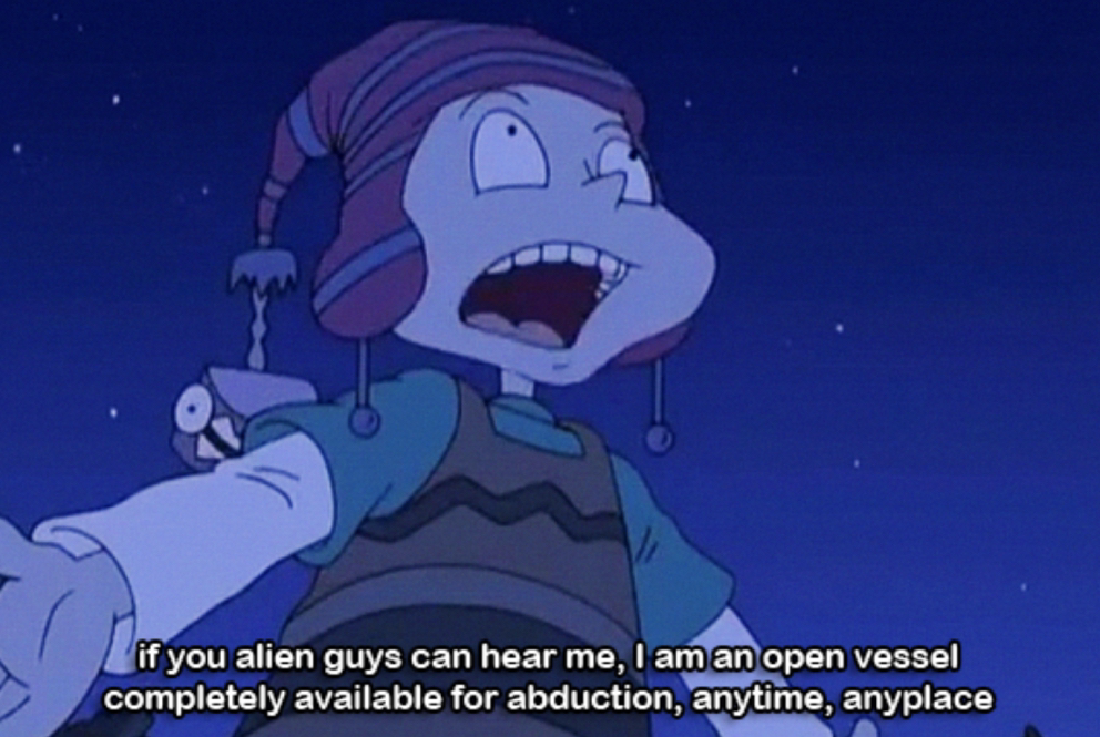
This scene from the old Nickelodeon show "All Grown Up" is the kind of humoristic take I was looking to reach in my pieces.
|
Planning:
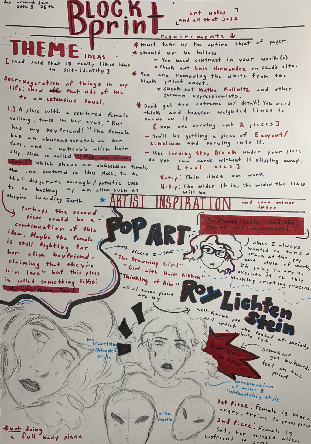
|
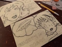
Close up of Journal/Planning Page 1
To the left is a brief showing of how I tested out Lichtenstein's style of art in my own hands. I added my own usual flowy, space considered design with the hair.
|
These first pages of notes consisted of many things that would later fly into my two sketches for the Linoleum sheet...
|
|
The two sketches to the right will both be the ones I'm planning to carve into my linoleum sheet.
You can read the notes on the page to see why was added where, but the main idea of this piece is about a naive teenager's approach to aliens abducting her and her family. She's blinded by her own obsession, however, so she sees nothing wrong in the matter because "she's in love". |

Journal/Planning Page 3
|
Journal/Planning Page 4
|
Experimentation:
The following are photos I took of myself to analyze facial expression patterns, and to practice drawing emotion into my sketches.
|
Per usual, I work best when looking at real life examples. I decided to reflect off my own reflections of both "hurt" and even "mild anger" to formulate the way the female in my drawing would look. I studied the shape of my facial features and the overall form of the teenage female face so the sketches wouldn't turn out so wonky in comparison.
|
|
As seen in my planning pages above, you can see a direct, rather small sketch I did of one of my facial expressions. It had the feeling I wanted the first final sketch to have when I'd draw it large and formally later on. This was only the tip of the iceberg for how my original idea would play out soon enough in the final product. Using line and form for this would be of value.
Process:
My first approach to this entire product was in reaching the goal of a pencil sketch on the given Linoleum board. This lead me to thinking back to part art projects and analyzing what would work best for doing this.
I honestly wasn't feeling like resketching out what I had, so I decided on printing out copies of my two sketches, carefully cutting them out so they'd be the direct size of the Linoleum sheets, and then I'd start to trace it on in the smoothest manner possible.
I honestly wasn't feeling like resketching out what I had, so I decided on printing out copies of my two sketches, carefully cutting them out so they'd be the direct size of the Linoleum sheets, and then I'd start to trace it on in the smoothest manner possible.
|
As stated above, I used a pencil and carefully traced over the black parts of my planning sketches with lead. Later on I could easily shade over the back side of the printed out copy, while it'd be on top of the linoleum board, and it'll slightly copy onto it. It's quicker than redrawing it, at least for me.
|
|

|
|
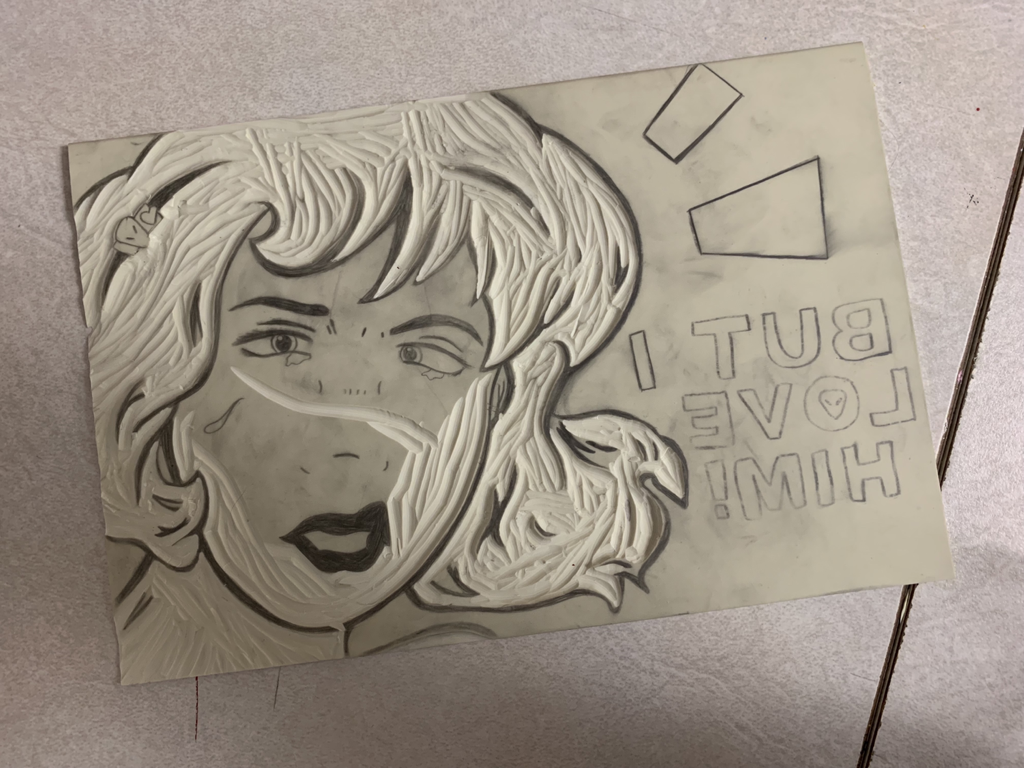
Doing this lead graphite transfer method onto the linoleum turned out very great for me. I did have a lot of blotchy spots though, however, so I went back in and traced the areas needed so everything would be clear for when I'd carve in the near future. I also revised the form of this piece in hopes to balance out neatly where the black and white would contrast in finalization.
|
|
|
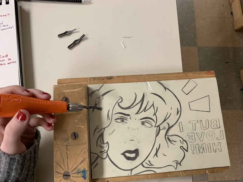
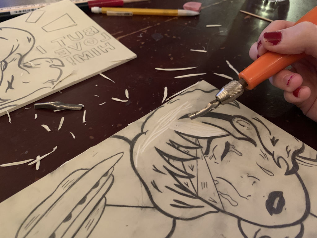
Admittedly, the entire carving process was nothing of what I expected it to be. My unfamiliarity with the medium and tools at hand didn't exactly help my strength in carving, but I tried my best to keep in tact as I went along. I ended up using the following materials for certain things:
in the white that I carved out. I'd use this more around the eyes and inside the lips. In contrast, the U Tip Carving Tool was used mostly in the hair and skin of the teenager; as this created thicker lines. |
|
|
|
|
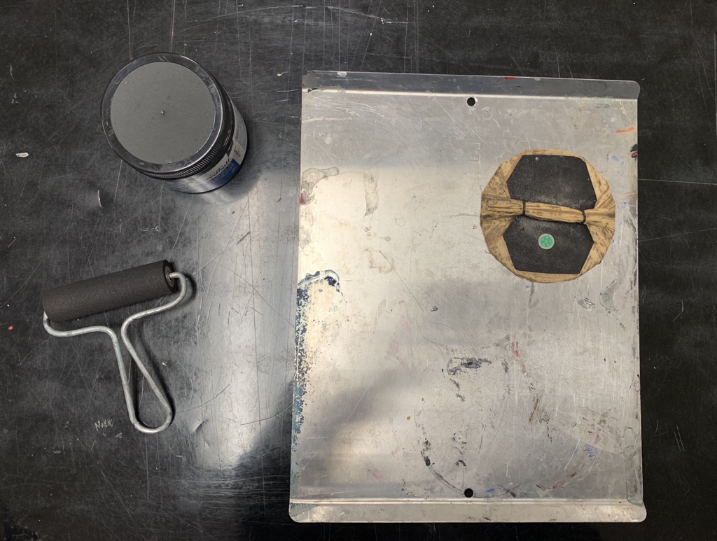
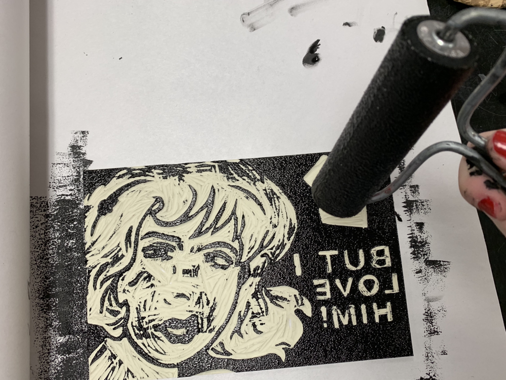
Taking a relieved step back from carving, I finally entered the actually Block Printing Process. As seen to the left, I gathered the following materials together for the process... I used black ink, a Baren (for pushing the piece on paper), a Brayer (this to get the ink on my linoleum carvings), and then a plate to soak the roller in with black ink (this would be spread on the plate).
|
|
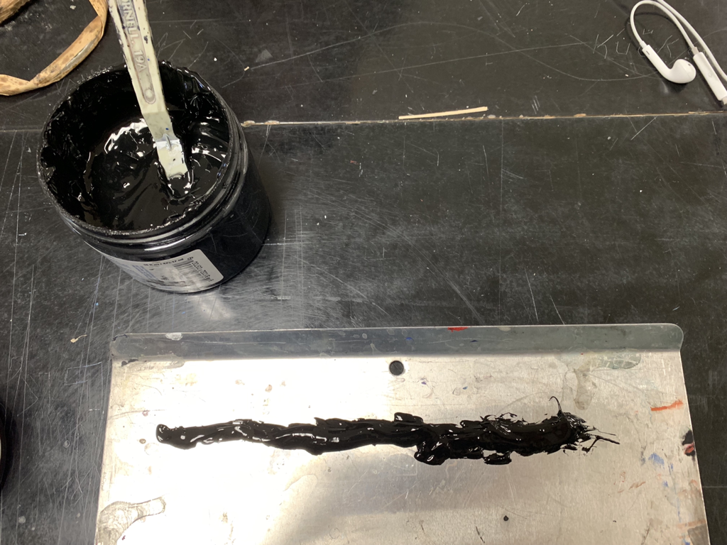
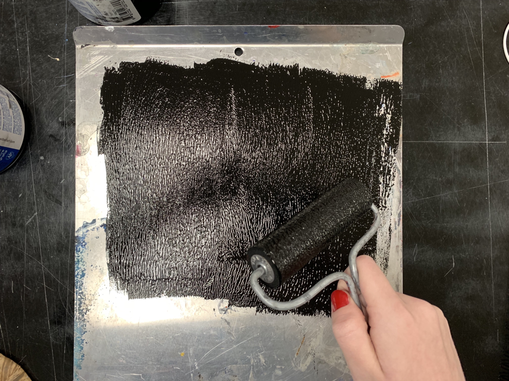
Spreading a good amount of ink on my metal plate, I first began by rolling the paint roller in the substance. When it reached a preferred level of ink I started to roll it onto one of my Linoleum carvings. I spread it til it met every area I wished to be black in the final product.
|
|
|
|
|
|
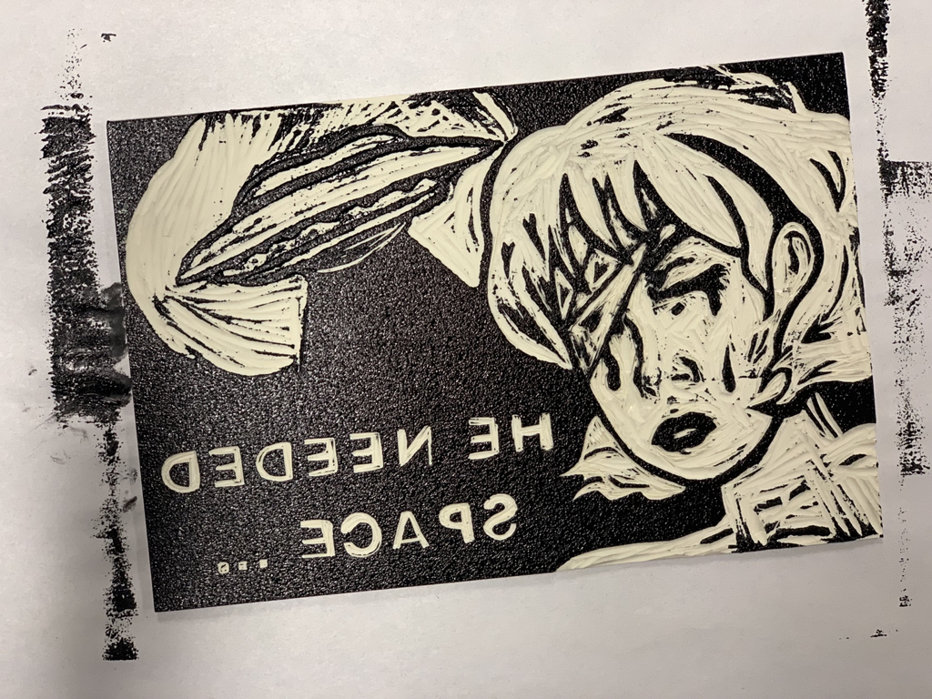
After this, I gained a blank, white sheet of paper and centered it on top of the inked linoleum carving. I used the hand presser tool to firmly, using enough power for the ink, to transfer onto the paper as an actual print. I was nervous to release the piece, but soon enough I did.
|
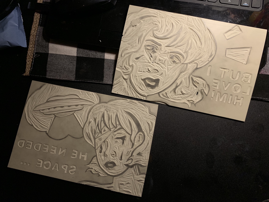
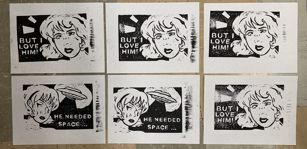
This process was repeated multiple times until I ended up receiving the looks I wanted for the prints.
This is where I completed the Block Printing Process, and came out with a few different varieties of prints. I reflected on which of the group I ended up liking the most, then discarded the others so I could only narrow my focus on the chosen ones.
Critique:
As always in comparing and contrasting the artist from the artist's inspiration, Roy Lichtenstein and I ended up having a very equal number of each sides. This is where that will be more specifically identified.


|
Similarities May Include:
- We're both very celebratory of the Pop Art Movement! Lichtenstein is very well known for his association in the movement as a whole, so I also tried to link into that bigger picture and see if I could nail down some of the values these artists held.
- Lichtenstein and I both used women in our pieces. In his to the left, he uses the female form to convey certain messages and value to his work overall. Mine does the same; putting emphasis on a female main character. - We both narrow the focus in on our main subject's. Lichtenstein and I went for the neck and up for the female's used in both of our art pieces as a main form. - We both overdramatize and, kind of, "tease" at society. There's in ironic nature in Lichtenstein's "Drowning Girl" and my two pieces about how naive and odd humans can be at. |

|
Differences May Include:
- Lichtenstein's pieces give a more "old-generation" look of Pop Art than my two pieces do. My pieces take place in a more futuristic society; a time in the future where intelligent extraterrestrials have made their way to Earth for abduction.
- My piece is in black in white, a total contrast to how colorful and sometimes value drivingly bright Lichtenstein's work is. An example of this would be in the comparison of Lichtenstein's "Girl With Hair Ribbon" to my own work. Very different use of hue.
- Both of my pieces are made using the Block Printing art medium while Lichtenstein's pieces, more specifically these pieces, are created just by painting. It's what really drives a contrasting look in both of our works, as there's less flexibility with a carving tool than a paint brush. It will almost always automatically differ in style because of this.
Reflection:
My "Spaced Out" series incorporated a concept idea I've had for quite awhile in the art movement and style I wished for it to take. In a way, block printing seemed to capture the elegance of this well. I wanted to show the frustration, the light repressed fear in this teenager's facial expressions in the style Pop art usually takes, but also wanted to tell the story of obsession. The female in my story is love crazed in the worst way possible, and I felt like the ironic nature of falling in love in the worst possible time would best be expressed through my inspiration. And, it ended up turning out very nice! There was a stern unity in text and figure positioning in my piece, a nice contrast of the black and white created by this entire process, and overall I enjoyed the outcome. I actually ended up liking the final product of my second favorite piece more than the one I previously thought would look the best. This was surprising, but, overall, I thought that all of the time I took carving this out truly payed off in my favor.
During the process of this project, exhaustion overcame my weak body because of late night carving and retouching up the linoleum boards. It struck me in a funny way... I had to take a long break so I'd get some actual sleep for once because my eyes were blood shot... so that wasn't great. However, the pay off of the final product really made me happy. The hardest part had to be when I carved the eyes and lettering in my piece, and if I'd fix anything I'd try to rewire the way I drew it so it didn't turn out as smudgy. Beyond that, I liked how nice the pieces turned out, it made me extremely relieved, actually, since I was so nervous that the prints wouldn't turn out. This has have to be one of my favorite projects so far, minus all the troubles I experienced on the way, but I've learned a lot.
During the process of this project, exhaustion overcame my weak body because of late night carving and retouching up the linoleum boards. It struck me in a funny way... I had to take a long break so I'd get some actual sleep for once because my eyes were blood shot... so that wasn't great. However, the pay off of the final product really made me happy. The hardest part had to be when I carved the eyes and lettering in my piece, and if I'd fix anything I'd try to rewire the way I drew it so it didn't turn out as smudgy. Beyond that, I liked how nice the pieces turned out, it made me extremely relieved, actually, since I was so nervous that the prints wouldn't turn out. This has have to be one of my favorite projects so far, minus all the troubles I experienced on the way, but I've learned a lot.
Connecting to the ACT:
1.) Clearly explain how you are able to identify the cause-effect relationships between your inspiration and its effect upon your artwork:
The Pop Art Movement and pieces by Roy Lichtenstein used an interesting variety of shape, aesthetic, and overall balance of attention to the female focus in his art, and I decided to fabricate these unique concepts into my own ideas. It is seen in my knowledgable usage of line, the facial expressions and style of the female teenager, and also in the overall ironic nature of my piece.
2.) What is the overall approach ( point of view ) the author ( from your research ) has regarding the topic of your inspiration?
Roy Lichtenstein is one of the major, more recognizable artists of the Pop Art Movement, and his works usually use qualities from comic books, media, and other social advertising to create pieces that stand as a "dramatization of society". This connects straight to my topic as I also over over-intensify the obsession some people can have with things, whether they be deadly or plain random, and how far a human will go because of how devoted they are.
3.) What kind of generalizations and conclusions have you discovered about people, ideas, cultures, etc. while you researched your inspiration?
Obsession can control a human's morals and values because of how easily we get wrapped up in the aesthetics of things to become unknown to the seriousness of the situation.
4.) What was the central idea or theme around your inspirational research?
A teenage girl, blinded by the love she's gained for another alien, falls hesitant and defensive for the being, even though her and her family are at threat in the situation. In a way, the piece is about a strained obsession.
5.) What kind of inferences ( conclusions reached on the basis of evidence and reasoning ) did you make while reading your research?
I wanted to capture the skills and style of Pop Art, alongside linking into the ways teenage obsession can take over someone's life. In this instance, a teenager can easily be dazed by love.
CITATIONS ( DONE IN MLA FORMAT )
Preparedness, 1968 by Roy Lichtenstein, www.roylichtenstein.com/girl-with-hair-ribbon.jsp.
“MoMA Learning.” Lee Bontecou. Untitled. 1959 | MoMA, www.moma.org/learn/moma_learning/lichtenstein-drowning-girl-1963/.
“Rugrats; All Grown up!: Growing up Changes Everything.”
“MoMA Learning.” Lee Bontecou. Untitled. 1959 | MoMA, www.moma.org/learn/moma_learning/lichtenstein-drowning-girl-1963/.
“Rugrats; All Grown up!: Growing up Changes Everything.”
