n a m e o f a r t p i e c e : u n e x c u s e d a b s e n c e
|
Title: Unexcused Absence Size: 9 x 12 inches Medium: Block Print & (Canon Camera) Photography Completion: October 2019 |
Exhibition Text:
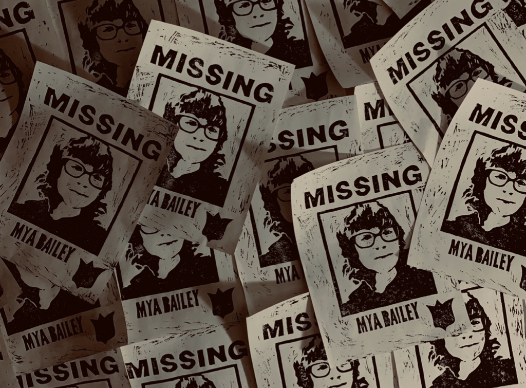
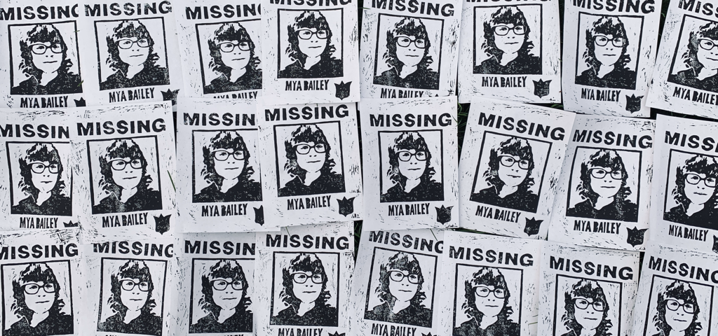
"Unexcused Absence," getting inspiration from actual missing persons posters and the photography expertise of both Jeff Wall and Francesca Woodman, explores the idea of personal alteration. My piece contains a spread of around 30 prints, created using ink on linoleum board, and it's supposed to capture my supposed individual disappearance in that particular look, haircut and style. By putting myself in front, it exemplifies me not genuinely being missing but more so who I used to be.
Inspirations:
|
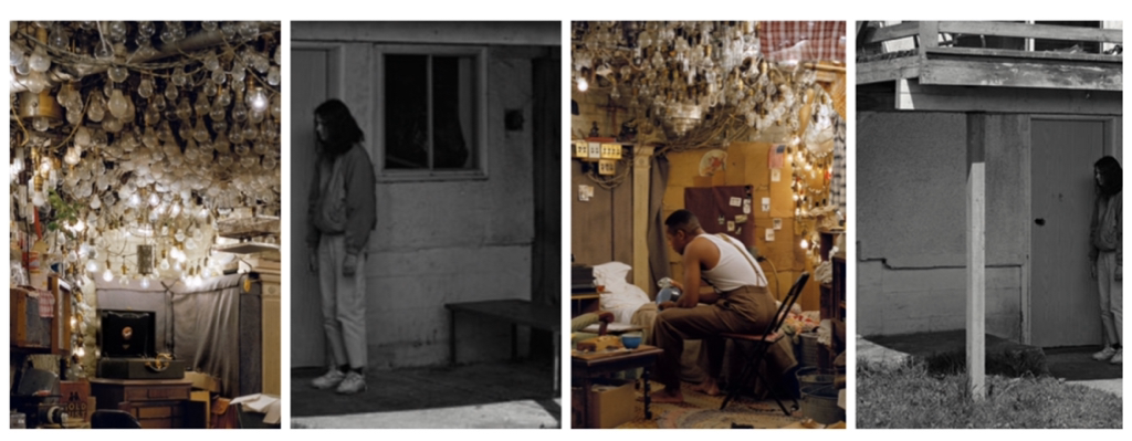
Artist In Focus: Jeff Wall
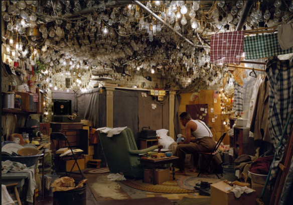
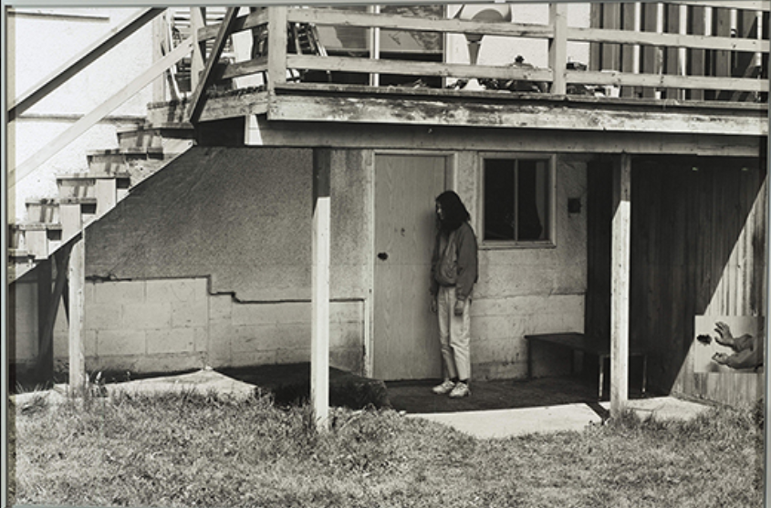
My goal for this project, even from the very beginning, was to incorporate a visual art piece of mine somehow in a photography-type setting, That being said, I looked into professional photography and artists who focused on camera work for a living, and came across Canadian artist Jeff Wall. He's known well for pieces that involve a wide spread back-lit, object-infested scenery beside a figure. |
|
|
Looking to his works to the right, I chose these as major inspirations for my project because of the uniqueness in setup. They have this dramatic atmosphere in them where the amount of objects and clutter only intensifies drama and/or intensity. They cause my eyes to travel from one area to another in pure seconds, the power given just by using movement as an important motif in your work.
|
|
|
The piece above to the right, first of the two, is a photograph named "After "Invisible Man" by Ralph Ellison, the Prologue" and then the other is another photograph taken by Wall labeled "Rear, 304 E 25 Ave." They share many qualities that I quite enjoy in photography. thus being incorporated as inspiration.
|
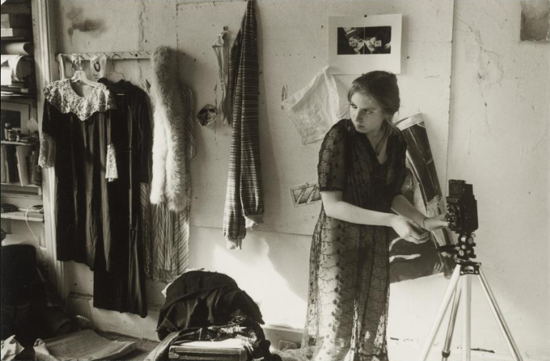
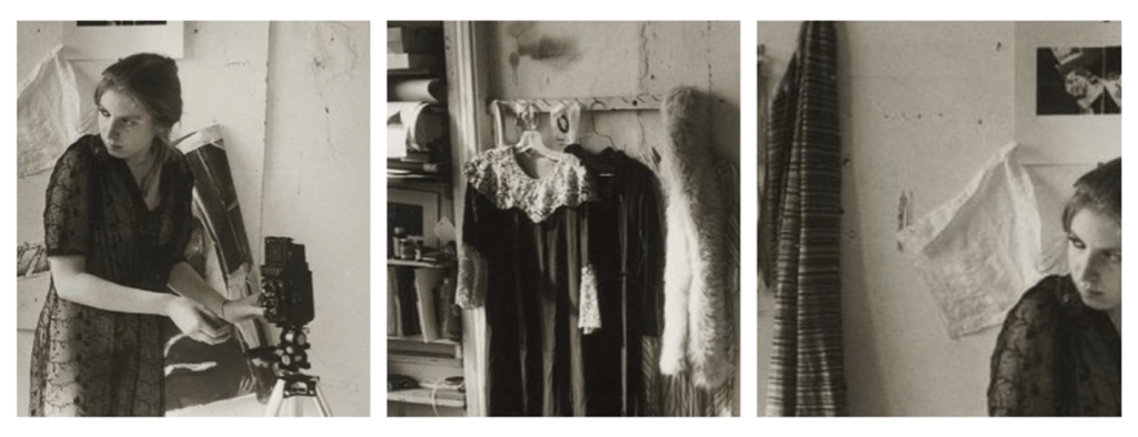
Artist In Focus: Francesca Woodman
Another camera-based artist that I looked into was American photographer Francesca Woodman, and her feminine based/black and white work. She uses the female figure more often than not, placing women in front of a certain surrounding that'll fully capture the wanted emotion of the photo, and I wanted to do something alike in my own work. Looking at both Wall and Woodman, my piece would focus on the power of scenery photography and the acquired emotion that a photo can have based on object/figure placement. |
|
The piece above to the right is named "Untitled, George Lange" while the other is a photograph unreleased professionally by Francesca Woodman; a personal photograph piece of her many private works, but everything about it just fascinates me. Female emphasis is a large value in her photography, I've noticed.
|
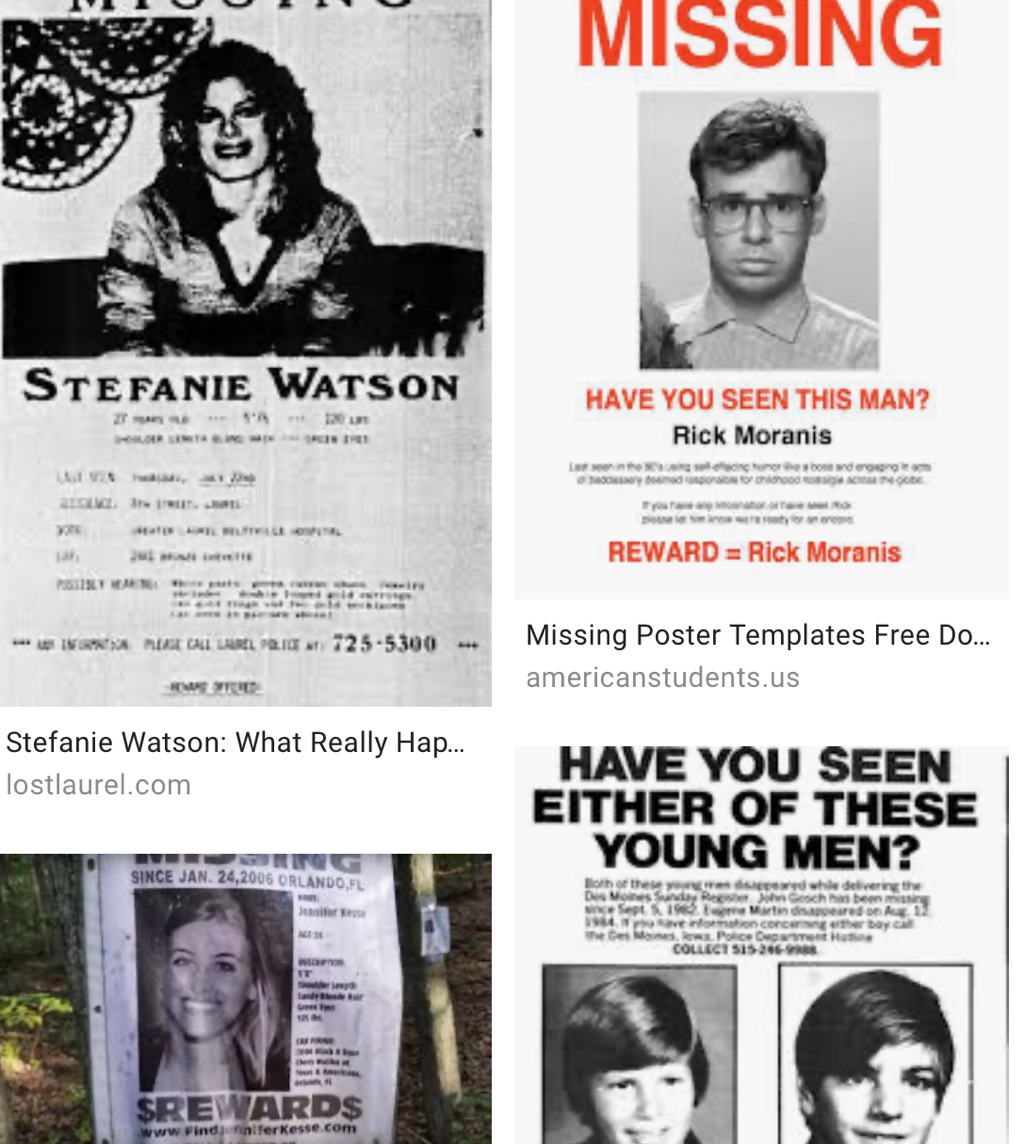
Other Inspiration - Missing Person Posters
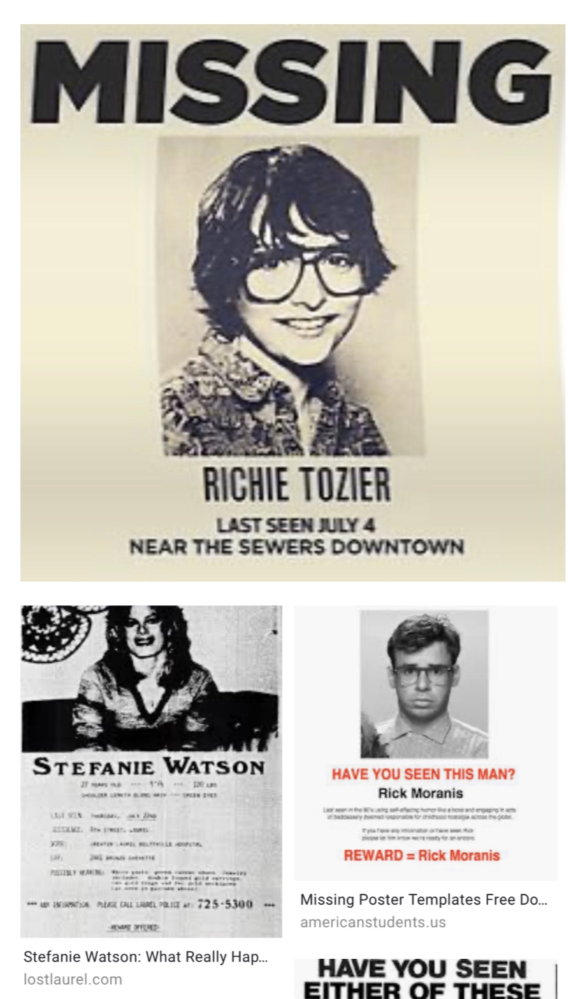
I thought about block prints and how messy the turnout can be at times with linoleum cuts on board, and rewired the art tool that would work that texture on paper in a more sufficient way... this is where I thought about Missing Person posters. I found inspiration in the old, 80's based posters that would be hung on outdoor structures for people who went missing... perhaps the subject matter is sad to use as direct inspiration, but I found myself curious to create my own.
It'd be unlawful to say that the idea didn't formulate itself in my head; Earlier this month I saw the movie "It: Chapter 2", one of my newfound favorite movies/series (alongside the first part in 2016 and the old 1990 movie), and a character I recognized with, Richie Tozier, goes through this state of panic when Pennywise, the demon haunting these kids, constructs a fake missing poster of the kid to taunt him.
|
The background for my piece is to tackle the concept of changing a small element of yourself on the outside for need of personal change—the effect of not breaking routine in such a long time—and how, although I look different than I did, that I'm still the same person. Looks don't specifically advocate for the person inside, as the two can exist separately. Also... I've just personally felt this detachment with my current hairstyle and have wanted to try out something entirely new for a while, but my parents have been sort of against it because of the stigmatization towards girls having shorter hairstyles so this is... a new step for me. Plus a value expression through the restyling of hair, so this project has a internal personal touch to it.
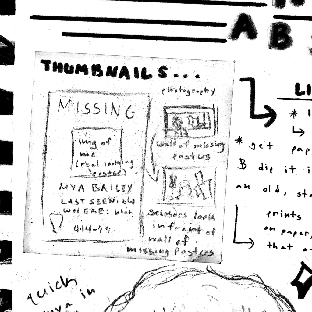
Planning for the Final Product:
|
When it came to initial planning, I started by listing off photographers and techniques used by past professional photographers in the past, so my photograph could spark an emotion of change in myself. There needed to be this irony of me still internally feeling the exact same contrary to my new hairstyle.
|
|
about value and contrast in black and white so that certain features would come through while shaping others just by the power of hue unity. My skin could stay white on paper if it was outlined by a contrasting black, thus showing my front facing portrait realistically on board when I'd print it out through the block print process.
Again, per usual, I explore my planning also in Experimentation. This is all shown below, and can be seen reflected above.
Experimentation:
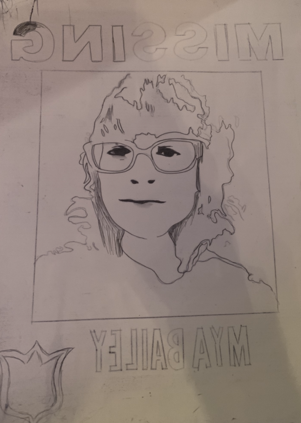
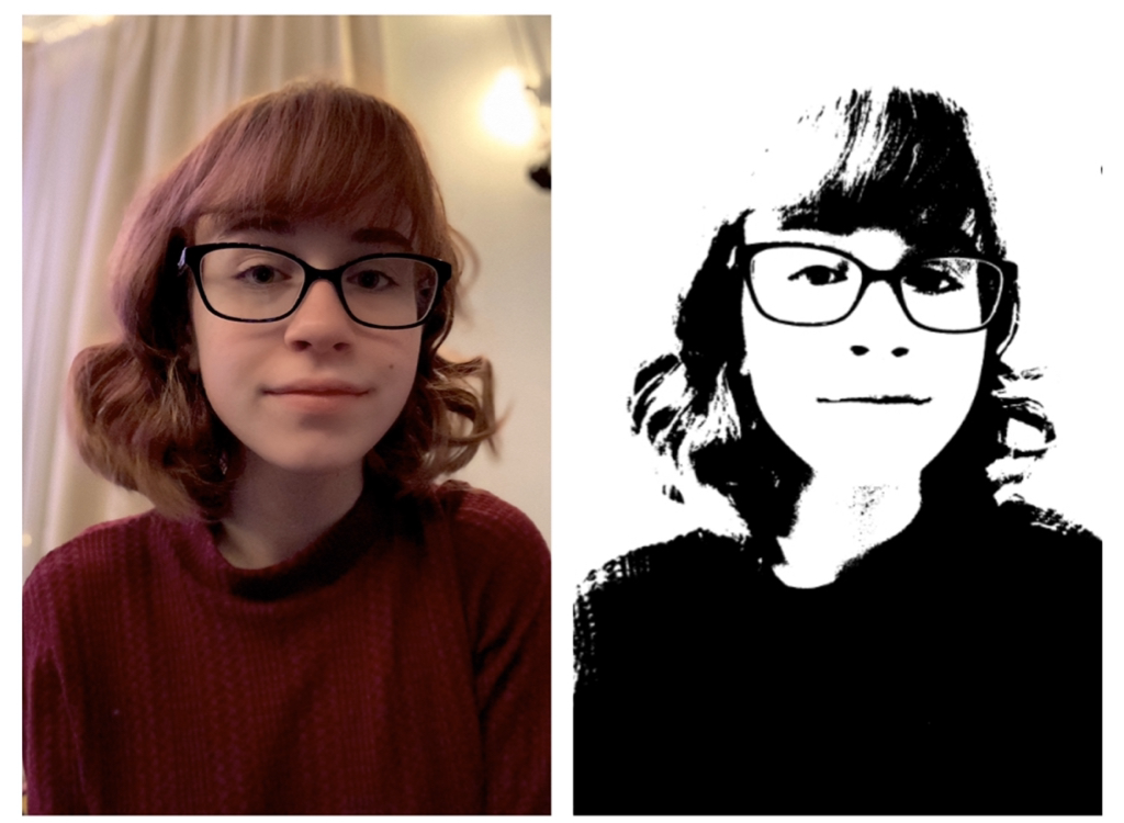
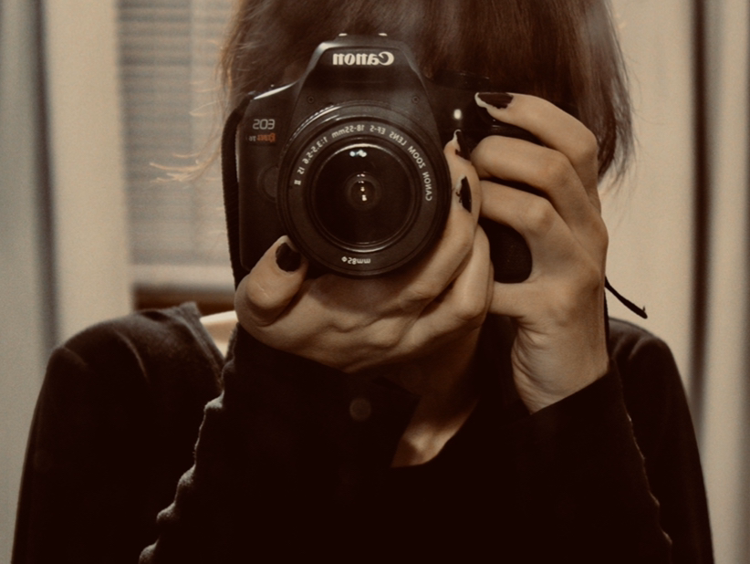
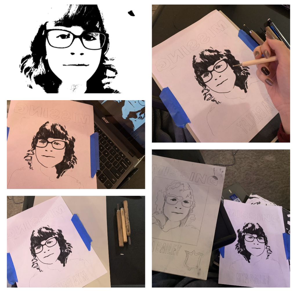
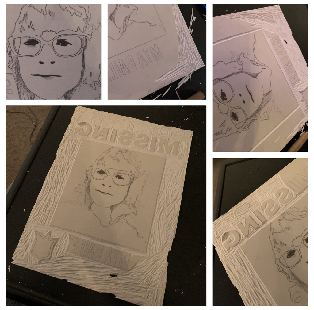
My first step towards experimentation was in getting my prints done. The plan was to make a set of around 30 prints on white paper, referencing 30 supposed Missing Posters of myself, and I wanted to hang these up on walling so I could place myself in front of it, That being said, I just turned the camera on myself at that moment in time and took a photo to see how I looked before change. You can see the photo for this below. Afterwards, I played around with online editing software and changed the value of the photo to black and white, intensified the appearance of lines, and then made my image more of a black and white silhouette to use.
|
To the left, here's what the image looked after tracing it onto my linoleum cut board. As seen to the right, I took a front facing portrait photo of myself that could visibly shape my features, especially my current hair style (bangs and all). I then played around with certain photographic factors in the photo, and got the result to the right of it... a black and white silhouetted copy of the image perfect for printing.
|
|
|
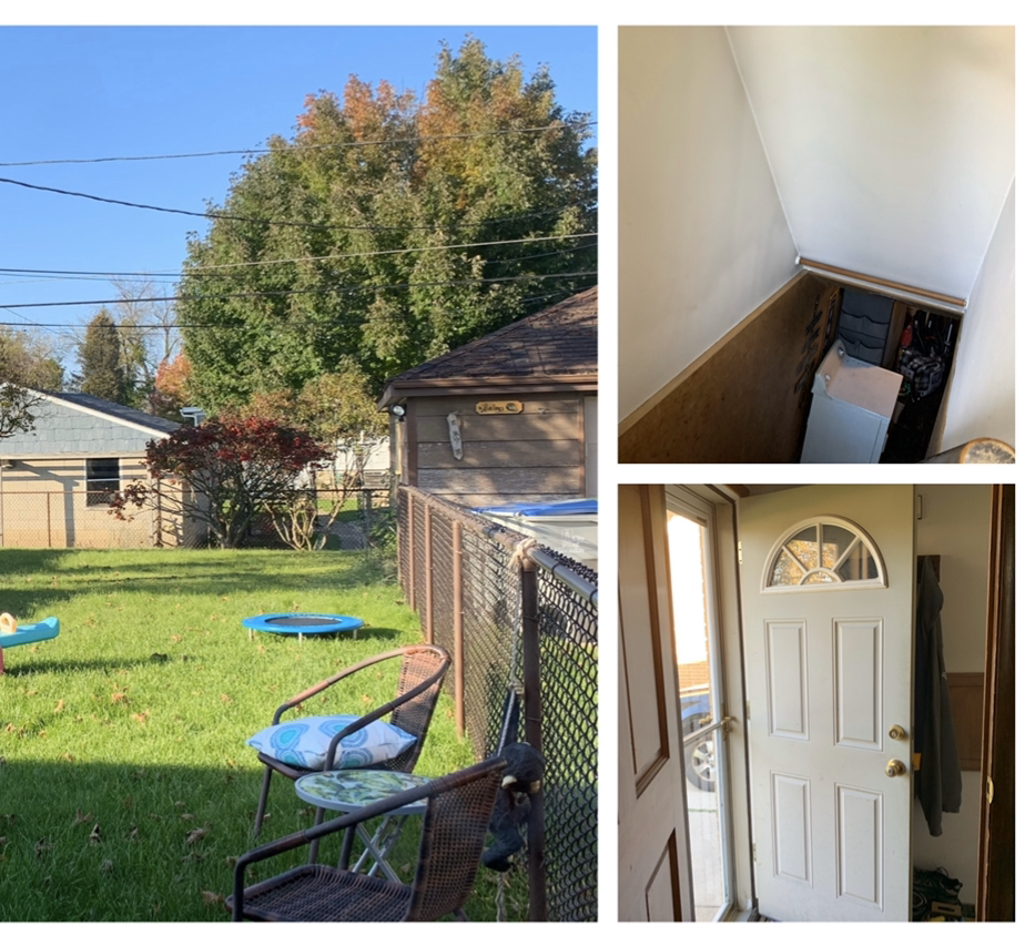
Experimentation towards taking the photo would be interesting. I'm scheduled to get a hair appointment the week of October 21st-26th, so getting the prints done first and setting up where the photo would be done had to come first. This is me looking around for good lighting locations before that final part of the process.
|
|
|
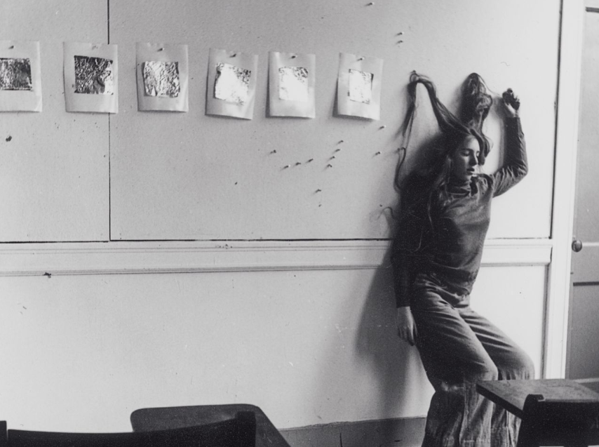
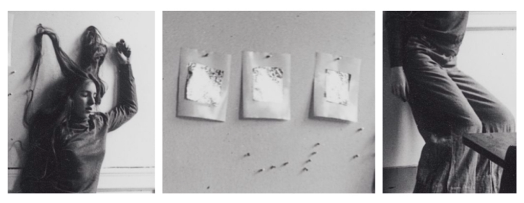
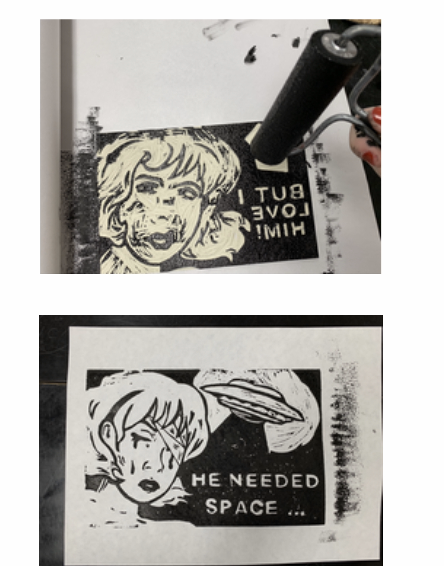
Experimentation with Medium: Block Printing & Photography To the left are some past block prints I did as of last year: Check out my "Spaced out" series. I'm more familiar with the medium than not, so I went into this project with a deep reflection towards my past. I knew how much ink I'd need to use and how to get it on with efficiency.
|
Process:
|
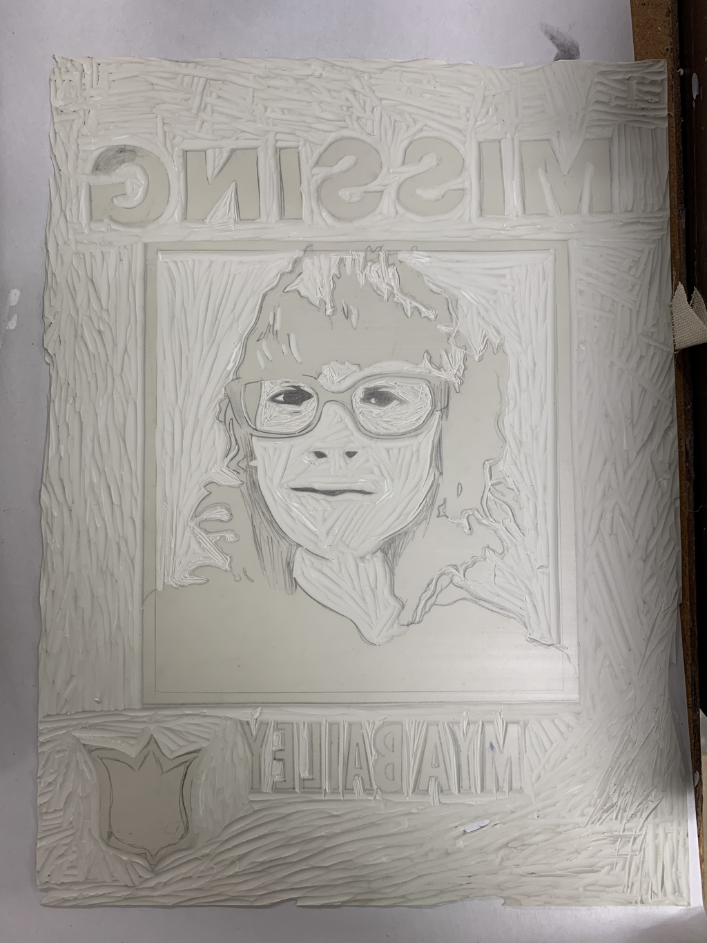
With my portrait recolored in a black and white silhouetted form, I could flip the image, draw it out, and then (using Carbon Copy paper) transfer the sketch onto my linoleum board. Shown to the left is me tweaking and transferring out the sketch onto the board. I kept having to take photos of what I was doing just so I could flip the image and see that proportions stayed true to themselves. If an eye or facial feature, even a letter, looked out of place in the final print I knew that my personal dissatisfaction would take over me. This, however, was a quicker part of the process with little to no difficulty besides small fixes to the eyes and lettering. When the line work transferred onto the board, I decided to color in some features just so I could distinguish what and what to not cut out when it came to the carving stage. |
|
Depending on the type of tip each tool had, I began to carve on the linoleum board. In this process, To the very right as my process of cutting and where on the board I started, and then to the right is my entire piece carved to completion. I made sure to consider the following as I worked through this process... - Using a Carving Stop Block could ease away from injury, as my piece wouldn't move around as much when carved into with force. |
|
- Carving Tool variation was also important for the process ahead of me (this would be very time consuming). The V Tip Carving Tool was used to create more thin lines for my final carved image. I'd use this more around the eyes and facial features, especially in the carving of letters. In contrast, the U Tip Carving Tool was used in the background area of the piece to replicate that blank outer side of a missing poster; as this created thicker, more wide lines.
|
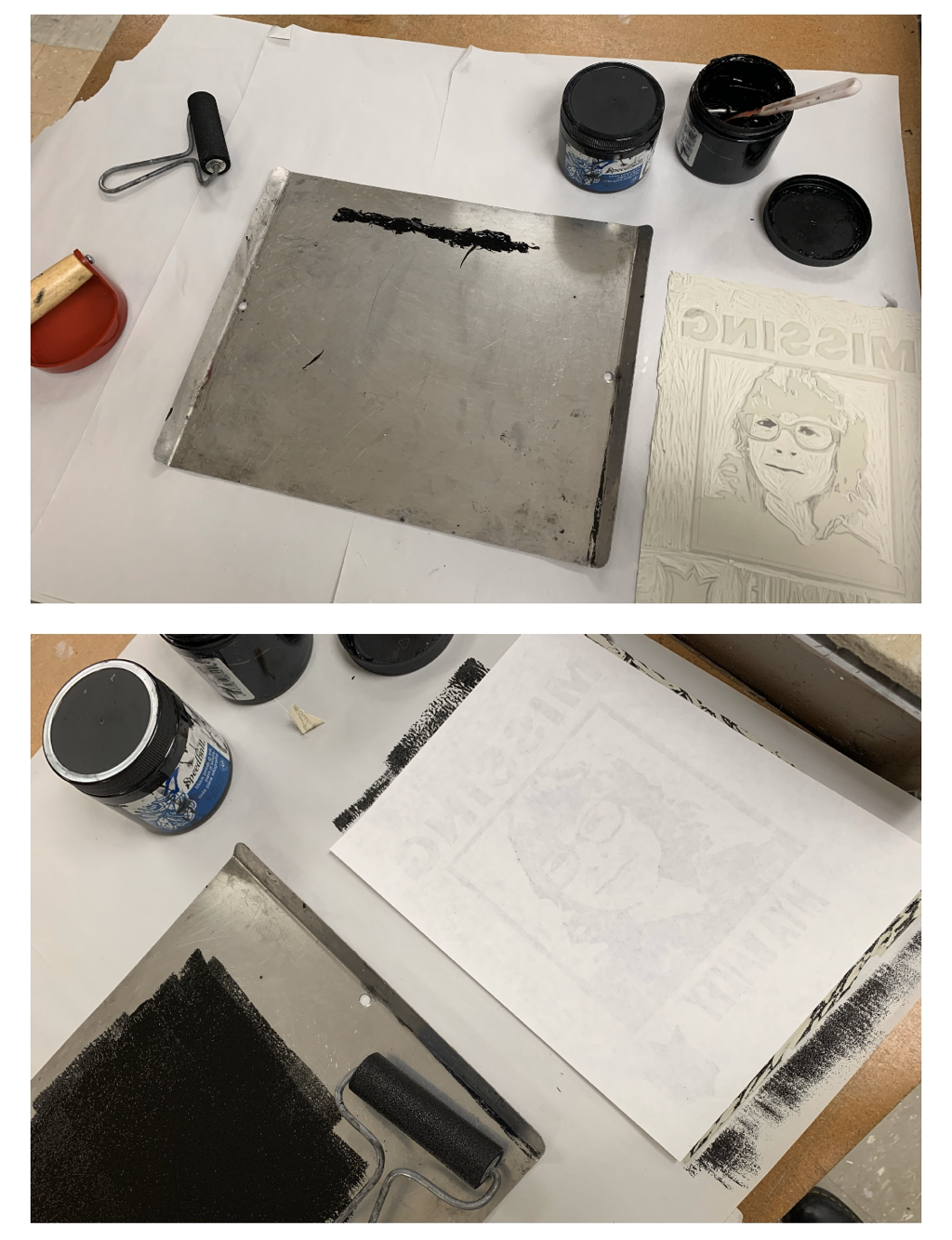
I could finally move from carving into the printing process. That being said, the following were used:
|
|
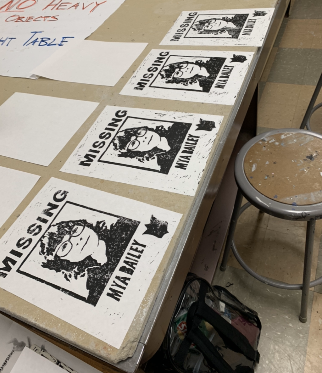
I used the hand presser tool, the Baren, to firmly transfer ink onto the paper as an actual print. I would press down harder and for longer periods of time to get more ink to pop up on the sheet. This is where I repeated the process 29-ish more times.
|
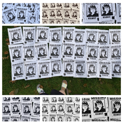
Before getting my new haircut, thus being the final step for this piece, I decided to go out and photograph my prints as a whole in natural lighting. I wanted to get a feel of how the posters looked all together, and I can confidently say, especially from the unsure looks of my mother who said the signs creeped her out, that the turnout would be really cool. The look of these all do seem oddly realistic, even with the messy look to printing and error in ink. They seem to attack the missing poster factor that I really wanted to attack in this piece. |
|
Critique:
This next area will be comparing my photographs to my inspirations: "The Prologue of 'Invisible Man'" and "Rear, 304 E 25 Ave." by Jeff Wall and "Untitled, George Lange" and "Unnamed" by Francesca Woodman. These pieces are located all below, the left two photos being Wall's and the right two being Woodman's work.
To the left: Jeff Wall's "The Prologue of 'Invisible Man' " and "Rear, 304 E 25 Ave" - To the right: Francesca Woodman's "Untitled, George Lange" and "Unnamed"

|
|
Similarities May Include:
- We're both putting emphasis on our centered, female figure. This falls more into the work done by Woodman, as we both use more feminine/girl-related themes and features to get a certain message across our work. This evokes a sense of emotion, in my piece more of a direct irony to the subject matter, so that falls significant.
- I, and both of the artists I used for inspiration, use clutter and atmosphere as a major element in our photograph. For me, my photograph lies in the areas around me covered in missing posters of myself to show the surroundings closing in on me, in a way. My being is surrounded by posters again to rub in the idea of personal irony and confusion. Their works also do this, especially looking into the top, all the way to the left, piece by Wall and how papers, lights, and excess clutter really sets the scene.
- We use value an contrast in photo filtering to emote a certain feeling. Especially seen in my process, I played around a lot with hue vibrancy and photo filters to test out how things would effect the viewer at hand. It was interesting to test black and white value in comparison to the photo having color, so I believe that the works fell significantly similar in that sense.
Differences May Include:
- I incorporated a separate art medium into this piece, using both the block printing process and photography to produce it. Their work, this being all of the pieces from my chosen artists of inspiration, used photography as a major motif. They took photos in the moment and played around with what the atmosphere naturally gave them. On the other hand, for me, I made missing posters strictly through the block printing process and put them up into an area to later photograph, and that's where things fall different. I had a hand in manipulation of the subject matter.
- My piece, compared to the others, focuses more on the concept of Irony. Although I suppose it might just be me making presumptions about their work, my piece focused more on Irony more often than not when I put it together. I wanted things to look off, feel off to the viewer, to show even my personal confusion to why I'm surrounded by such missing signs if I'm alive and well right there. Their work, although very pristine and nice to the eyes to follow around, do not seem to have the same feeling.
- My piece is a self portrait, in a way, after all. Alike to the majority of my artwork, having a personal touch and putting myself into it is something I value deeply. It goes along to my overall theme of teenage emotions and confusion to life as someone like me, and my work shows a small piece of something much bigger when put in correlation to their work on a personal level.
Reflection:
My art has always had this personal touch to it. Whether that be a natural thing that happens or not, I find it important to incorporate current events and feelings in my life into the art I'm working on at that very moment. With this piece, I had just seen It: Chapter 2 and, especially with the inspiration received from this cinematic masterpiece of a movie (my opinion is very strong on this one) that has qualities I quite enjoy in it, I wanted to create something that incorporated the idea of the world having out missing posters of yourself even though you aren't really missing. This is where I drew back to that Richie Tozier poster from the movie, and his reaction to the it since he was indeed not missing. Anyways, the meaning of my piece was the show how even as I change how I look, this being in my hairstyle, I'm still here and I'm still myself. There's irony again in me having missing signs of myself all around me as I'm actually living and breathing on the contrary.
I’ve got to say that my favorite part about this piece was how everything came together. Unity in art is such an important quality that I feel like even if there's an element of your work that doesn't look as good as you’d like, all together it can turn out to be something beautiful. I liked how the signs came together especially, as they look like actual missing person posters with the medium of Block Printing and how the ink turned out on paper. If I was to do this project again, I would probably test out other colors of ink. I wanted to try out a red hue, perhaps something scarlet-like, as that may emote a different feeling in my work.
I’ve got to say that my favorite part about this piece was how everything came together. Unity in art is such an important quality that I feel like even if there's an element of your work that doesn't look as good as you’d like, all together it can turn out to be something beautiful. I liked how the signs came together especially, as they look like actual missing person posters with the medium of Block Printing and how the ink turned out on paper. If I was to do this project again, I would probably test out other colors of ink. I wanted to try out a red hue, perhaps something scarlet-like, as that may emote a different feeling in my work.
Connecting to the ACT:
1.) Clearly explain how you are able to identify the cause-effect relationships between your inspiration and its effect upon your artwork:
Figuring out where to put a figure in contrast to the background was something that I found very important in the photographers that I was inspired by. They find a way to put the human figure in a certain mode of being, perhaps in finding a way of living beyond surroundings, and I wanted to show that in my piece with myself and the missing posters when they were pictured contrasting one another.
2.) What is the overall approach ( point of view ) the author ( from your research ) has regarding the topic of your inspiration?
Scenery and any by-standing figures in a photo can create a sense of strong Unity when incoporated together in a piece.
3.) What kind of generalizations and conclusions have you discovered about people, ideas, cultures, etc. while you researched your inspiration?
It depends on how things are set up to show a certain emotion or to emote a specific feeling in the viewer.
4.) What was the central idea or theme around your inspirational research?
Looks don't advocate for the person inside. Someone can change something outwardly about themselves, but they'll still be the same inwardly.
5.) What kind of inferences ( conclusions reached on the basis of evidence and reasoning ) did you make while reading your research?
Change in looks can make others look at you differently even if you're the same exact person.
CITATIONS ( DONE IN MLA FORMAT )
“Francesca Woodman:” MCA Denver, 25 Sept. 1970, https://mcadenver.org/exhibitions/francesca-woodman. Accessed 21 Oct. 2019.
Gumport, Elizabeth. “The Long Exposure of Francesca Woodman.” The New York Review of Books, https://www.nybooks.com/daily/2011/01/24/long-exposure-francesca-woodman/. Accessed 21 Oct. 2019.
“Jeff Wall.” Gagosian, 12 Apr. 2018, https://gagosian.com/artists/jeff-wall/. Accessed 21 Oct. 2019.
“Jeff Wall: Artist at Work.” Art21, https://art21.org/gallery/jeff-wall-artist-at-work/#/12. Accessed 21 Oct. 2019.
“Jeff Wall: Artwork Survey: 1990s.” Art21, https://art21.org/gallery/jeff-wall-artwork-survey-1990s/#8. Accessed 21 Oct. 2019.
Warner Bros. Pictures, 2017, https://en.wikipedia.org/wiki/It_(2017_film).
