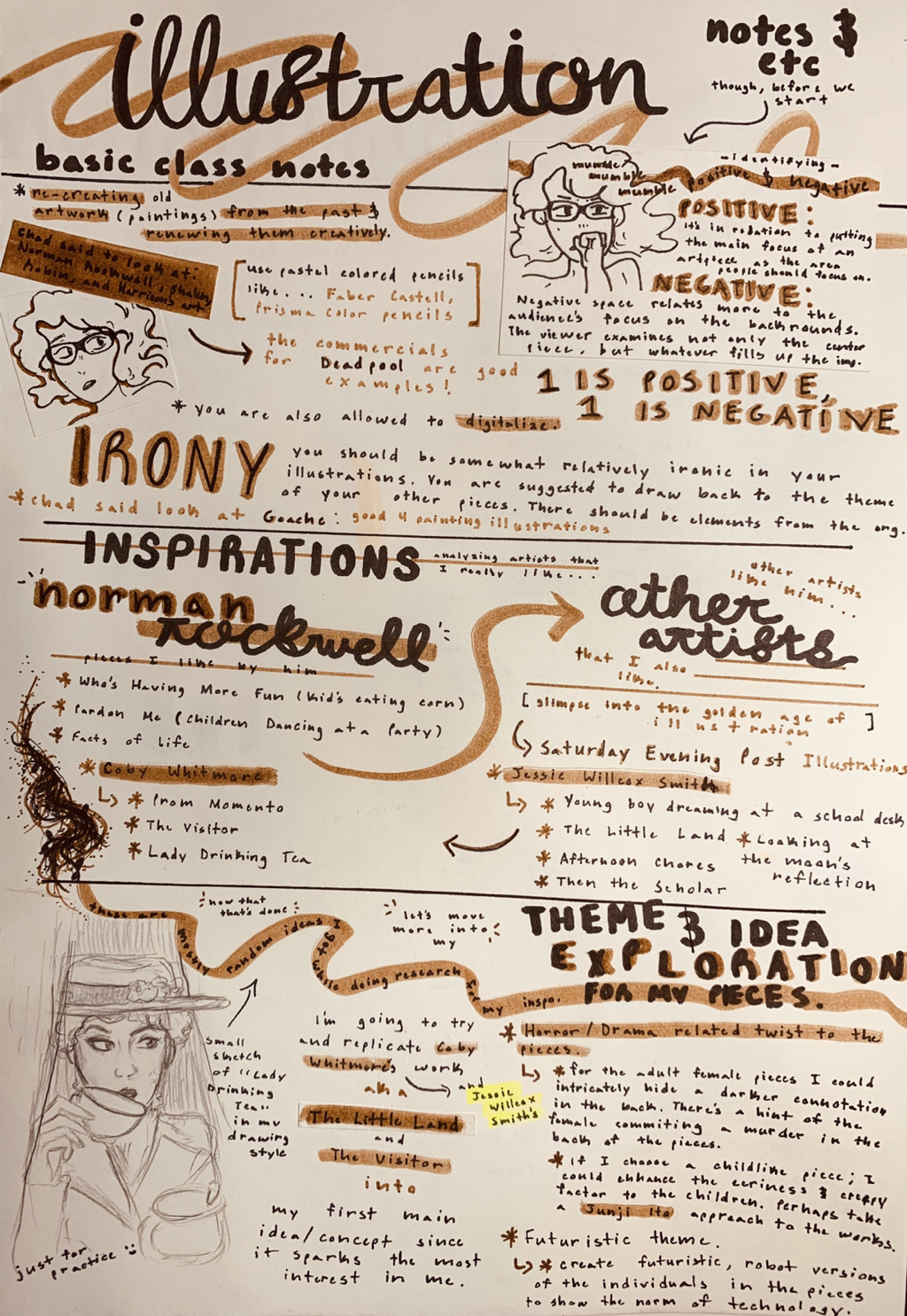
a r t w o r k : i l l u s t r a t i o n
|
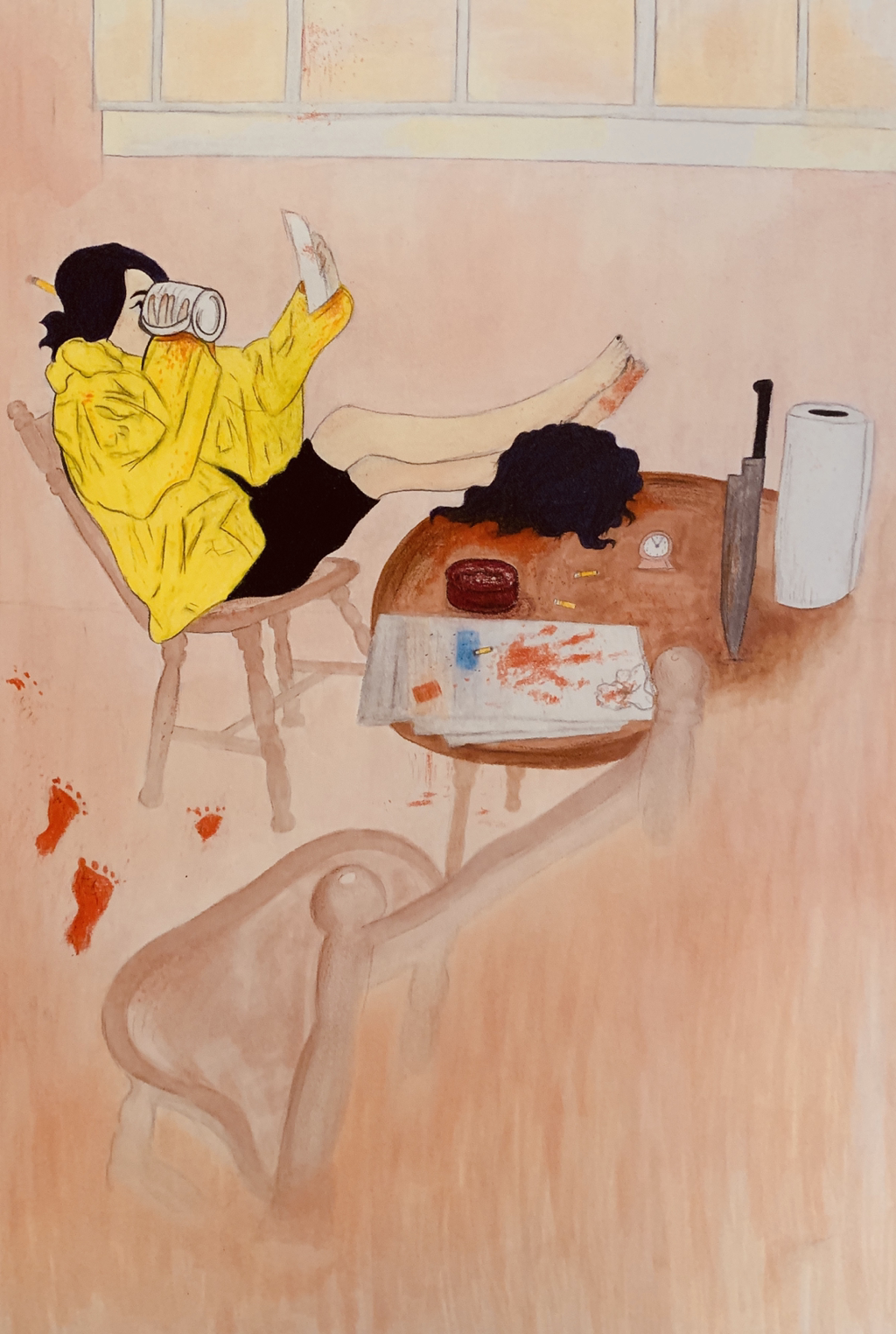
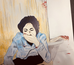
Title: Natural Born Killer
Size: 30.5 by 40.5 cm Medium: Colored Pencils & Markers Completion: February 2018 Exhibition Text:My illustration series "Natural Born Killer", these being gore twisted reversions of both Coby Whitmore's piece "The Visitor" and Jessie Willcox Smith's "The Little Land", is a collection that digs into personal destruction and inner self damage. The piece focuses on me as the main character, and references loosely to something sinister happening in the background; the unexpected murder of another, myself.
|

|
Inspiration:

|

|
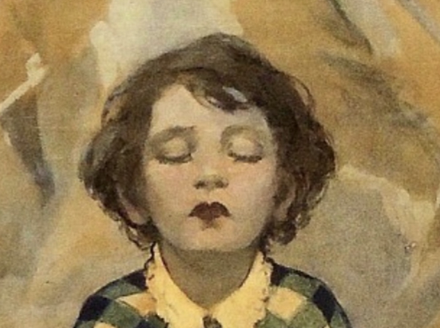
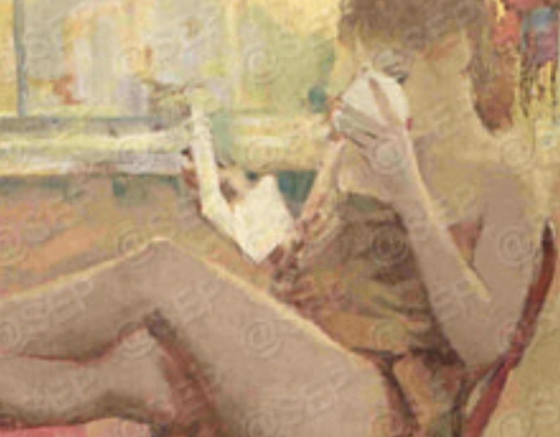
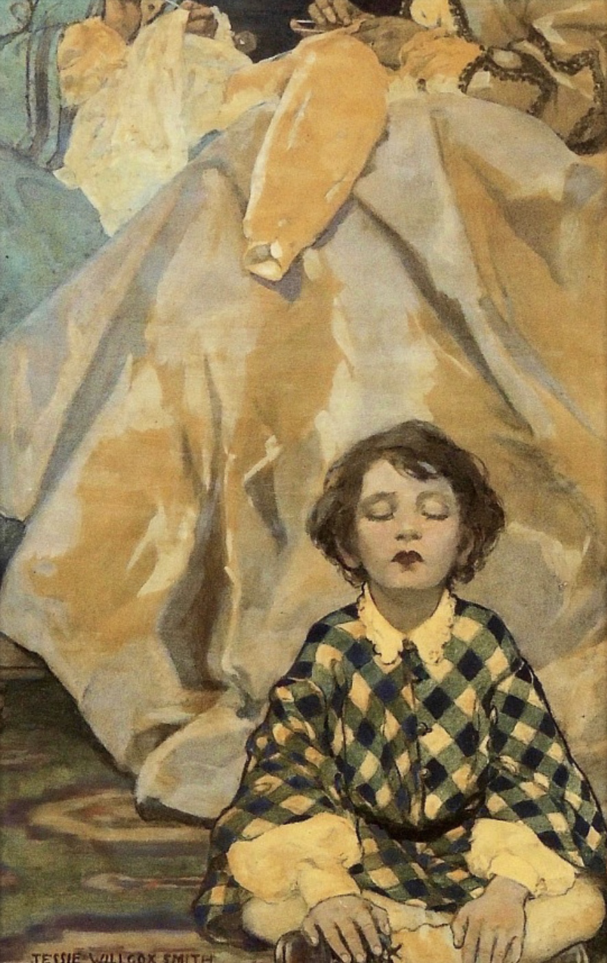
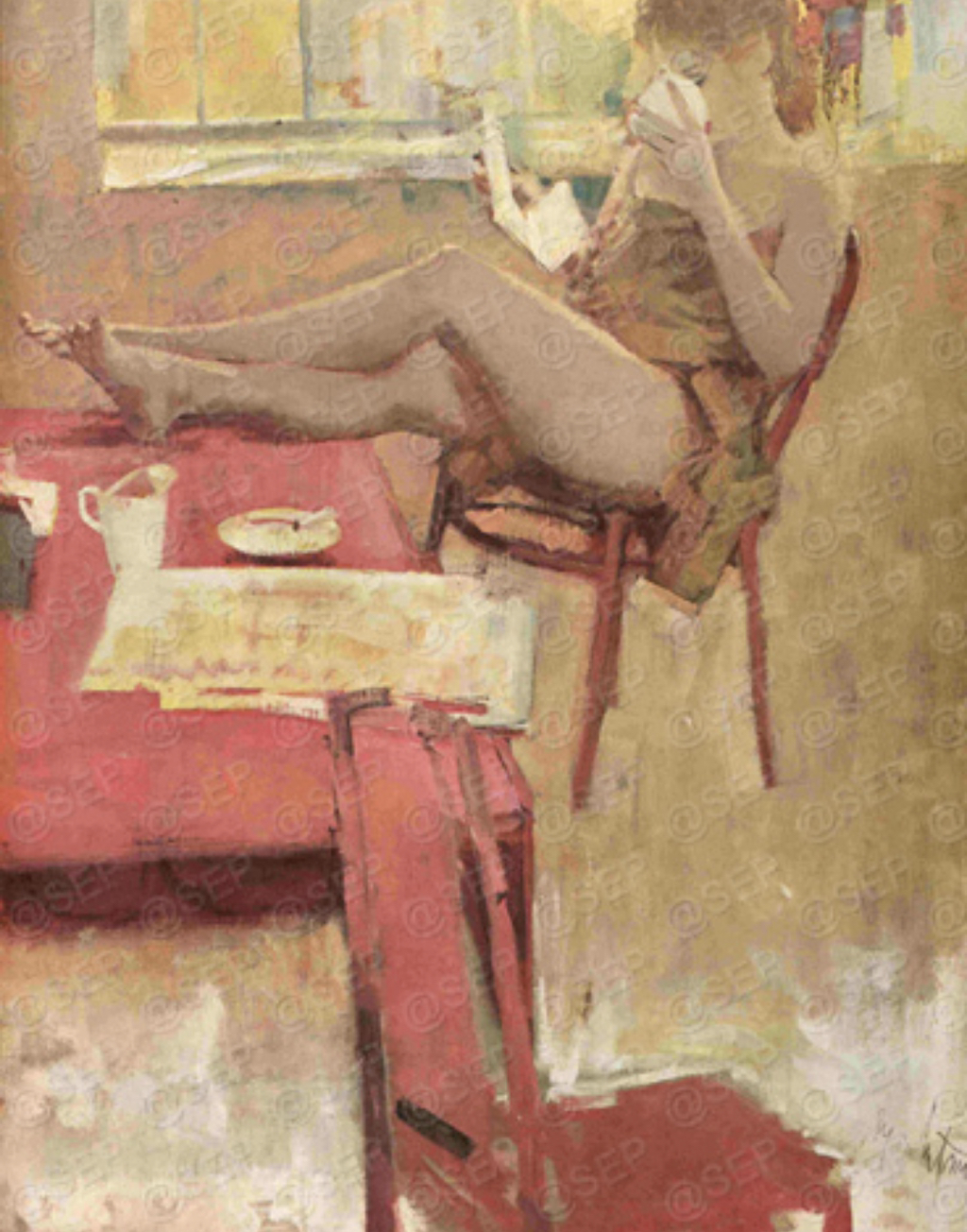
Artists In Focus: Coby Whitmore & Jessie Willcox Smith
Maxwell Coburn Whitmore, otherwise known as Coby Whitmore, is an American artist who works in painting and illustrating covers for magazines (mostly for Saturday Evening Post). Alongside Whitmore, I have also decided on re-creating the piece "The Little Land" by illustrator Jessie Willcox Smith, an illustrator from the Golden Age of Illustration. Although both are very strategic in the hue usage, main figure form, and delicate looks to their pieces, the pieces were usually intended for advertisement use. Both artists, for those initial reasons, however, were what truly caught my interest. There's a calming, peaceful nature to them, and I want to tweak it. |
These are the two selected pieces I decided to illustrate and tamper my own creativity into the two pieces above. The one to the left is called "The Little Land" (By Jessie Wilcox Smith) and the one to the right is called "The Visitor" (By Coby Whitmore).
|
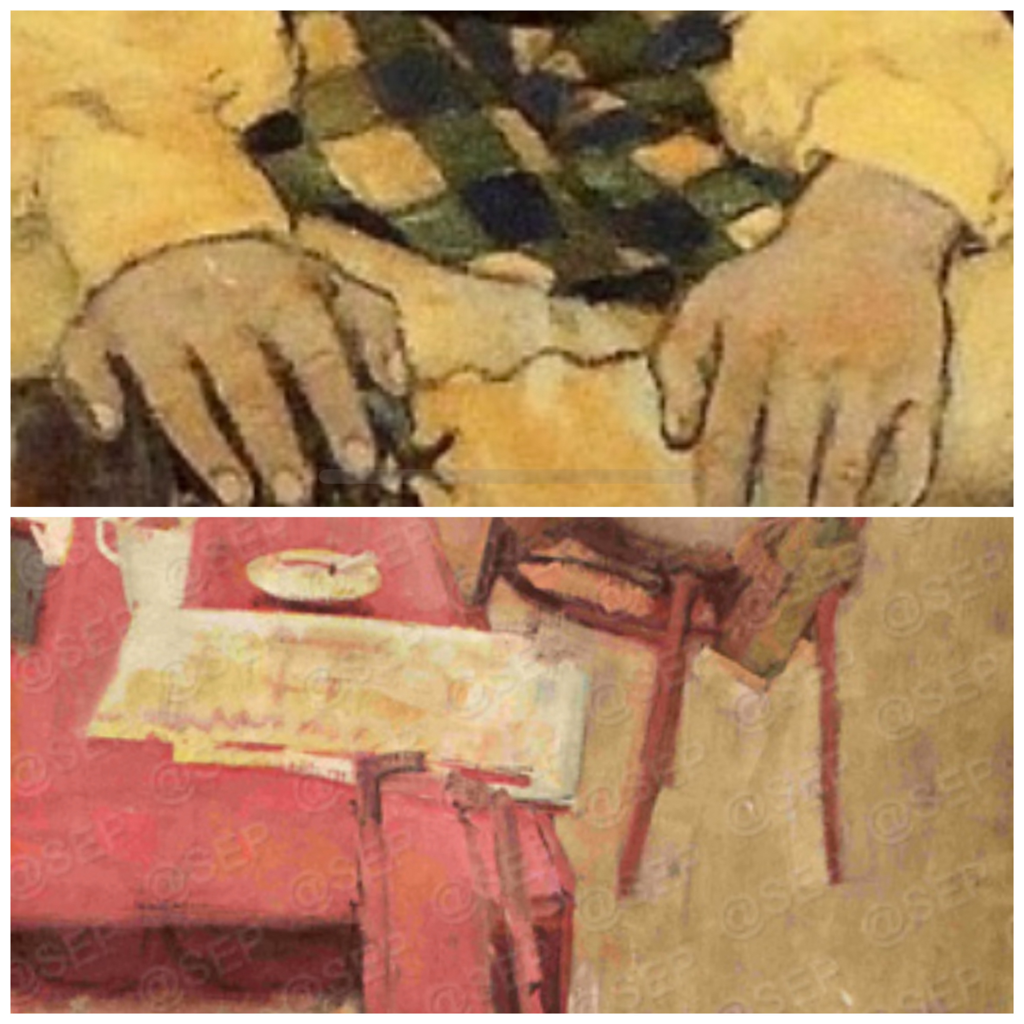
Areas that caught my attention the most, this being towards ironic twist, are in the close-ins to the right. The main figure, these unique facial cues and calmness, I for sure wanted to change up their looks a lot more from "pretty and gentle" to, instead be more like, "powerful and mysteriously evil".
|
|
|
|
|
Heading into the direction of my Horror Twist inspiration . . .
I personally quite enjoy the creepy factor to anything in life; especially in short films like "Tea Time" to the right. In this film, created by film maker Erik Deutschman, the audience is silently introduced to an older lady of which we assume is just making tea for her and her husband. However, as the film uses small details like the woman pouring food for her cat into an already overfilled container, and in the uneasy twist in nature to the setting, everything is flipped on it's side. Spoiler: The woman's insanity is going off the rails as it starts to become clear that she killed her own husband and the cat. |
|
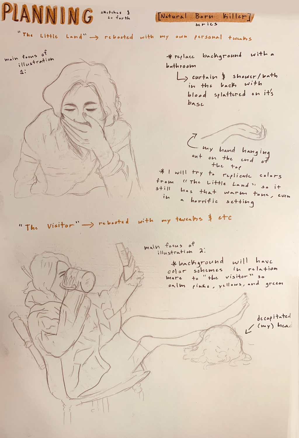
Planning:
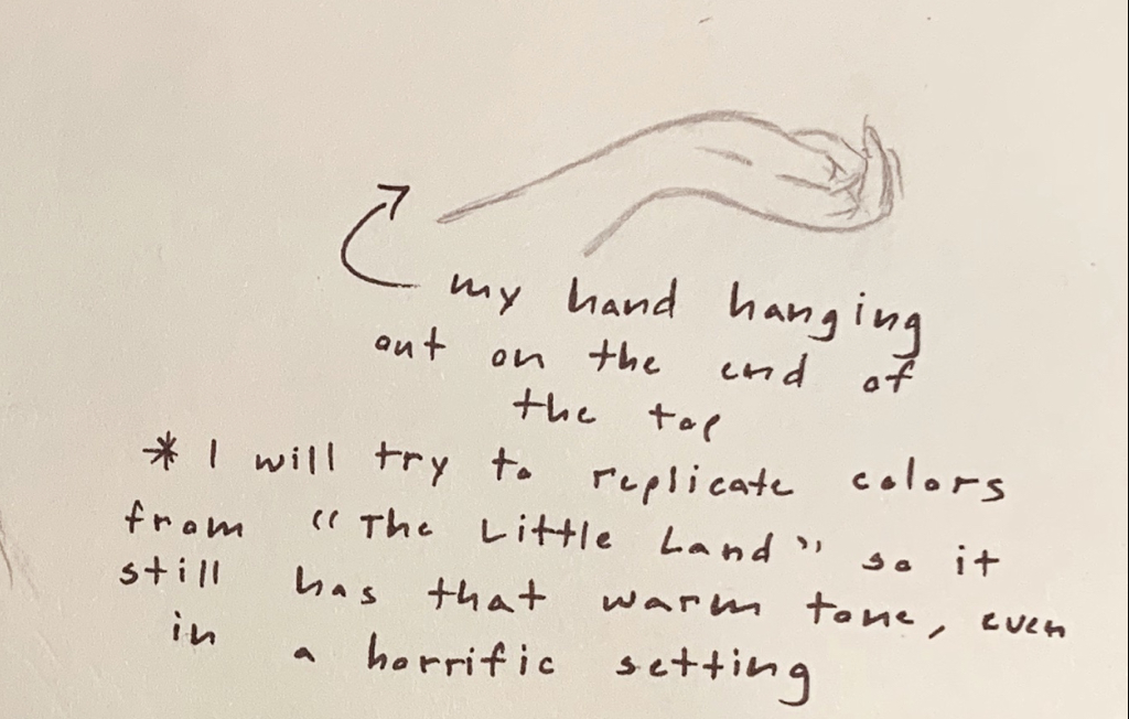
|
I began by taking notes in my drawing journal. This made it easier to get a grasp of the entire illustration project while also steering near my main theme and twist to the original illustrations.
I moved from the illustrations of Norman Rockwell, into Jessie Wilcox Smith's artwork, and then I came across the covers Coby Whitmore drew. With him in mind, I tried to look for art pieces that gave me a warm feeling in my chest (enhanced the mood of calm), so I could change the meaning completely with a much creepier approach. The same feeling occurred from Smith’s work. |
Journal/Planning Page 1
|
Journal/Planning Page 2
|
Journal/Planning Page 3
|
Journal/Planning Page 4
|
I sketched out the two main figures for my sketches; these being two individuals who look/and are exactly inspired by me. My pieces, a lot like the others I’ve made in the past, would be another self reflection on myself where I link into something deeper about who I am.
I used the images below in my experimentation to draw out these figures. |
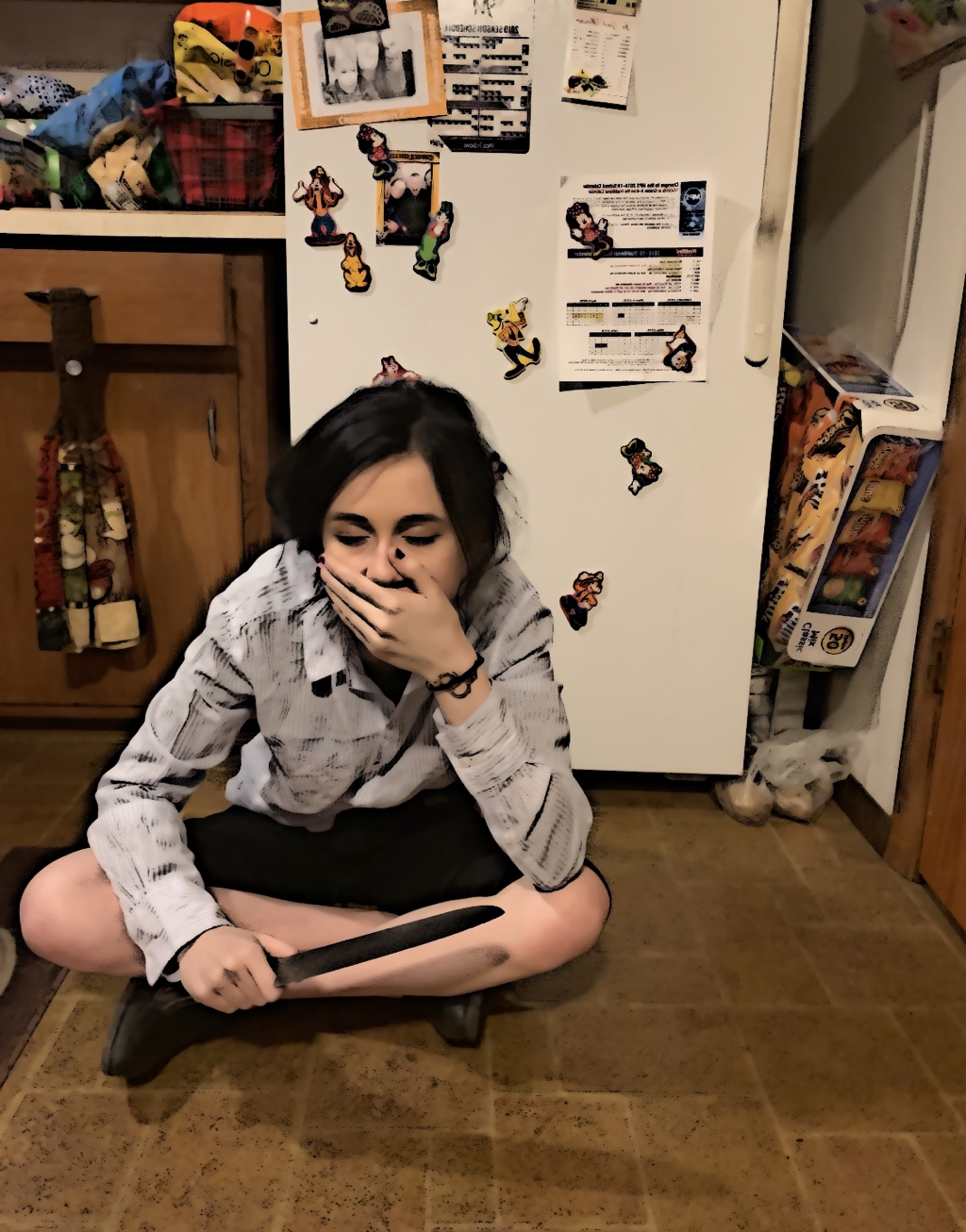
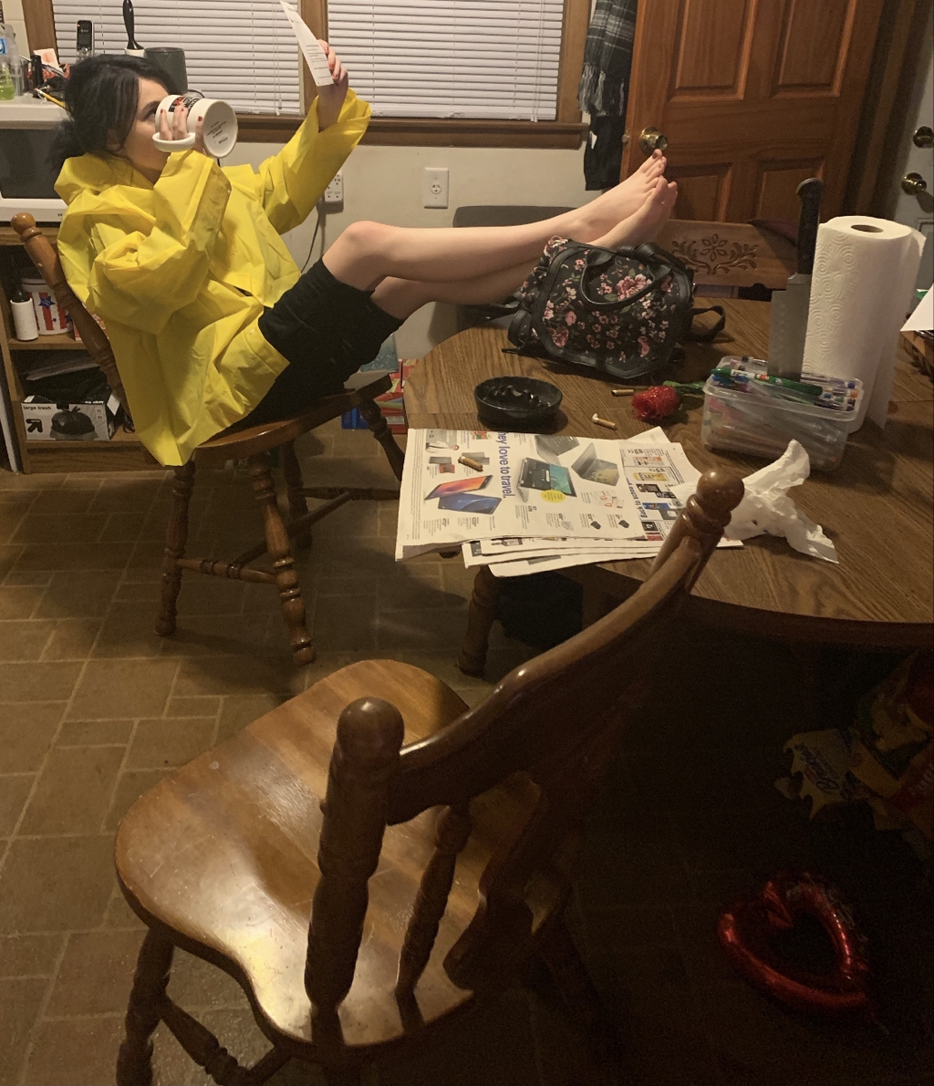
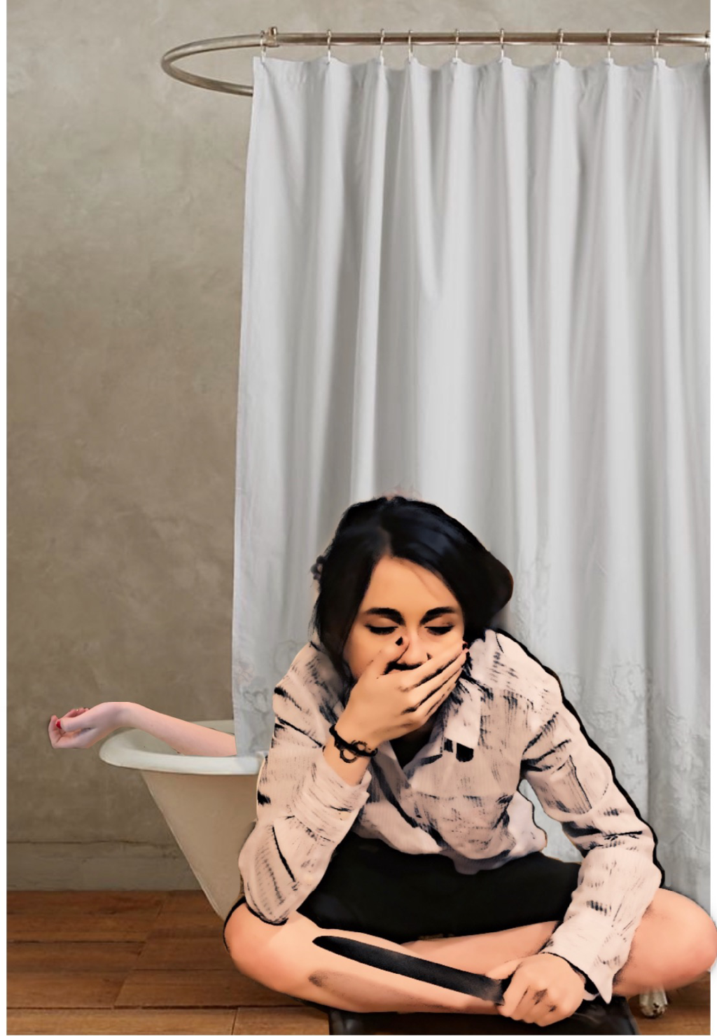
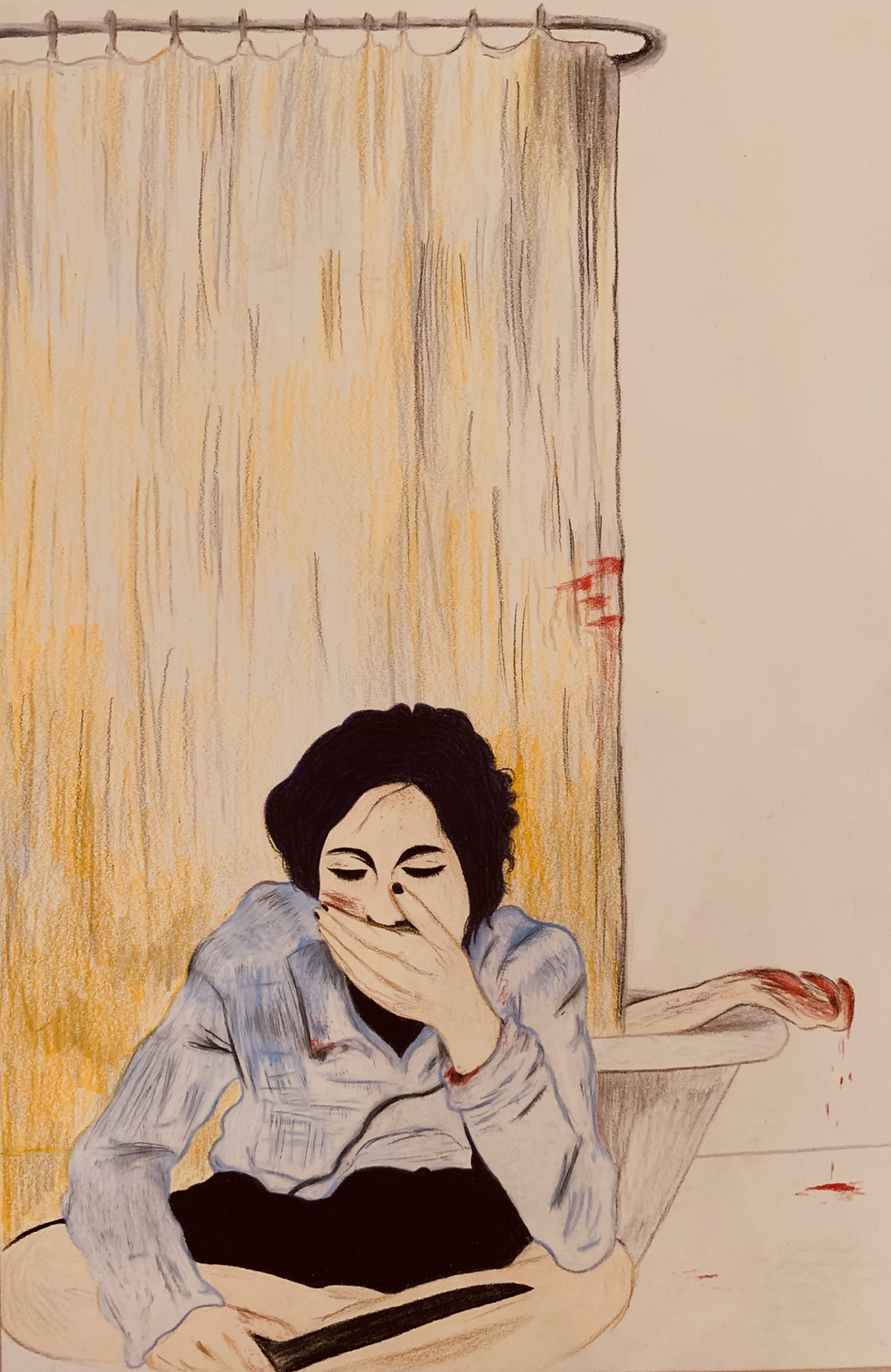
As you can begin to see, the person in the first piece (knife in hand) will link into me being the “killer” for both works. The hand in the tub is also mind, referencing into how I’m responsible “killing my self” off internally, perhaps accidentally lately. The second piece shows me sitting near a table, feet up on what’s to be my decapitated head.
Experimentation:
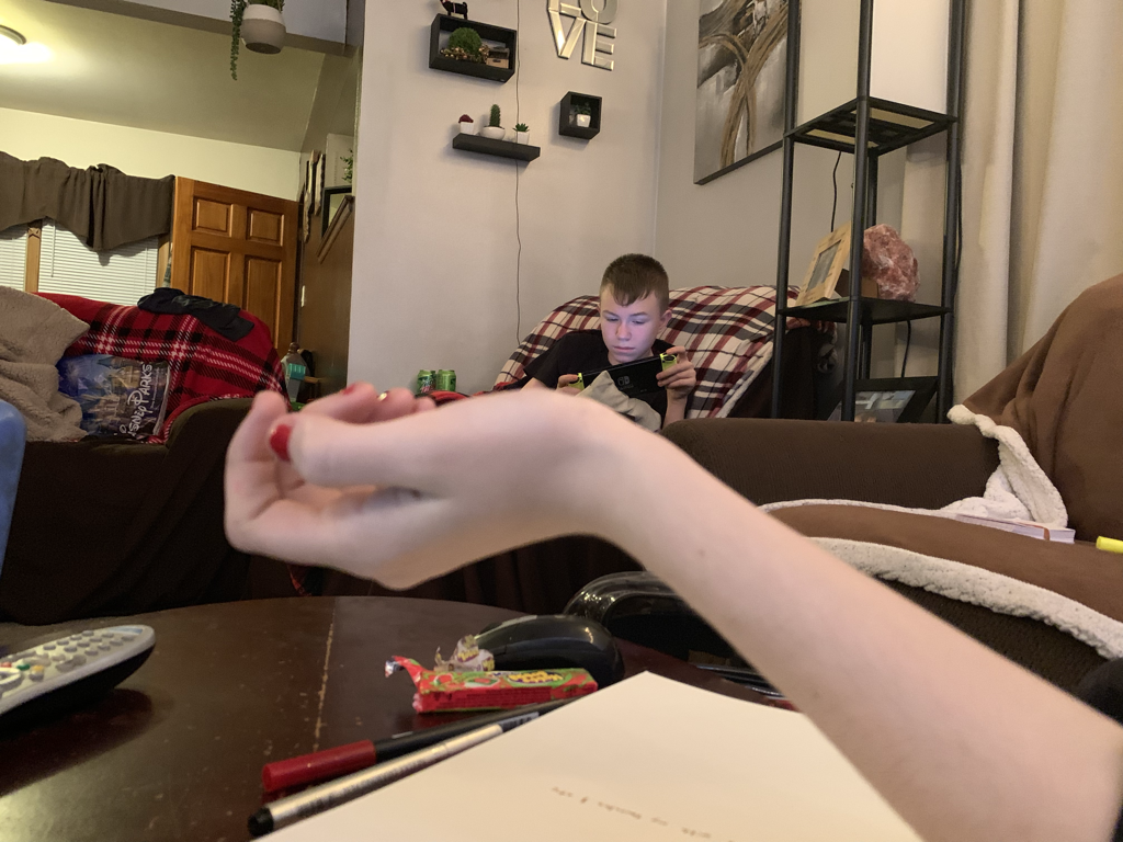
The following are photos I took of myself to analyze facial expression patterns, and to practice drawing emotion into my sketches.
|
|
|
|
|
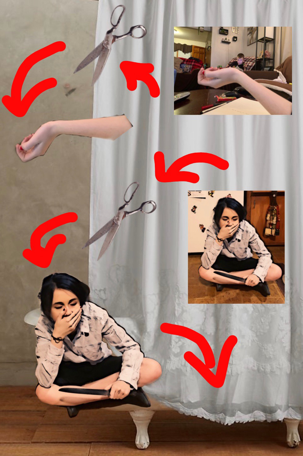
I tried to pose myself in relation to both my inspiration pieces. I decided on photoshopping the image to the left of this text so I'd be in a bathroom instead of my kitchen. This is a direct reference to my side inspiration "Tea Time", and the body found in the bathroom setting of the short.
The body in the tub is actually of my own, since I'm showing a metaphorically graphic representation of tearing myself down and on how I can sometimes ruin my life without knowing it/little care at all. |
|
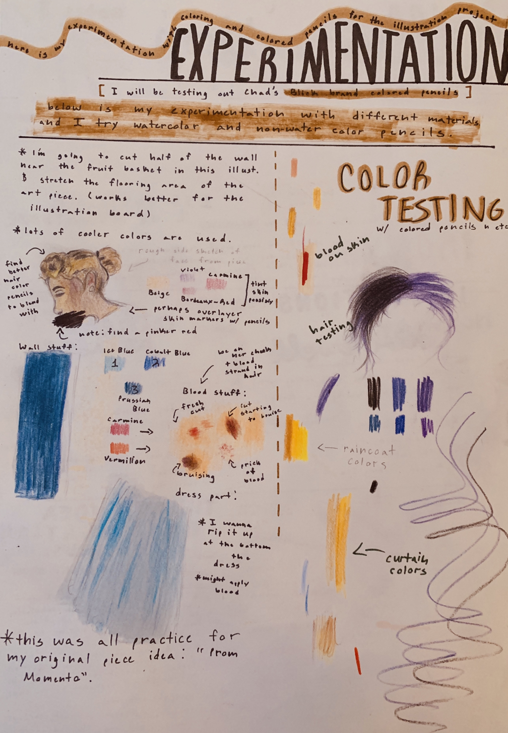
Experimentation with Medium: Colored Pencils
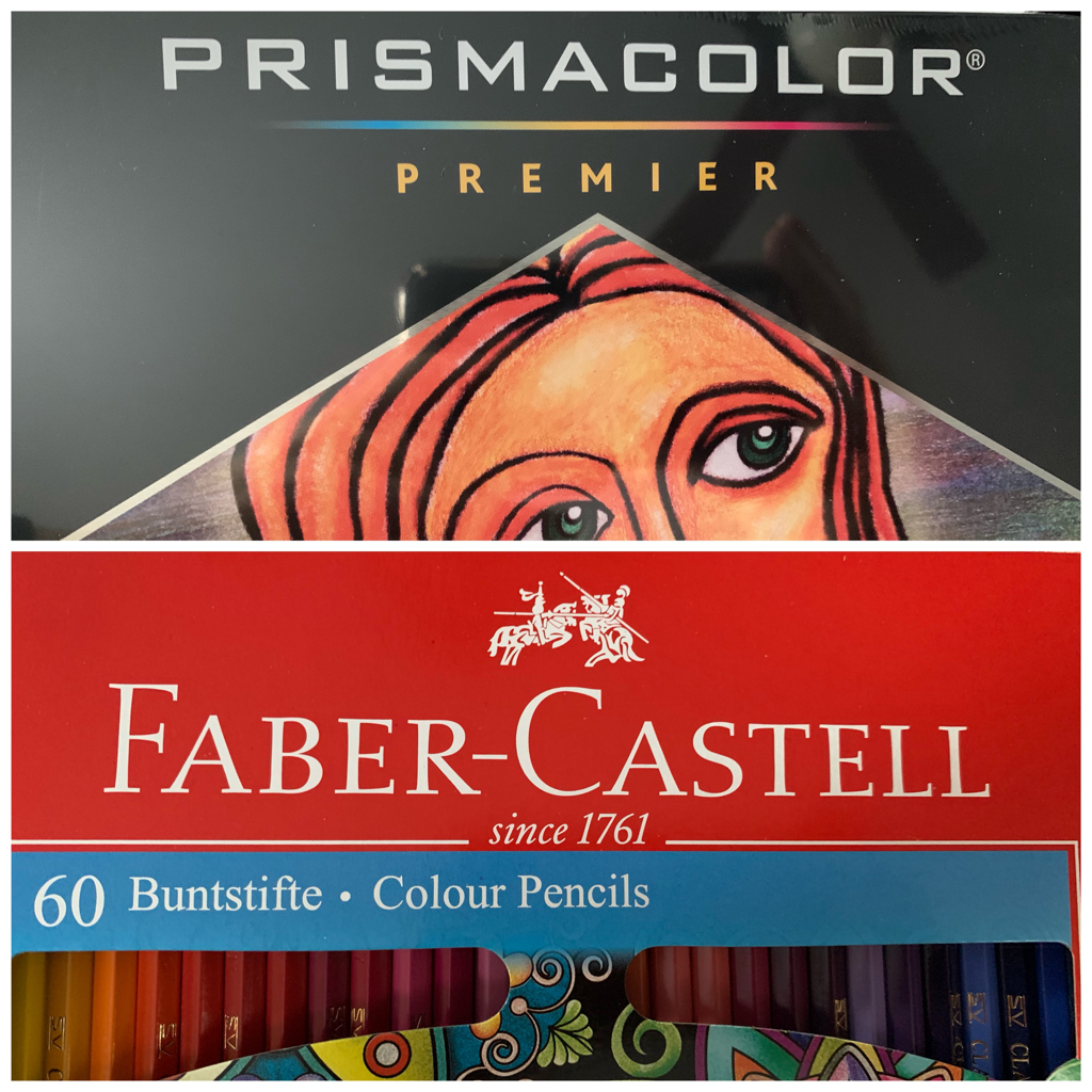
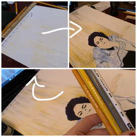
For me, it was important to experiment with different types of good quality colored pencils beforehand so I could familiarize myself with techniques and style of coloring. Prisma Colored Pencils mended up being good blender colors to mix with. They were nice on paper, and moved softly across the surface to create a more softer texture to things. The Faber-Castell Pencils, on the other hand, were better for delicate detail like hair strands and even the features on a face. |
|
Process:
|
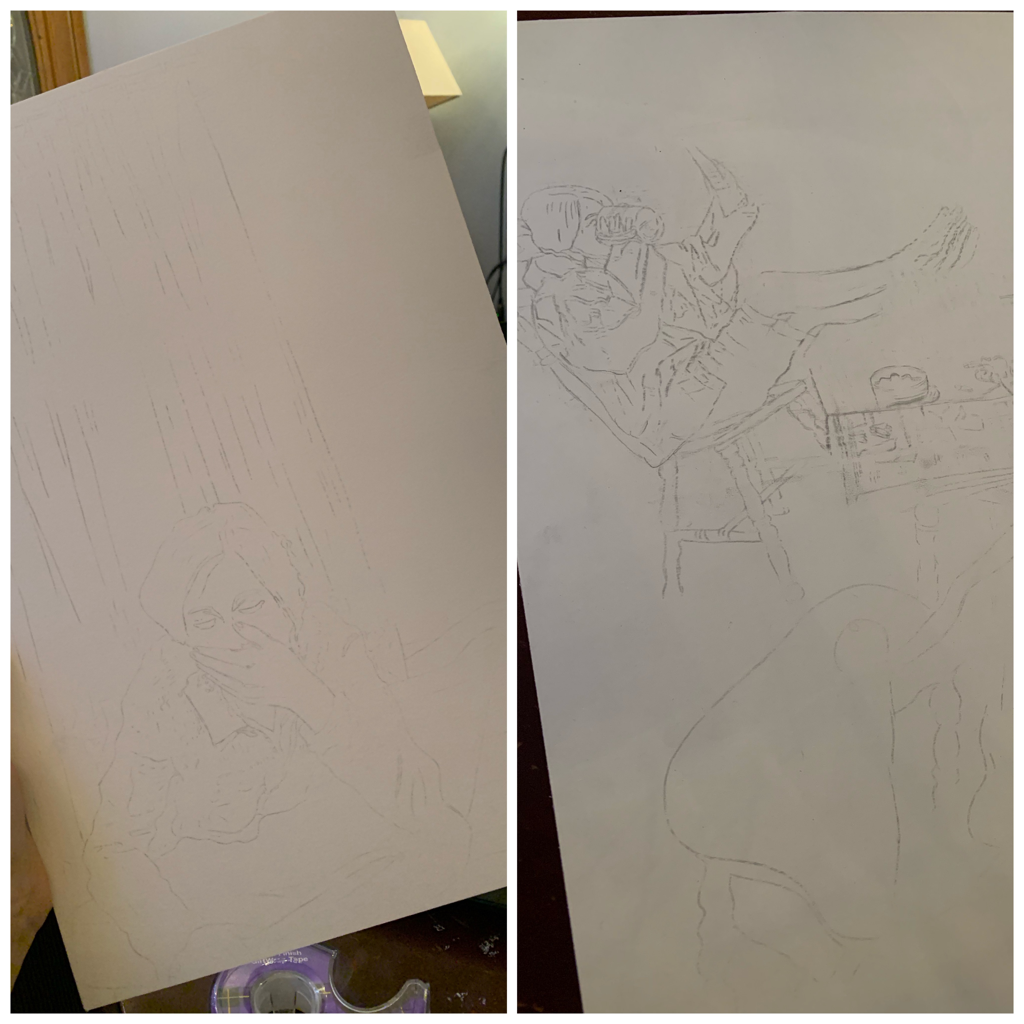
I began by lightly sketching out the photos I had taken earlier for reference onto both of my illustration boards. This didn't take me too long; I just had to make sure all of the detail I truly needed was somewhere easy for me to see so I could color things out correctly.
My rendition of Willcox Smith's "The Land Little" ended up being easier to sketch out since it had less detail. This meant that my other piece replication, "The Visitor" by Whitmore, was a lot harder to place onto the illustration board so it'd include exactly everything I needed. |
|
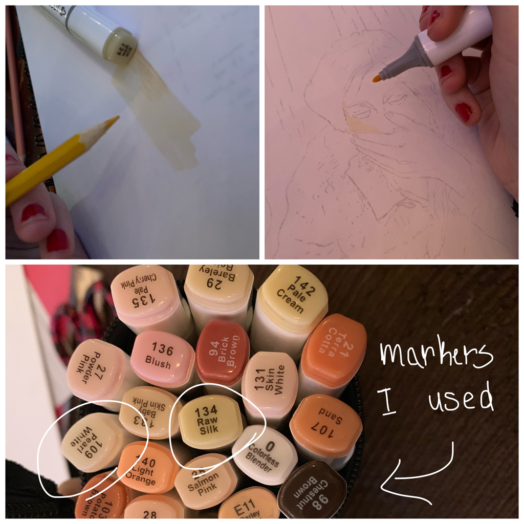
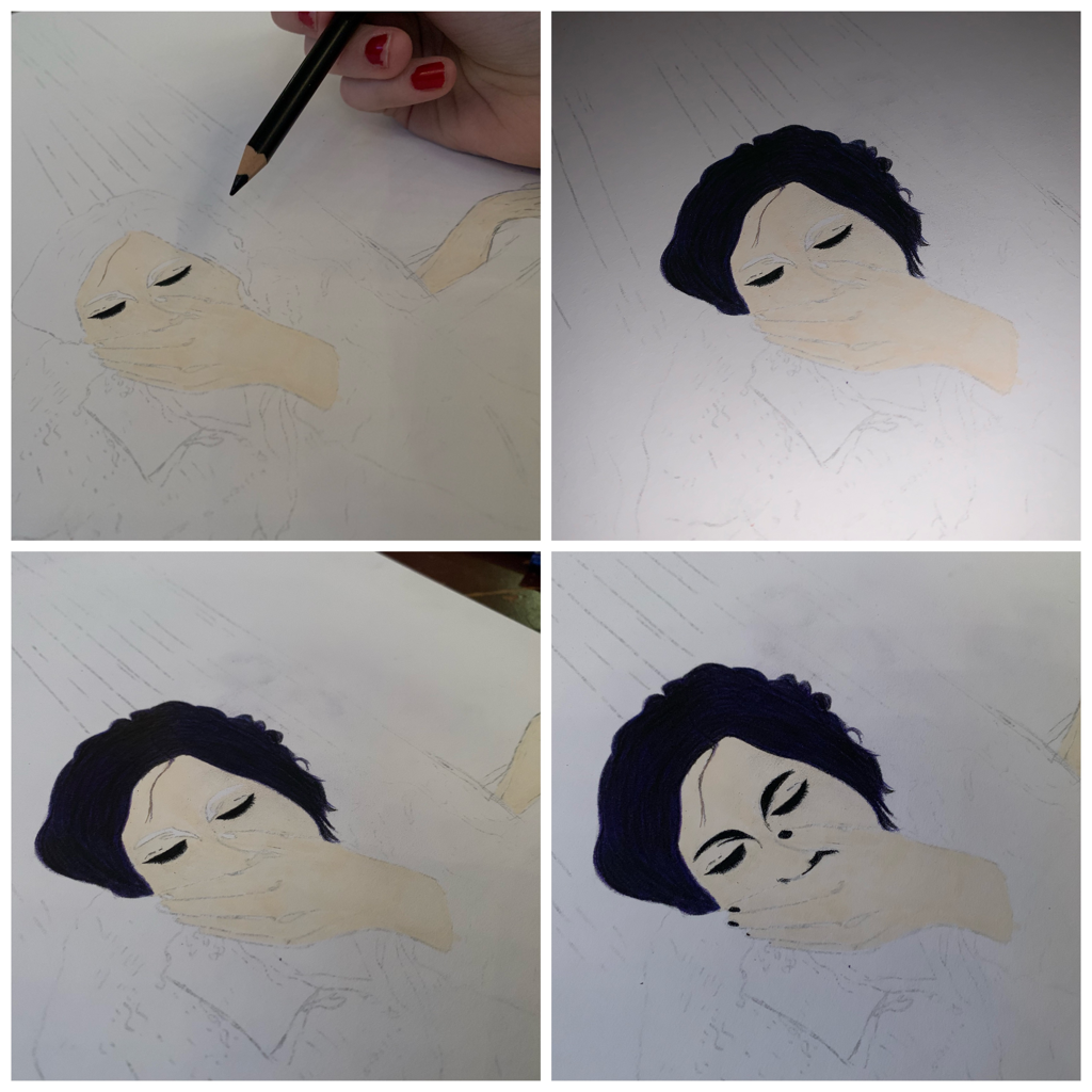
I started off with my first illustration piece, complimentary to the style and form of artist Jesse Willcox Smith's "The Little Land" Here I ended up experimenting with my TouchNew branded, skin color themed packet of markers. Skin creation, especially on colored pencil, could take a lot more time than needed to get right, so, using the marker named "Raw Silk", I began filling in an initial coating of white skin tone.
This would later be shaded and tweaked with colored pencils, but, for now, I kept my self character in clear, white skin, so I could slowly work around the face and hands. |
|
|
Perhaps my favorite part of creating this illustration, I moved into combining colors for the hair and filling in the eyes. For the hair, I started off with this purple colored pencil (Prisma branded) and filled I the whole head in the color. Next, I took a blackish blue and mixed this directly into where the purple was in the hair being worked with. This was then finally layered in complete black colored pencil. My hair in real life looks like all of these different colors all at once, so I tried to achieve the same with myself in this illustration.
Eyes weren't too difficult. They just took nice procession with black colored pencil to get looking at a level I liked. |
|
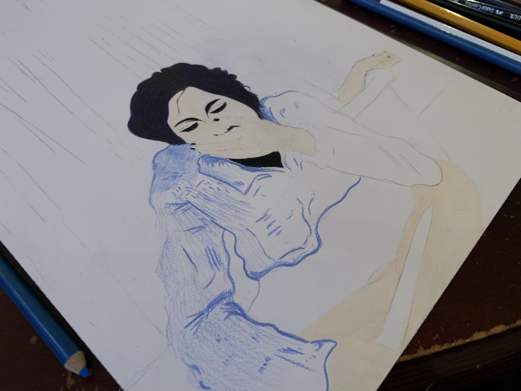
This is when I began coloring in, while contrasting hue and shading, the clothing . For the pictures I had worn this blue, baggy dress shirt, so I tried my best to replicate the looks of that well enough.
The pants were just filled by the scribblings of a black colored pencjl. |
|
|
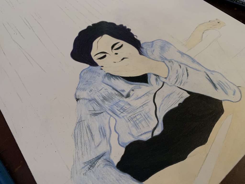
Now, I had finally reached the point of using specific colors (related to he background of "The Little Land") to create the shower scenery. I focused on making both long and short lines, dragging them harsher and then lightened on certain points to show a ripple in the curtain. I also switched colors a lot for shading and drawing what would look like creases in the shower curtain.
This all took some time. I had to also color in, with the handy work of Prisma color greys and blacks, the metal bars and etc for the shower. |
|
|
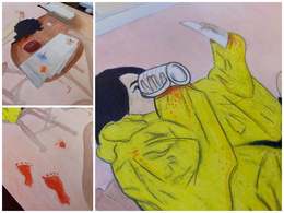
Being very close to the finalization of this illustration, I finished off by adding blood and other gore-y aspects to the drawing to really set my whole theme in plac did this very enormously on the hands of the dead body (my own) inside the tub, as blood drips onto the floor, and then even on the shower curtain, making the viewer imagine a bloody hand gripping onto the fabricing.
This, in a way, brought my entire piece together. |
|
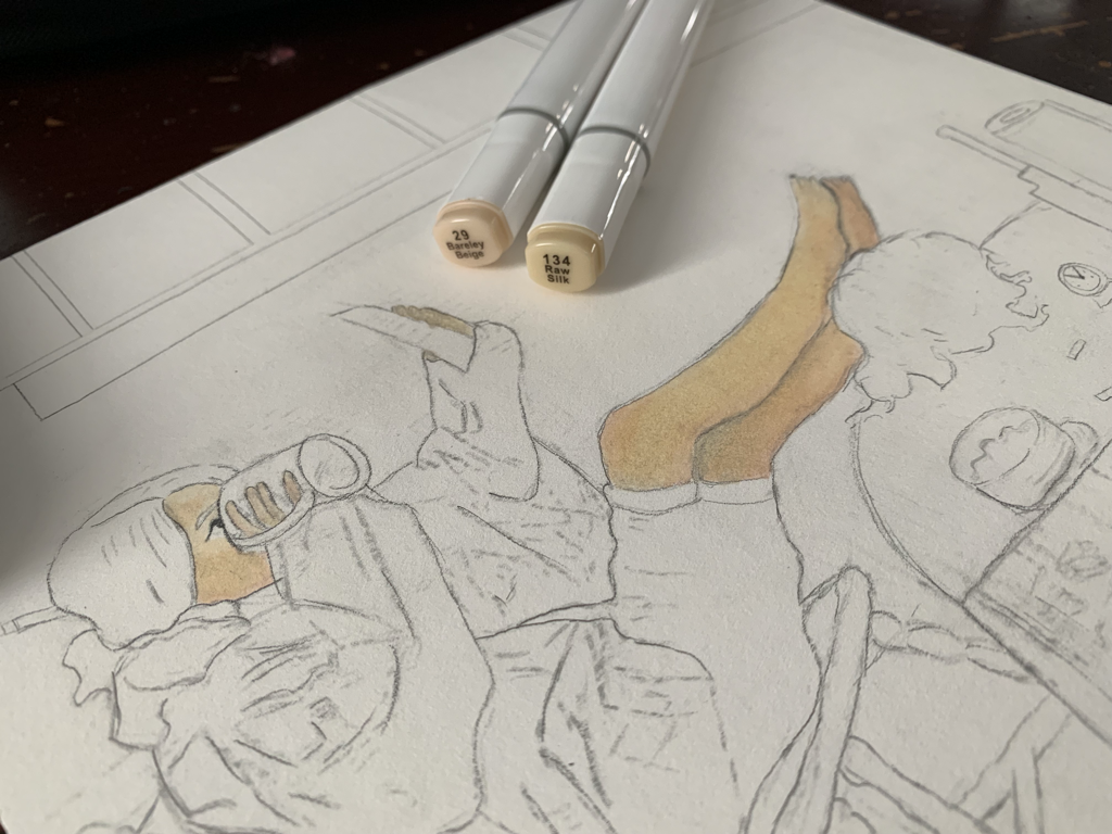
Now that I was familiar with the medium and materials I had for illustrating, I decided to move into my next piece with a sense of exploration into the matter. For starters, however, I began by using the two skin color markers in the photo to the right on my skin. Instead of blending over marker in colored pencil, I tried to layer the slightly darker skin tone onto the lighter one so it'd give certain areas of the figure's body depth and realness to it.
I tried to be softer around the face area since one mess up could sort of demolish the realization of it being a person. |
|
|
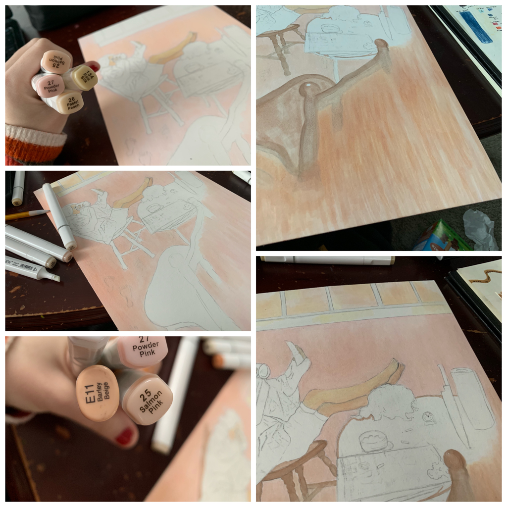
Next, I experimented with the markers I owned and reflected back to the warm, soft hues that artist Coby Whitmore used in his piece "The Visitor". I began with a solid, light pink hue and filled the whole board with the color. Layering began with colors that became increasingly thicker, heavier on the illustration board while also being a soft background to the main scenery.
This took me the longest time. I had to run back and add more colors to piece, increasing this fascinating texture of colors through extensive line and form usage. I also began using a light brown on the chair and table legs, so I could easily fade this into the colorful background of this piece with ease. It was easier to work around it if these were filled in beforehand. |
|
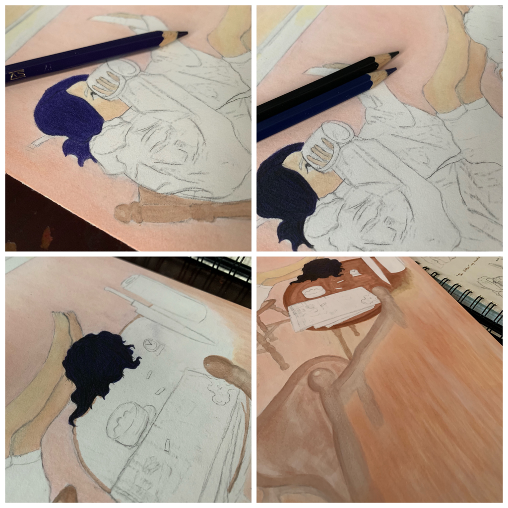
Reflecting back on how I did the hair in my remake of "The Little Land" by Jessie Willcox Smith, I wanted to do the same level of darkness and so forth with this one, so it'd be clear that this figure was also me.
Doing the same as I did before, I began with a violet hue and filled the entire hair portion with color until no white was showing. Then I moved in with the dark blue, giving the purple the blueish tint my hair recently has to it. Lastly, I finished off by covering the entire head in a harsh black. This gave the final texture and likeness to my hair as I wanted to see. |
|
|
Coming to a close with my illustration, I used two different yellow colored pencils to fill in the raincoat I was wearing, started to create detail with the objects at the table, and finished off with blood patterning.
It was important to make the correlation to my first piece with this one. Using blood as a common motif in such a calming, almost warm orientated illustration can out such a damper on the audience's thoughts while viewing a work. |
Critique:
This next area will be comparing both of my illustrations to their original inspirations: "The Little Land" by Jessie Willcox Smith and "The Visitor" by Coby Whitmore.
|
Similarities May Include:
- We're both putting emphasis on our centered, female figure. Willcox Smith and I seem to both like the immediate focus of our characters by putting them front and center.
- We both use soft colors. Her piece, more than mine, has a softer, warm colored vibe to it, and I tried to replicate that in my work as well. - Willcox Smith's piece and mine use a contrast of placement to enhance certain feelings and thoughts. By putting the figure smaller than the other, while also making them the center piece, can really differentiate the power one has. |
|
Differences May Include:
- Willcox Smith's "The Little Land" is a painting rather than a piece created with marker and colored pencil like mine. This difference in medium gives us a different set of texture, hue, and overall form of things and figures in the piece. Hers is more soft looking, and, in a way, the piece doesn't look as flat as mine does.
- My piece definitely gives off a way different tone than hers does. In hers to the left, she uses a child figure to convey certain messages and values to her work overall; this gives off a direct correlation to the title of her piece "The Little Land" as if to capture how a child feels in the world of adults. Mine, however, seems to have more sinister undertones to the meaning of the piece. Mine relates more on a personal level.
- My piece is pretty much a series of self portraits of myself, as I'm the direct character in focus for each, while she uses a random, unrelated kid as a focus. I, of course, did this to demonstrate personal struggle and horror in myself, so that's why the difference lied there. Plus, I felt slightly bad making a random kid the focus of something so gore-like, so I changed mine to fit a more "identity theme
|
Similarities May Include:
- We both have a female in focus! Mine is myself, of course, while his figure is a calm inducing, female character.
- We both use soft colors to, in a way, give off a softer undertone to our works. Although mine does hold a more sinister theme to it, the detail around the chairs and the background were inspired directly by Whitmore's. - The moment happening in both pieces is almost identical. Mine and Whitmore's piece shape the scene of a female drinking from a mug, feet propped up on a table, in a morning-like setting. |

|
Differences May Include:
- Again, there's a different in my piece from the inspiration because of the medium being used. Whitmore uses paints to create his illustration "The Visitor", so it contrasts in my piece, as I use colored pencils to produce it.
- My piece captures the violence and horrors in the calmness of life, while Whitmore's seems to just create a clear, steady feeling of calm in his. Even though my piece tries to convey the same background hue use and soft spread of line to create a warm morning atmosphere, the blood and knife (even the harsh yellows in my rain coat) seem to interrupt that fully.
- My piece captures the violence and horrors in the calmness of life, while Whitmore's seems to just create a clear, steady feeling of calm in his. Even though my piece tries to convey the same background hue use and soft spread of line to create a warm morning atmosphere, the blood and knife (even the harsh yellows in my rain coat) seem to interrupt that fully.
Reflection:
Illustration has always been very fascinating for me, so this was one of the projects I was most excited to get my self into this year. I haven't gotten to do as much free hand work with a medium I'm familiar with as of recently, so this made me very happy to have a pencil between my fingertips at free will. Both of my pieces turned out to look so satisfying, in my opinion, and I think the pay off of long exploration in colored pencil and marker technique was worth it. I decided to dig into self identity for this project in terms of how February, the time I'd be doing most of this project in, is usually my worst month mentally. Blame it on superstition, but that's always how it's been for me. That being said, the piece reflected on my inner opinions, and, using gore to formulate an even more sinister presentation of myself, I used the medium to illustrate how I've been accidentally "killing myself" in the terms of happiness and expression. There's apparent murder in my piece; it shows myself being the murderer of, also, myself. It's ironic even, as the figures that are alive in my pieces seem unfazed by my dead corpse, for being responsible.
My favorite parts of doing this were in the coloring of the hair (with my unique purple and blue tones to it nowadays), and then in the creation of my "The Visitor" rendition. I liked experimenting a lot, and the experience didn't feel pressured at all. I felt free to do as I want, and that was internally a relaxing difference to my past art projects. If I'd change anything, It'd have to be in the design and detail of the blue shirt in my remake of "The Little Land". I tried to hard to get creases right, and it ended up looking way sloppier than I wanted it to. Overall, I'm overwhelmingly proud of myself for creating this illustrations and in how nice they look.
My favorite parts of doing this were in the coloring of the hair (with my unique purple and blue tones to it nowadays), and then in the creation of my "The Visitor" rendition. I liked experimenting a lot, and the experience didn't feel pressured at all. I felt free to do as I want, and that was internally a relaxing difference to my past art projects. If I'd change anything, It'd have to be in the design and detail of the blue shirt in my remake of "The Little Land". I tried to hard to get creases right, and it ended up looking way sloppier than I wanted it to. Overall, I'm overwhelmingly proud of myself for creating this illustrations and in how nice they look.
Connecting to the ACT:
1.) Clearly explain how you are able to identify the cause-effect relationships between your inspiration and its effect upon your artwork:
The soft, undisturbed nature of both Jessie Willcox Smith's and Coby Whitmore's work inspired me to create the opposite. I wanted to flip that original piece with my own horror inspired touches to it.
2.) What is the overall approach ( point of view ) the author ( from your research ) has regarding the topic of your inspiration?
These artists were both specialized in making perfect works that didn't really break the mold of unadulterated peace and so forth; they always had a strict structure of being "pretty and perfect" to the viewer. This happens a lot in old illustration, however, since it was most acceptable and of higher interest in the time.
3.) What kind of generalizations and conclusions have you discovered about people, ideas, cultures, etc. while you researched your inspiration?
I've learned more about how I see myself presently, and how I've been dragging myself back without noticing sometimes that I'm the one responsible for withholding my own inner happiness.
4.) What was the central idea or theme around your inspirational research?
Sometimes we're responsible for our fallouts, mistakes, and the overall annihilation of everything we want to be; we just don't realize it at times and blame everything else.
5.) What kind of inferences ( conclusions reached on the basis of evidence and reasoning ) did you make while reading your research?
I've learned that I quite like working with colored pencils and creating illustrations. It was also fun to experiment with gore related art.
CITATIONS ( DONE IN MLA FORMAT )
Nilsson, Jeff, and Ellen Michaud. “Coby Whitmore | The Saturday Evening Post.” The Saturday Evening Post, 1 July 2015, www.saturdayeveningpost.com/2015/07/coby-whitmore/.
“Tea Time (a Creepy Short Film).” YouTube, YouTube, 5 May 2009, youtu.be/LKQpG7EjXsg.
